|
="Centerfield":ubq8t083]Holy crap that sucks. They might as well just wear a patch of my ass.[/quote:ubq8t083]
Yes.
|
Willets Point
Dec 22 2008 12:05 PM
|
|
="Centerfield":3bs7sdlk]Holy crap that sucks. They might as well just wear a patch of my ass.[/quote:3bs7sdlk]
Doesn't Ralph's ass have priority?
|
Centerfield
Dec 22 2008 12:51 PM
|
|
All threads eventually lead...
|
Edgy DC
Dec 22 2008 01:50 PM
|
|
="SteveJRogers"]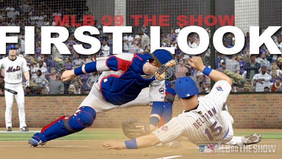 |
Is the Citifield infield really going to be surrounded by brick walls?
|
soupcan
Dec 22 2008 02:34 PM
|
|
I think so.
|
Edgy DC
Dec 22 2008 02:42 PM
|
|
If I'm Dabidrye's knee, I'm feeling vulnerable.
|
metsmarathon
Dec 22 2008 03:24 PM
|
|
maybe it'll be padding, with brick printed upon it
|
Gwreck
Dec 22 2008 04:02 PM
|
|
I think it's probably just the backstop, from dugout to dugout. Similar to what they have at Wrigley and Busch Stadium. Only real injury threat might be to a catcher going back on a popup.
|
Edgy DC
Dec 22 2008 06:21 PM
|
|
<img src="http://assets.espn.go.com/media/videogames/photo/2008/1216/mlb09_firstlook_580x327.jpg">
Other big problems I have with Citifield 2009 is the proliferation of
1) folks paying no attention to a play at the plate.
2) bearded men of color doing that arm-twirly thing. I see about nine of those guys, and at least tree sweatshirt guys simultaneously knocking back a drink.
Way to sell all the best seats to a cult, Mets.
|
Edgy DC
Jan 09 2009 09:20 AM
|
|
Uni Watch sez:
<img src="http://lp.imageg.net/prod?set=key[name],value[KICK%20ME]&set=key[number],value[00]&set=key[displaysize],value[500]&load=url[http://chains.imageg.net/graphics/dynamic/chains/pG01-5461419_customback.chain]">
|
themetfairy
Jan 09 2009 09:22 AM
|
|
Blech!
|
metirish
Jan 09 2009 09:23 AM
|
|
The patch looks too small on the right sleeve , make it bigger .
Actually it looks horrible.
|
John Cougar Lunchbucket
Jan 09 2009 09:35 AM
|
|
It's thisclose to an actual ad on the uni, of course, and that makes it all the more sadder.
|
batmagadanleadoff
Jan 09 2009 09:43 AM
|
|
At least they ditched the black on that patch thing.
|
Edgy DC
Jan 09 2009 09:43 AM
|
|
Which Horowitz can't say, of course, so he says nothing.
How about saying, "I retire"?
|
batmagadanleadoff
Jan 09 2009 09:46 AM
|
|
="John Cougar Lunchbucket":3l874qhx]It's thisclose to an actual ad on the uni, of course, and that makes it all the more sadder.[/quote:3l874qhx]
My theory is that Citi had significant input into that design. I think that the Wilpons are ruthless businessmen who put the dollar ahead of every single damn thing they ever do with this team -- not that this behavior is unusual but that the Wilpons operate out of greed even more than is to be reasonably expected from MLB team owners.
|
Edgy DC
Jan 09 2009 09:52 AM
|
|
="batmagadanleadoff":1q3q58va]My theory is that Citi had significant input into that design.[/quote:1q3q58va]
I'm guessing you're far from alone. As an opinion, that practically qualifies as a fact.
|
attgig
Jan 09 2009 12:08 PM
|
|
="SteveJRogers"]This would have been a better choice, from a Photoshop expert on Baseball-Fever.com
 |
or how about this that they already have:

|
metsguyinmichigan
Jan 09 2009 12:47 PM
|
|
That routunda design is so much better. I would love to hear someone justify picking the rectagle over this. (And you can easily take off the Citi name on top)
|
soupcan
Jan 09 2009 01:06 PM
|
|
Okay - no corporate logos on uniforms? No problem.

I did this in 30 seconds - nobody associated with the team could come up with this?
Inexcusable.
|
Edgy DC
Jan 09 2009 01:21 PM
|
|
Well, an excuse for not using that logo is that they've stilpulated and exclusive license that doesn't allow that logo to be used on any merchandise except that bought within the mallpark.
The excuse for using the logo that resembles the corporate one is because they're getting a lot of money to do that.
|
Benjamin Grimm
Jan 09 2009 01:32 PM
|
|
But it doesn't resemble Citi's logo:
<img src="http://www.citibank.com/domain/cm/img/top_nav/logo.gif">
It just resembles the Citi Field logo, the tilted rectangle. I don't see how THAT has a whole lot of corporate value. If it only represents the ballpark (and as far as I know that's true) then I'm not sure what this is all about.
|
soupcan
Jan 09 2009 01:38 PM
|
|
Agree wholeheartedly with Grimm.
This:
Does not resemble this: 
The logo that they will use on the merchandise is nicer and makes a lot more sense. They're using it on the merchandise - throw it on the unis! Synergy baby. You can't fight that.
|
John Cougar Lunchbucket
Jan 09 2009 01:50 PM
|
|
But that diamond shape is the "citi field" logo, which is, more or less, a secondary logo for citibank. We've seen it

|
Zvon
Jan 09 2009 02:22 PM
|
|
This patch gets the lame award for 2009 and we are only nine days into the new year.
Compared to the other inaugural stadium patches I've seen over the last bunch of years, this is a disgrace in concept and design.
And if its the Citi Bank people that pushed it on the team, they suck.
It IS close to an ad, and a cheap bumper sticker kind of ad to boot.
|
mario25
Jan 12 2009 04:07 PM
|
|
The logo is awful, I agree with Lukas. It is a sell out to Citibank.
|
Edgy DC
Jan 13 2009 09:15 AM
|
|
Patchless so far:
<img src="http://www.newsday.com/media/photo/2009-01/44491441.jpg">
|
John Cougar Lunchbucket
Jan 13 2009 09:17 AM
|
|
Mets by the Numbers is reporting that Redding is the third player on the current 40-man roster who can make a claim to to the No. 44 jersey.
Knight wore it most recently, and Kunz wore it prior to that. Knight initially was 28 but that went to Murphy while Knight was in Bejing.
|
Edgy DC
Jan 13 2009 09:22 AM
|
|
He seems to have something on the uniform top there. Mets.com lists him as --.
|
John Cougar Lunchbucket
Jan 13 2009 09:35 AM
|
|
Yes, that's a 44 jersey, you can tell in other photos and on the video of him at mlb.com
|
Fman99
Jan 13 2009 10:34 AM
|
|
More humor at the patch's expense, [url=http://thesportshernia.typepad.com/blog/2009/01/other-inventive-patches-found-in-mets-brainstorming-lab.html:f79je3a2]some entertaining 'discarded' patch ideas.[/url:f79je3a2]
Oh good, it's been a few months since someone laughed at the expense of a Mets fan.
Fuck.
|
soupcan
Jan 13 2009 12:38 PM
|
|
[url=http://sports.yahoo.com/mlb/blog/big_league_stew/post/Mets-pizza-patch-the-laughingstock-of-baseball-?urn=mlb,133840:1ki8azaz]Possible that all this 'outcry' over the patch forces the Mets hand and they consider changing it?[/url:1ki8azaz]
|
Edgy DC
Jan 13 2009 12:45 PM
|
|
That blog has nothing supporting that possibility.
|
soupcan
Jan 13 2009 12:50 PM
|
|
i know the blog didn't say it but I was just wondering since the fugly patch has become the topic du jour among the diehards and is finding some ink in the media.
|
metsmarathon
Jan 13 2009 12:50 PM
|
|
| ]They could've held a coloring contest among preschoolers and still ended up with a better design than the one above. |
they could've held a writing contest by preschoolers and come up with a better punchline than the one above...
|
MFS62
Jan 13 2009 12:51 PM
Edited 1 time(s), most recently on Jan 13 2009 12:54 PM
|
|
Remember when MLB was going to put Spiderman on the bases?
There was a tremendoud hue and cry from the fans, and the idea was killed.
Maybe the front office will back off on this idea as a result of reactions such as the stories we've seen linked here.
At least, we can hope.
Later
|
metirish
Jan 13 2009 12:52 PM
|
|
I know it's ugly but is it really the laughingstock of MLB , will there be soccer style chanting at opposing stadiums ridiculing the Mets about the patch?
|
DocTee
Jan 13 2009 01:12 PM
|
|
It's a patch. It takes up like 2% of the uniform, and will be gone in ten months.
Yes, they could've done better.
Yes, I hope they change it.
No, I'm not losing sleep over it.
It's a patch.
|
SteveJRogers
Jan 13 2009 06:54 PM
|
|
="MFS62":3grqchiz]Remember when MLB was going to put Spiderman on the bases?
There was a tremendoud hue and cry from the fans, and the idea was killed.
Maybe the front office will back off on this idea as a result of reactions such as the stories we've seen linked here.
At least, we can hope.
Later[/quote:3grqchiz]
That is probably a reason for the reaction that it is garnering. Basically people with opinions thinking they can get a grass roots movement going.
Hey its better than that article in the Post the other day that was bashing the Mets because rust has been forming on Citi Field's exposed steel beams.
|
themetfairy
Jan 14 2009 07:10 AM
|
|
[url=http://mlb.fanhouse.com/2009/01/14/the-dugout-inaugural-season-2009/:3nnav038]The Dugout rips into the patch[/url:3nnav038].
|
Benjamin Grimm
Jan 14 2009 07:21 AM
|
|
It really doesn't matter a whole lot to me, but there would appear to be hope of some kind of a change. The revulsion has been pretty wide-spread, and since the real point of the logo is to move merchandise, then I would think the Mets would have to weigh that very few people will be buying t-shirts, mugs, caps, and beach towels with the boring ugly logo.
I don't know whether or not it's too late to make a change. I know that anything that appears on the uniform has to be approved by MLB, and they may have missed a deadline for a new sleeve patch, but maybe they can call an emergency meeting or something.
|
soupcan
Jan 14 2009 07:34 AM
|
|
EMERGENCY SLEEVE PATCH MEETING!!!
|
seawolf17
Jan 14 2009 07:40 AM
|
|
That Dugout is hilarious. I need to catch up on their stuff.
|
themetfairy
Jan 14 2009 08:40 AM
|
|
This one made me laugh -

|
metirish
Jan 14 2009 08:45 AM
|
|
How about no patch ?
|
dgwphotography
Jan 14 2009 09:17 AM
|
|
They should have a patch designed like the old World's Fair patch from '64 celebrating the demise of the chop shops across the street...
|
Rockin' Doc
Jan 14 2009 11:34 AM
|
|
I agree that the patch is pretty ugly and a far better design could and should be designed, but I agree with DocTee's sentiment that it's not that big a deal in the overall scheme of things. I'm far more concerned wirth the quality of the collective players that will be wearing the uniform than I am the logo on the sleeve.
|
Centerfield
Jan 14 2009 11:43 AM
|
|
| ="themetfairy"]This one made me laugh -
|
Fantastic!
|
Centerfield
Jan 14 2009 11:44 AM
|
|
="Rockin' Doc":1ly46k5l]I agree that the patch is pretty ugly and a far better design could and should be designed, but I agree with DocTee's sentiment that it's not that big a deal in the overall scheme of things. I'm far more concerned wirth the quality of the collective players that will be wearing the uniform than I am the logo on the sleeve.[/quote:1ly46k5l]
Wait, you're not going to obsess over every minute detail of this team from the speaking patterns of our GM to colored dots on hats?
Dude, you're like, not going to fit in around here at all.
|
Frayed Knot
Jan 14 2009 02:57 PM
|
|
="Rockin' Doc":1brfj8rx]I agree that the patch is pretty ugly and a far better design could and should be designed, but I agree with DocTee's sentiment that it's not that big a deal in the overall scheme of things. I'm far more concerned wirth the quality of the collective players that will be wearing the uniform than I am the logo on the sleeve.[/quote:1brfj8rx]
It's not just that the design is ugly (or plain, or unimaginative, or whatever adjective you want to throw in there) it's that the design is ugly because it's essentially advertising and they're not wearing it to celebrate the opening of the stadium as much as they're wearing it because they struck a deal with the (broke) company that's paid for the naming rights for the damn thing.
|
soupcan
Jan 15 2009 08:30 AM
|
|
The 'controversy' hits the mainstream media...
] January 15, 2009
Mets’ Latest Off-Season Problem? A Dull Patch
By TYLER KEPNER
The Mets unveiled their primary logo on Nov. 16, 1961, and it has gone virtually unchanged. With the team’s name scripted across a city skyline and above a bridge on an orange-laced baseball, the trademark is timeless.
The Mets’ most recent design has not been as warmly embraced. The uniform patch that commemorates the opening of Citi Field has caused a stir on the Internet, with ESPN.com calling it “the worst sleeve patch in M.L.B. history.”
Dave Howard, the Mets’ executive vice president for business operations, said the Mets signed off on the design presented to them by Citigroup, which is paying the team $400 million over the next 20 years for naming rights to the stadium.
“Everyone has their own point of view,” Howard said. “Taste is very subjective, and we understand that and appreciate the passion of Mets fans.”
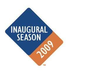
The sleeve patch is a variation of the official Citi Field logo introduced last year, with the words Inaugural Season in white letters on a blue square. Below is an orange square that says 2009, also in white.
In recent seasons, the Astros, the Phillies, the Cardinals and the Nationals have all used distinctive ballpark elements in their commemorative patches; the Astros showed their roof in silhouette, the Cardinals their arched entryway. The Yankees’ 2009 patch prominently features the rooftop facade of the new Yankee Stadium.
The Mets’ patch seems to take minimalism to the extreme. Baseball forbids teams putting corporate names on uniforms, but Citigroup wanted the patch to evoke the company’s general branding. The Mets did not object. Citigroup itself is in financial distress and is planning to dismantle part of its corporate empire. But the patch remains the patch, for better or worse.
“It is compatible and consistent with Citigroup’s overall branding and graphic design elements,” Howard said. “That’s the connection. The Citi logo is a fairly simple logo. It’s ‘citi’ in lowercase, with a red arc. So they have more of a minimalist style to their brand and their logo. Obviously, as our partner for Citi Field, we’re going to give substantial deference to their design and graphic treatment.”
The official Citi Field logo has been widely panned as drab and too evocative of the Domino’s Pizza logo. But fans will have to get used to it, because it will be affixed to the side of every other seating row at the ballpark and used extensively in marketing and promotions, assuming the Citi name survives.
Howard said the Mets were flattered that Citigroup designed a logo that incorporated the team’s blue and orange colors. That is not always the case; the logo for Petco Park in San Diego has the corporate name in red, even though the Padres do not wear that color. Then again, that logo also includes a Padres insignia and two palm trees, while the Citi Field trademark looks painfully plain.
The Mets do have an alternate inaugural season logo that features the windows of the distinctive rotunda at Citi Field. But Howard said that logo would be available only on merchandise sold at the ballpark. He added that the team would not change the sleeve patch, which will be used for all home games.
January 15, 2009
Mets’ Latest Off-Season Problem? A Dull Patch
By TYLER KEPNER
The Mets unveiled their primary logo on Nov. 16, 1961, and it has gone virtually unchanged. With the team’s name scripted across a city skyline and above a bridge on an orange-laced baseball, the trademark is timeless.
The Mets’ most recent design has not been as warmly embraced. The uniform patch that commemorates the opening of Citi Field has caused a stir on the Internet, with ESPN.com calling it “the worst sleeve patch in M.L.B. history.”
Dave Howard, the Mets’ executive vice president for business operations, said the Mets signed off on the design presented to them by Citigroup, which is paying the team $400 million over the next 20 years for naming rights to the stadium.
“Everyone has their own point of view,” Howard said. “Taste is very subjective, and we understand that and appreciate the passion of Mets fans.”
The sleeve patch is a variation of the official Citi Field logo introduced last year, with the words Inaugural Season in white letters on a blue square. Below is an orange square that says 2009, also in white.
In recent seasons, the Astros, the Phillies, the Cardinals and the Nationals have all used distinctive ballpark elements in their commemorative patches; the Astros showed their roof in silhouette, the Cardinals their arched entryway. The Yankees’ 2009 patch prominently features the rooftop facade of the new Yankee Stadium.
The Mets’ patch seems to take minimalism to the extreme. Baseball forbids teams putting corporate names on uniforms, but Citigroup wanted the patch to evoke the company’s general branding. The Mets did not object. Citigroup itself is in financial distress and is planning to dismantle part of its corporate empire. But the patch remains the patch, for better or worse.
“It is compatible and consistent with Citigroup’s overall branding and graphic design elements,” Howard said. “That’s the connection. The Citi logo is a fairly simple logo. It’s ‘citi’ in lowercase, with a red arc. So they have more of a minimalist style to their brand and their logo. Obviously, as our partner for Citi Field, we’re going to give substantial deference to their design and graphic treatment.”
The official Citi Field logo has been widely panned as drab and too evocative of the Domino’s Pizza logo. But fans will have to get used to it, because it will be affixed to the side of every other seating row at the ballpark and used extensively in marketing and promotions, assuming the Citi name survives.
Howard said the Mets were flattered that Citigroup designed a logo that incorporated the team’s blue and orange colors. That is not always the case; the logo for Petco Park in San Diego has the corporate name in red, even though the Padres do not wear that color. Then again, that logo also includes a Padres insignia and two palm trees, while the Citi Field trademark looks painfully plain.
The Mets do have an alternate inaugural season logo that features the windows of the distinctive rotunda at Citi Field. But Howard said that logo would be available only on merchandise sold at the ballpark. He added that the team would not change the sleeve patch, which will be used for all home games.
 The Yankees’ 2009 uniform patch, left, depicts the facade of the team’s new stadium. The Mets’ uni-
form patch for the season displays ... words.
The Yankees’ 2009 uniform patch, left, depicts the facade of the team’s new stadium. The Mets’ uni-
form patch for the season displays ... words.
|
|
metirish
Jan 15 2009 08:36 AM
|
|
It actually looks somewhat better in cloth form.
|
Farmer Ted
Jan 15 2009 08:47 AM
|
|
Fire Dave Howard NOW!!
|
Edgy DC
Jan 15 2009 08:52 AM
Edited 1 time(s), most recently on Jan 15 2009 09:03 AM
|
|
What's amazing is that they got the Mets to admit two basic truths that --- though as big and glaring as Dave Kingman's feet --- I fully expected them to talk around:
| ]Dave Howard, the Mets’ executive vice president for business operations, said the Mets signed off on the design presented to them by Citigroup, which is paying the team $400 million over the next 20 years for naming rights to the stadium. |
| ]The Mets’ patch seems to take minimalism to the extreme. Baseball forbids teams putting corporate names on uniforms, but Citigroup wanted the patch to evoke the company’s general branding. |
Where Howard is lost is this:
| ]“Everyone has their own point of view,” Howard said. “Taste is very subjective, and we understand that and appreciate the passion of Mets fans.” |
No, actually, this time, everyone seems to have the same point of view.
The funny thing is that Wilpon put his heart into evoking the aesthetic he wanted, but took the queen's shilling and is now letting her wreck his whole palace.
OE: Maybe MLB will step in and end this nonsense.
|
metirish
Jan 15 2009 08:57 AM
|
|
I hadn't thought about it like that , very lame from the Mets.
|
Benjamin Grimm
Jan 15 2009 08:59 AM
|
|
| ]"we understand that and appreciate the passion of Mets fans.” |
Or, it's good that everyone hates this patch! It shows that they care!
|
Centerfield
Jan 15 2009 09:27 AM
|
|
That MFY Patch is really nice.
Dear Dave Howard:
My ass is still available if you want to do some last minute revisions.
|
Benjamin Grimm
Jan 15 2009 09:31 AM
|
|
I hope, for their sakes, that they're not printing up too many t-shirts and mugs with that logo on it.
It's the New Coke of baseball logos.
|
metsmarathon
Jan 15 2009 09:32 AM
|
|
y'know, they could've at least had the lettering be in lowercase. that way, not only would it be more in line with the citi logo, but it would also appeal to my narrow sensibilities.
|
Fman99
Jan 15 2009 09:42 AM
|
|
| ]
Dave Howard, the Mets’ executive vice president for business operations, said the Mets signed off on the design presented to them by Citigroup, which is paying the team $400 million over the next 20 years for naming rights to the stadium.
“Everyone has their own point of view,” Howard said. “Taste is very subjective, and we understand that and appreciate the passion of Mets fans.” |
What an ass. They can't even admit that it's a shitty patch. This is like standing pat with a half a lineup full of duds and washed up vets.
Oh wait.
|
G-Fafif
Jan 15 2009 10:14 AM
|
|
| ]Obviously, as our partner for Citi Field, we’re going to give substantial deference to their design and graphic treatment. |
Good god, do they ever fucking learn? You tell The Paper Of Record that you're deferring to a discredited corporate fat cat on an issue of what goes on your very own uniforms? Jesus fucking crackers, I swear with this organization.
Oh, and this:
| ]Howard said the Mets were flattered that Citigroup designed a logo that incorporated the team’s blue and orange colors. |
Gee, that was mighty blue and orange of them! WHY SHOULDN'T THEY? There'd be no Citi FUCKING Field without a team to play in it.
Good god, Mets. Pull up your pants and stand up straight for once.
|
Edgy DC
Jan 15 2009 10:25 AM
|
|
See, maybe my standards have fallen, but I'm just happy he didn't say, "I am standing, and those, um, aren't my pants."
|
attgig
Jan 15 2009 11:42 AM
|
|
lol that dugout chat was hilarious.
|
Zvon
Jan 15 2009 09:55 PM
|
|
Stephen Colbert took a shot at the patch tonight on his show.
I'll link the segment when/if its on the shows site.
Should be up sometime tomorrow.
http://www.colbertnation.com/home
|
Gwreck
Jan 16 2009 12:07 AM
|
|
="metirish":2301kyuo]It actually looks somewhat better in cloth form.[/quote:2301kyuo]
It's more the angle -- it's not at that ridiculous angle in that picture.
|
themetfairy
Jan 16 2009 06:31 AM
|
|
="Zvon":1sa3qaqn]Stephen Colbert took a shot at the patch tonight on his show.
[/quote:1sa3qaqn]
<style type='text/css'>.cc_box a:hover .cc_home{background:url('http://www.comedycentral.com/comedycentral/video/assets/syndicated-logo-over.png') !important;}.cc_links a{color:#b9b9b9;text-decoration:none;}.cc_show a{color:#707070;text-decoration:none;}.cc_title a{color:#868686;text-decoration:none;}.cc_links a:hover{color:#67bee2;text-decoration:underline;}</style><div class='cc_box'><a href='http://www.comedycentral.com' target='_blank'><div class='cc_home'></div></a><div><div class='cc_show'><a href='http://www.colbertnation.com/' target='_blank'>The Colbert Report</a><span>Mon - Thurs 11:30pm / 10:30c</span></div><div class='cc_title'><a href='http://www.colbertnation.com/the-colbert-report-videos/215975/january-15-2009/tip-wag---monkey-on-the-lam' target='_blank'>Tip/Wag - Monkey on the Lam</a></div></div><embed src='http://media.mtvnservices.com/mgid:cms:item:comedycentral.com:215975' width='360' height='301' type='application/x-shockwave-flash' wmode='window' allowFullscreen='true' flashvars='autoPlay=false' allowscriptaccess='always' allownetworking='all' bgcolor='#000000'></embed><div class='cc_links'><div><a target='_blank' href='http://www.colbertnation.com/video/tag/Christmas'>Colbert at Christmas</a><br><a target='_blank' href='http://shop.comedycentral.com/detail.php?p=76445&v=comedy-central_shows_the-colbert-report&SESSID=e404c55c0698e438f4508b6b848da5eb'>Colbert Christmas DVD</a></div><div><a target='_blank' href='http://www.colbertnation.com/video?keywords=green+screen'>Green Screen</a><br><a target='_blank' href='http://www.colbertnation.com/the-colbert-report-videos/81003/january-18-2007/bill-o-reilly'>Bill O'Reilly Interview</a></div><div></div></div><div></div></div>
|
Zvon
Jan 16 2009 09:33 PM
|
|
Thanks for posting that TMF.
I really got a kick out of that bit.
|
themetfairy
Jan 17 2009 05:22 AM
|
|
You're very welcome Zvon :)
|
Farmer Ted
Jan 27 2009 05:10 PM
|
|
Still stuck with this horseshit logo. Embarrassed that the Mets haven't taken another look at this hunk of junk.
|
metsguyinmichigan
Jan 27 2009 09:02 PM
|
|
Not gonna happen. They're already selling patches and jerseys.
|
themetfairy
Jan 27 2009 09:05 PM
|
|
But is anyone buying it?
|
DocTee
Jan 27 2009 09:16 PM
|
|
As Paul Lukas explains today, the Mets might be off the sartorial hook thanks to Texas awful new batting helmet:
[url:3aj1ya7j]http://sports.espn.go.com/espn/page2/story?page=lukas/090126&sportCat=mlb[/url:3aj1ya7j]
|
Edgy DC
Jan 28 2009 06:55 AM
|
|
That's only 15% worse than the Mets two-toner.
|
metsmarathon
Jan 28 2009 08:09 AM
|
|
well, the voting right now has the 1999 future uni's leading the way at 41.3%, with citifield patch holding onto second with 13% of the vote. the devil rays' inaugural duds are currently tied with the rangers' ugly hats for third, at 12.7%.
the ugliness of the devil rays' uniforms is the only one of the four that the mets did not directly have a hand in. yay mets.
|
|
|
|
|
|
|
|
|
|


