Mar 30 2011 10:03 AM
Re: The Uniform
Insignia stirrups!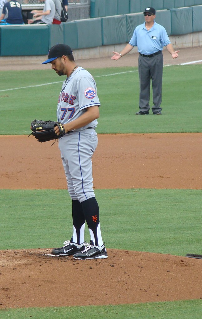


Master Index of Archived Threads
The Uniform
| batmagadanleadoff Feb 24 2010 09:26 PM |
|
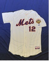
2010 will be the 13th consecutive season where the Mets wear their snow white home unis with the black drop shadow, the black home/roads with "Mets" across the chest in script with drop shadows and the road grays with "New York" across the chest in gothic lettering, also with drop shadows.
|
| seawolf17 Feb 25 2010 04:39 AM Re: The Uniform |
|
"Which is why we're adding purple for 2011." -Jeff Wilpon
|
| John Cougar Lunchbucket Feb 25 2010 05:55 AM Re: The Uniform |
|
I don't know this as well as I should but didn;t they introduce some new tweaks to the plackets of the home whites this year? Or was that just one of those things under discussion?
|
| LeiterWagnerFasterStrongr Feb 25 2010 06:54 AM Re: The Uniform |
|
|
A: For shame, sir. FOR SHAME. B: Placket tweaks? How much more can you do to buttonholes? OE: I think I'm getting my grommets and my plackets mixed up.
|
| metsguyinmichigan Feb 25 2010 07:14 AM Re: The Uniform |
|
Don't forget the addition of the cream pinstripes this year!
|
| batmagadanleadoff Feb 25 2010 12:17 PM Re: The Uniform |
|
|
That should read "1965 Met home uniform".
|
| John Cougar Lunchbucket Mar 18 2010 01:58 PM Re: The Uniform |
|
|
Adam Rubin tweets
|
| metirish Mar 18 2010 02:09 PM Re: The Uniform |
|
Like a key lime pie?
|
| Edgy MD Mar 18 2010 02:10 PM Re: The Uniform |
|
Probably going to bust 'em out tonight for the night game.
|
| Benjamin Grimm Mar 18 2010 02:24 PM Re: The Uniform |
|
Key lime??
|
| LeiterWagnerFasterStrongr Mar 18 2010 04:47 PM Re: The Uniform |
|
I'm not sure I'd call them "green," exactly, but having seen them again recently in a Modell's... the pallor isn't exactly rally-inspiring.
|
| Centerfield Mar 18 2010 06:59 PM Re: The Uniform |
|
I think the off-whites look stupid.
|
| batmagadanleadoff Apr 10 2010 03:48 AM Re: The Uniform |
|
|
Sigh.
http://www.metsblog.com/2010/04/08/buzz ... e-stripes/
|
| Gwreck Apr 10 2010 10:49 AM Re: The Uniform |
|
Ditching the blue trim on the alternate home jerseys (the non-pinstripe ones) was under consideration for this year as well but I guess the cream pinstripes was enough change. I dislike the alternate home jerseys but would dislike them even more if the blue trim was removed.
|
| Edgy MD Mar 30 2011 10:03 AM Re: The Uniform |
|
Insignia stirrups!
|
| John Cougar Lunchbucket Mar 30 2011 10:06 AM Re: The Uniform |
|
I would prefer all players wear stirrups than just those who choose to. It's a uniform!
|
| TransMonk Mar 30 2011 10:07 AM Re: The Uniform |
|
Are those actual stirrups or stirrup socks?
|
| Edgy MD Mar 30 2011 10:09 AM Re: The Uniform |
|
|
And I'm pretty sure the third-base ump agrees.
|
| Benjamin Grimm Mar 30 2011 11:36 AM Re: The Uniform |
|
|
Word!
|
| batmagadanleadoff Mar 30 2011 11:43 AM Re: The Uniform |
|
Those socks look ridiculous because they're black. Oh, but they match the cap!
|
| Edgy MD Mar 30 2011 11:52 AM Re: The Uniform |
|
Waddayagonnado. They look less deplorable in a stirrup, and have a fun variation with the insignia.
|
| LeiterWagnerFasterStrongr Mar 30 2011 01:14 PM Re: The Uniform |
|
|
They look painted-on. They'd look better blue. They'd also look better with a nice, white/orange horizontal stripe, a la St. Loo.
|
| Edgy MD Mar 30 2011 01:26 PM Re: The Uniform |
|
Izza step inda right direction.
|
| G-Fafif Mar 30 2011 01:29 PM Re: The Uniform |
|
|
Can they be worn or do they have to be rocked? The older players are a little concerned.
|
| metsguyinmichigan Mar 30 2011 01:32 PM Re: The Uniform |
|
Uniwatch today reveals that he wore logo socks with the Pirates and another team, too. Much rather see this than another Nike logo.
|
| LeiterWagnerFasterStrongr Mar 30 2011 01:41 PM Re: The Uniform |
||
|
When you're a DJ, they're rocked.
|
| Edgy MD Nov 10 2011 01:01 PM Re: The Uniform |
|
Smoley crap! Black drop shadows are out!
|
| Benjamin Grimm Nov 10 2011 01:19 PM Re: The Uniform |
|
|
Did you catch this line from that link?
|
| John Cougar Lunchbucket Nov 10 2011 01:21 PM Re: The Uniform |
|
I like that note that they're in on Ioki below that.
|
| Edgy MD Nov 10 2011 01:46 PM Re: The Uniform |
|
I got so giggly at the good news that I missed the great news.
|
| batmagadanleadoff Nov 10 2011 03:15 PM Re: The Uniform |
|
|
So now the Mets'll look even more ridiculous when they match their dropped drop shadow tops with the black caps with the neon electric NY logo. It's a half-assed move.
|
| Benjamin Grimm Nov 11 2011 03:02 PM Re: The Uniform |
|
|
No word yet on whether the blue cap will have a blue or orange button. I don't mind the orange, but if it were up to me, it would be blue.
|
| TransMonk Nov 11 2011 03:09 PM Re: The Uniform |
|
|
Oh man, 2012 is going to be a long, agonizing season.
|
| metsguyinmichigan Nov 15 2011 08:06 AM New "old" uniforms and 50th anniversary patch |
|
[url]http://www.metsblog.com/2011/11/14/these-are-the-mets-jerseys-for-the-2012-season/
|
| TransMonk Nov 15 2011 09:13 AM Re: The Uniform |
|
I wonder how often we'll see the black unis with the orange drop shadow.
|
| batmagadanleadoff Nov 15 2011 09:19 AM Re: The Uniform |
|
No numbers on the front? (NTTAWTT)
|
| John Cougar Lunchbucket Nov 15 2011 09:21 AM Re: The Uniform |
|
O's are going back to cartoon bird on their hats.
|
| Edgy MD Nov 15 2011 10:45 AM Re: The Uniform |
|
Wow. What comes around goes around. Maybe the Athletics will go back to the cartoon elephant.
|
| metsguyinmichigan Nov 15 2011 11:13 AM Re: The Uniform |
|
|
I think those are blank jerseys that they sell on the website. But I don't think they had numbers on the front in 1962.
|
| Benjamin Grimm Nov 15 2011 11:38 AM Re: The Uniform |
|
|
| metirish Nov 15 2011 11:43 AM Re: The Uniform |
|
Nice, and the patch doesn't look like the Domino's logo.
|
| metsguyinmichigan Nov 16 2011 09:51 AM Re: The Uniform |
|
|
| batmagadanleadoff Nov 16 2011 10:01 AM Re: The Uniform |
|
|
| metirish Nov 16 2011 10:05 AM Re: The Uniform |
|
Colors remind me of the Padres .
|
| metsguyinmichigan Nov 16 2011 10:09 AM Re: The Uniform |
|
|
It's gold on the actual patch.
|
| Ceetar Nov 16 2011 10:12 AM Re: The Uniform |
|
|
well it was designed by "the Mets" and not Citi Group.
|
| TransMonk Nov 16 2011 10:13 AM Re: The Uniform |
|
Per Michael Baron on Metsblog:
|
| HahnSolo Nov 16 2011 10:21 AM Re: The Uniform |
|
I like that. Would they wear blue caps with black jerseys? Doubt it.
|
| metirish Nov 16 2011 10:22 AM Re: The Uniform |
||
|
Thanks!
|
| Benjamin Grimm Nov 16 2011 10:36 AM Re: The Uniform |
||
|
Me too. Here's what their announcement says:
I especially like the part about the blue cap and the grey road uniforms.
|
| TransMonk Nov 16 2011 10:49 AM Re: The Uniform |
|
|
I'm not sure what took them so long.
|
| G-Fafif Nov 16 2011 12:48 PM Re: The Uniform |
|
Saw it up close as modeled on the third baseman at press conference (and later during a few minutes of graciously provided blogger time). Looks good. As does he. As does Ike in alternate whites. (Duda was whisked away relatively quickly, but he wore the road grays well from a relative distance.)
|
| Edgy MD Nov 16 2011 12:54 PM Re: The Uniform |
|
I sometimes wonder what it takes to get some non-white guys at these fashion shows. But I guess the the only big league ones the Mets currently have under contract are in wintering in the their respective Caribbean homes. Ángel Pagán maybe.
|
| Ceetar Nov 16 2011 01:00 PM Re: The Uniform |
|
|
Johan was involved in a bunch of the things last winter if I recall.
|
| G-Fafif Nov 16 2011 01:02 PM Re: The Uniform |
|
Beltran was at the 2010 holiday party. Reyes was the lead player among several who showed up to surprise school kids last winter.
|
| Ceetar Nov 16 2011 01:10 PM Re: The Uniform |
|
I'd like to go to the holiday party, just not feeling justified to take a day off. :-(
|
| Edgy MD Nov 16 2011 01:34 PM Re: The Uniform |
|
Oh, I know the Mets trot their non-white players to community events as best as they can. But as most teams' fashion shows are in November, they just seem to tend toward whiteness.
|
| G-Fafif Nov 16 2011 01:39 PM Re: The Uniform |
|
Don't recall a fashion show in recent years. The creamstripes were intro'd via press release.
|
| Edgy MD Nov 16 2011 04:56 PM Re: The Uniform |
|
I mean with all teams.
|
| MFS62 Nov 16 2011 09:24 PM Re: The Uniform |
|
The full announcement.
|
| batmagadanleadoff Nov 16 2011 11:41 PM Re: The Uniform |
|
|
Astros 50th anniversary logo: Astros to wear throwbacks every home Friday -- throwbacks will represent every uni era in team history: 
|
| John Cougar Lunchbucket Nov 17 2011 05:25 AM Re: The Uniform |
|
Orange is making a comeback. I think it has something to do with the rotten economy.
|
| G-Fafif Nov 17 2011 05:39 AM Re: The Uniform |
|
|
 
|
| Edgy MD Nov 17 2011 06:07 AM Re: The Uniform |
|
Is anybody going to give me a break here? I didn't mean to suggest that black players are 100% absent or banned from fashion shows and I think you know that. I meant to suggest that there seemed to tend to be a relative paucity of available non-white players, and if there is, it's likely based on factors largely beyond the control of those booking the show, so it's tough.
|
| G-Fafif Nov 17 2011 06:22 AM Re: The Uniform |
|
|
Mighty broad assertion yesterday. Four recent fashion shows: three with the "non-white guys" joining in the festivities. Diversity apparently lives. 
|
| Edgy MD Nov 17 2011 06:28 AM Re: The Uniform |
|
No, that's a mighty narrow reading. And you know it. I guess even pleading for a break isn't going to get me one.
|
| Frayed Knot Nov 17 2011 06:32 AM Re: The Uniform |
|
|
So I guess the days of Michael Kay describing the Baltimore uniform as having "an ornithologically correct" bird on their caps are over. Such was part of his schtick back when, in his radio days, he would always take a moment during each game to detail that day's uni for the two participating teams; 'no names ... of course'
|
| Benjamin Grimm Nov 17 2011 06:36 AM Re: The Uniform |
|
Well, if I ever had to wear a Yankees uniform I certainly wouldn't want my name on the back. Why promote the fact that you've been forced to wear the garb of an evil organization?
|
| G-Fafif Nov 17 2011 06:41 AM Re: The Uniform |
|
|
You piqued my curiosity with your statement on a topic I'd never before pondered. I checked on other teams. The composition of their participants was contrary to what you'd suggested. Thank you for your generosity.
|
| batmagadanleadoff Nov 17 2011 07:26 AM Re: The Uniform |
|
Mets black jersey will be an alternate and used on the road and sparingly in 2012. The black jersey will then be ditched in 2013. Mets uni changes announced yesterday are not a one-off set for 2012: those jerseys (below) are the new unis.
|
| TransMonk Nov 17 2011 07:35 AM Re: The Uniform |
|
Squatchee...I never knew it had a name.
|
| Benjamin Grimm Nov 17 2011 07:36 AM Re: The Uniform |
||
|
Squatchee? I've never heard that word, but I assume it refers to the button on the top of the cap.
I have to call bullshit on that.
|
| soupcan Nov 17 2011 07:39 AM Re: The Uniform Edited 2 time(s), most recently on Nov 17 2011 07:46 AM |
|
Ding dong the Black is dead!
|
| Benjamin Grimm Nov 17 2011 07:41 AM Re: The Uniform |
||
|
Actually, I think it's the other way around. The blue/black is gone, and the all-black will be seen on the (rare) occasions when the Mets wear the black jerseys.
Make that Phoenix Firebirds and I'm with you!
|
| Edgy MD Nov 17 2011 07:43 AM Re: The Uniform |
|
|
Keep repeating. It can't be said often enough. One thing not mentioned is stirrups.
|
| batmagadanleadoff Nov 17 2011 07:49 AM Re: The Uniform |
||
|
Will you pick a song already?
|
| LeiterWagnerFasterStrongr Nov 18 2011 10:39 PM Re: The Uniform |
|
Speaking of uni changes... the Jays' new oldish set looks sa-weet.
|
| John Cougar Lunchbucket Nov 19 2011 08:05 AM Re: The Uniform |
|
I really like that font, especially writ big on the numbers.
|
| Edgy MD Nov 19 2011 08:07 AM Re: The Uniform |
|
Their original numbers kinda messed me up. A very soccerish look.
|
| batmagadanleadoff Nov 19 2011 08:53 AM Re: The Uniform |
|
Split numbers are back.
|
| LeiterWagnerFasterStrongr Mar 09 2012 09:55 PM Re: The Uniform |
|
After a bit of a hiccup from MLB Centrale about the bang-bang-shoot-shoot imagery, the Astros bite the bullet and go with the original Colt '45 jerseys as is for this year's throwbacks.
|
| Ashie62 Mar 09 2012 10:27 PM Re: The Uniform |
|
I dont think we will see this again..
|
| Edgy MD Mar 10 2012 04:58 AM Re: The Uniform |
|
Oh, we have and we will again.
|
| metsguyinmichigan Mar 16 2012 10:44 AM Re: The Uniform |
|
|
| batmagadanleadoff Mar 16 2012 11:06 AM Re: The Uniform |
|
I love the rainbows, too. BTW, the team whiffed on this year's Colt.45 throwbacks. The throwback lettering is slightly wrong, as is the wisp of smoke coming out of the gun barrel to form the big "C".
|
| The Second Spitter Mar 16 2012 09:59 PM Re: The Uniform |
|
|
The O's had one of the most elegant logos in the professional sports. Now they've effed that by reverting to a logo aimed at 10 years olds.
|
| John Cougar Lunchbucket Mar 16 2012 10:10 PM Re: The Uniform |
|
eh, I don't mind the funny bird.
|
| Edgy MD Mar 16 2012 10:20 PM Re: The Uniform |
|
I can't see that bird and not think about Scatman Crothers.
|
| The Second Spitter Mar 16 2012 10:30 PM Re: The Uniform |
|
|
Lunchpail -- DON'T use Daddy's computer when he's away!
|


 So even when fate threw various obstacles in our path — which, in retrospect, happened more often than not — at least the tableau unfolding before us was generally pleasing to the eye.
 These soon spread to the extremities,
  and before long the malignancy had proliferated throughout the body.
 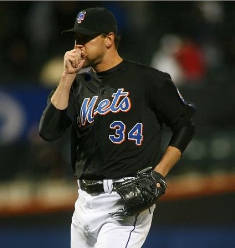 So began the dire times we have experienced, lo these past dozen years.
 and consequently it did not feel Good. Although there have always been those of us who refused to give up hope, deep down we wondered if we would ever live to see the day when the Dark Plague finally succumbed to the forces of Good.


