

Sep 19 2011 08:49 AM

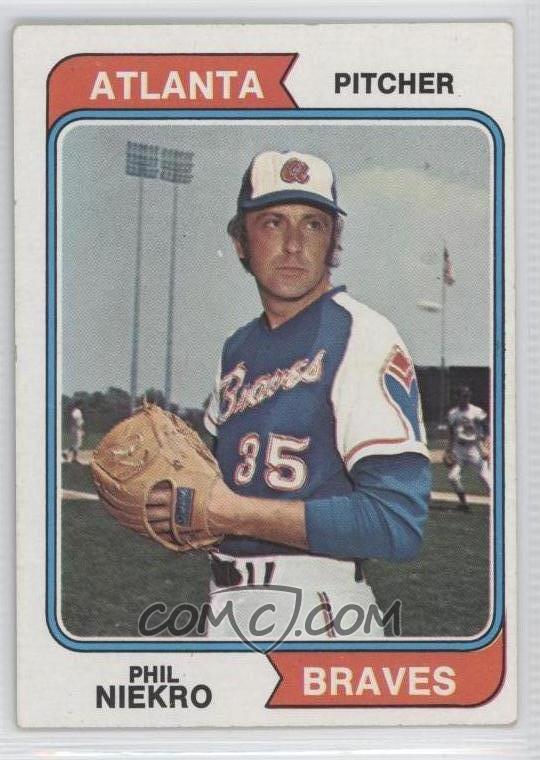
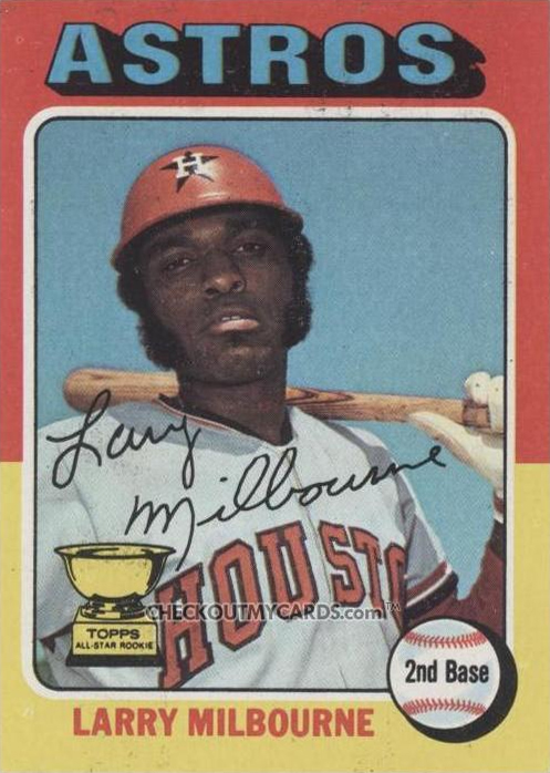
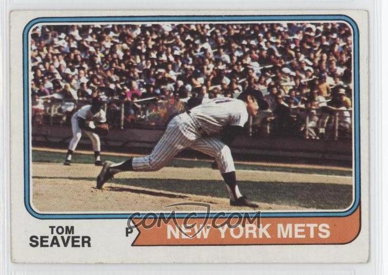
1. The condidtion of the spring training practice field --- no better than your standard 1970s Little League field.
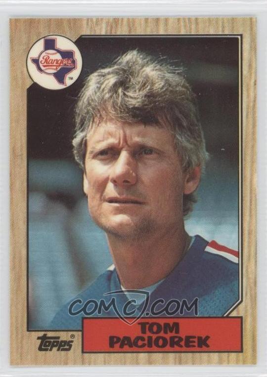
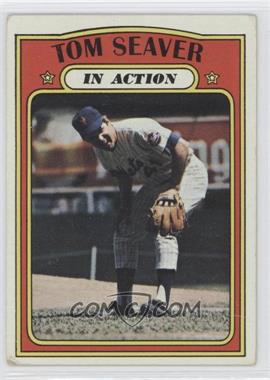
2. The moustache --- so neatly trimmed, but pointless --- yielding an effect no more impressive than that of a milquetoaste high school chemistry teacher (no insult meant to chem teachers). You will never be a Swingin' Oakland A, Mr. Harrison.
3. The apparently lower-case a, telegraphing just how modest the ambitions of the 1970s Braves were.
4. The squinty sad eyes, crying "defeat" even before the pitch is thrown --- or even before the non-pitch of this posed photo.
5. The two-tone hat, another seventies leftover that will forever cry "bush league," even when retro-revitalized for the 2011 MLB patriotism hat.
6. The prominent adam's apple, the telltale sign of a hapless Braves pitcher --- or sometimes even a good one, actually.
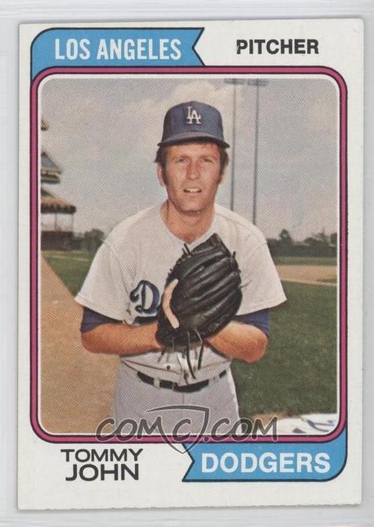
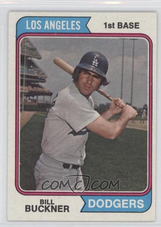
7. Everything about the 1974 set, part one: The font is some 1974 version of calibri --- the font of a designer who has been crushed by the world.
8. Everything about the 1974 set, part two: The utter lack of variety in the font, all a similar face, all in all-caps.
9. Everything about the 1974 set, part three: The pennant/arrow frames boxing in the names of the teams above and below, the colors almost but not quite matching the secondary color of the team, but smokier, and more repressed. Those flag arrow frames cling for security to the sides of the curved frame --- the signature design element on cards humbly designed to deliver to a humbed nation.
10. "Roric"?


