Forum Home

Master Index of Archived Threads


Unis

soupcan
Apr 07 2012 12:37 PM

Tell me that the uniforms don't look 1,000% better now that all that nasty black is gone.

Go ahead. Tell me.

You can't.

John Cougar Lunchbucket
Apr 07 2012 03:06 PM
Re: Unis

I shan't. I can't. I won't.

metsguyinmichigan
Apr 07 2012 05:49 PM
Re: Unis

I didn't think the shadows looked bad on the snow whites -- though they looked horrible on the pinstripes -- though I always disliked the black stirrups and sleeves.

But make no mistake, the uniforms now are spectacular!

Fman99
Apr 07 2012 06:05 PM
Re: Unis

Agreed, they look sharp out there. I think it's why they are winning.

G-Fafif
Apr 07 2012 06:15 PM
Re: Unis

Lettering on the back and the numbers seem different. Harder edges to them. Almost a comic book effect in terms of the tone.

But effing great, mind you.

Benjamin Grimm
Apr 07 2012 07:19 PM
Re: Unis

They look like the Mets again. And that, of course, is a good thing.

Ashie62
Apr 07 2012 08:20 PM
Re: Unis

Benjamin Grimm wrote:
They look like the Mets again. And that, of course, is a good thing.


That

LeiterWagnerFasterStrongr
Apr 07 2012 09:48 PM
Re: Unis

G-Fafif wrote:
Almost a comic book effect in terms of the tone.


Exactly. Between the light, and the unis, they were like comic-book versions of themselves.

Edgy MD
Apr 08 2012 06:07 AM
Re: Unis

And only in comic books can a team go 162-0.

Mets – Willets Point
Apr 08 2012 01:44 PM
Re: Unis

soupcan wrote:
Tell me that the uniforms don't look 1,000% better now that all that nasty black is gone.

Go ahead. Tell me.

You can't.


I'm going to argue you with you. The uniforms don't look 1,000% better now.


They look 2,000% better.

TransMonk
Apr 08 2012 02:01 PM
Re: Unis

I agree the unis look sharp. Give me the pins more than the snowballs at home, though. Can't wait to see blue caps on the road again.

Along the same lines...I'm loving the blue walls at Citi. However, thumbs down on the ugly Party City logo.

batmagadanleadoff
Apr 08 2012 02:08 PM
Re: Unis

TransMonk wrote:
I agree the unis look sharp. Give me the pins more than the snowballs at home, though.


If it was up to me, I'd ditch the whites altogether. I only tolerated the whites because they were less of an affront than the blacks. The Mets are pinstripes. The whites are bullshit.

themetfairy
Apr 08 2012 02:10 PM
Re: Unis

TransMonk wrote:
I agree the unis look sharp. Give me the pins more than the snowballs at home, though. Can't wait to see blue caps on the road again.

Along the same lines...I'm loving the blue walls at Citi. However, thumbs down on the ugly Party City logo.


While we're judging the new place, I HATE the Cholula Hot Sauce signs on either side of the video scoreboard - they are loud, crass and distracting.

bmfc1
Apr 08 2012 03:27 PM
Re: Unis

Without being blatantly political, let's just say that there's a sign adjacent to one of the scoreboards that makes me sick so the hot sauce signs are nothing in comparison.

metsguyinmichigan
Apr 08 2012 03:46 PM
Re: Unis

I know what you mean. Budweiser. Yech.

G-Fafif
Apr 08 2012 04:33 PM
Re: Unis

Edited 2 time(s), most recently on Apr 08 2012 05:16 PM

themetfairy wrote:
While we're judging the new place, I HATE the Cholula Hot Sauce signs on either side of the video scoreboard - they are loud, crass and distracting.


Double Cholula Signs seem more appropriate for a Tijuana bordello. Or a bordello anywhere, I suppose.

Edgy MD
Apr 08 2012 05:01 PM
Re: Unis

My buddy Tim --- a frequent spring training visitor --- came by today and presented me with a late birthday present --- my first authentic jersey. A lovely road gray.

Yup --- black drop shadows. Loved him for it any how. At least the shoulder patch had the blue skyline.

soupcan
Apr 12 2012 08:37 AM
Re: Unis

'No Black'

Roger didn't get the memo.


Edgy MD
Apr 12 2012 08:39 AM
Re: Unis

[list]One night with Roger Craig, the world's your oyster![/list:u]

I'd like to thank Mr. Craig for bringing along a taste of 1962 yesterday. Sheesh.

Ceetar
Apr 12 2012 08:42 AM
Re: Unis

soupcan
Apr 12 2012 08:43 AM
Re: Unis

...and why the heck wouldn't they at least put him in the pinstripes?

It's the little things you know?

Ceetar
Apr 12 2012 08:44 AM
Re: Unis

I'm very pro-education and all, but I think this is the only advertisement in the entire place I truly hate. the LIU is just..too big.

HahnSolo
Apr 12 2012 10:35 AM
Re: Unis

batmagadanleadoff wrote:

If it was up to me, I'd ditch the whites altogether. I only tolerated the whites because they were less of an affront than the blacks. The Mets are pinstripes. The whites are bullshit.


Amen. Preach it!

Edgy MD
Apr 12 2012 10:37 AM
Re: Unis

Out of context, that post makes batmag look like he's an Asian with some twisted racial hangups.

G-Fafif
Apr 12 2012 10:41 AM
Re: Unis

soupcan wrote:
...and why the heck wouldn't they at least put him in the pinstripes?

It's the little things you know?


Per Howie, and picked up on by Lukas, Mets are loosely going snow whites during day games, pinstripes at night. Roger was just fittin' in.

Edgy MD
Apr 12 2012 10:44 AM
Re: Unis

So the road look we're going to start seeing... solid grays and blue tops on Sundays?

TransMonk
Apr 12 2012 11:02 AM
Re: Unis


I was under the impression the roads would always be the same.

Edgy MD
Apr 12 2012 11:03 AM
Re: Unis

Duda kills me.

John Cougar Lunchbucket
Apr 12 2012 11:47 AM
Re: Unis

Blue alts are on the agenda for next year, I understand.

Benjamin Grimm
Apr 12 2012 11:56 AM
Re: Unis

And I think we'll see them a few times this year, too. If I remember right, the Mets didn't get approval in time to make them "official" for 2012, but they are allowed to wear "unofficial" uniforms a limited number of times each season, and the blues will be used that way this year. And they'll become "official" in 2013.

Lefty Specialist
Apr 12 2012 01:36 PM
Re: Unis

themetfairy wrote:
While we're judging the new place, I HATE the Cholula Hot Sauce signs on either side of the video scoreboard - they are loud, crass and distracting.


They may be loud, crass and distracting, but somehow I know that Gary Cohen is secretly pleased at seeing those giant iconic wooden caps every day.

Edgy MD
Apr 12 2012 01:41 PM
Re: Unis

They have more flava than 20-ounce Pepsi or Budweiser bottles would there, I think. But maybe that's a false choice. I guess anything under the "Let's Go Mets" arc should be editorial and not advertising, but it's all so hard to see where the lines should be once you're playing in a corporately named ballpark.

metsmarathon
Apr 12 2012 02:10 PM
Re: Unis

or they could give us a bigger screen there. lousy cheapass wilpons.

Edgy MD
Apr 12 2012 02:11 PM
Re: Unis

Yeah, that's wh'mean with "editorial, not advertising."

batmagadanleadoff
Apr 12 2012 02:26 PM
Re: Unis

metsmarathon wrote:
or they could give us a bigger screen there. lousy cheapass wilpons.


That's another scoreboard peeve. It's one of the smallest main screens in all of baseball, maybe even the smallest one from the new generation stadiums. There are auxiliary scoreboard screens that are bigger than CF's main board. Not to mention that it's ugly. Both of them. And look like an afterthought, as if they realized at the last second that they forgot to allot for scoreboards and so just stuck 'em there, the both of them, right next to each other, practically touching each other, without regard for their surroundings, or how they'd fit in. Collectively, and again, practically touching each other, they look as out of place as cactus growing on a Manhattan sidewalk. Who the hell puts two scoreboards right next to each other like that?

But the new old pinstripes homies are a thing to behold.

Ceetar
Apr 12 2012 02:28 PM
Re: Unis

I've never thought it was small. It's not like it does much, the other one's the one with all the info.

Is there stats for that? scoreboard size?

Ceetar
Apr 12 2012 02:39 PM
Re: Unis

Citi's main video board is 50x70 (RF board is 40x90)
CBP's is new last year, 76x97
Target Field: 57' x 101'

don't see sizes listed for the Nats (who I thought had a pretty huge one (it's 4500sq ft so..60x75? ) or the Marlins,

or the Yankees.

edit: Yankees is 59x101

Gwreck
Apr 13 2012 06:52 PM
Re: Unis

Blue hats on the road. Amazing. You always knew those blue/black hats were hideous but it becomes that more obvious when contrasted with what we have tonight.

Mets – Willets Point
Apr 13 2012 07:20 PM
Re: Unis

To be honest, I don't even remember what the old unis looked like. Ignorance is bliss.

Ceetar
Apr 13 2012 07:58 PM
Re: Unis

TransMonk
Apr 13 2012 08:29 PM
Re: Unis

I'm more excited about these being back than the home unis!

Benjamin Grimm
Apr 14 2012 04:53 AM
Re: Unis

TransMonk wrote:
I'm more excited about these being back than the home unis!


I think I am too. They look almost as fabulous as Megan Fox!

Fman99
Apr 14 2012 05:42 AM
Re: Unis

It's what the Mets are supposed to look like on the road. I always loved the road grays with the block letters. And I firmly believe that the road uniform should always have the city/state name instead of the team name. It's a traditionalist thing I guess.

Edgy MD
Apr 14 2012 12:29 PM
Re: Unis

So, this new road jersey my friend Tim gave me... do you think I can break out a razor blade and excise the black drop shadows on it without ending up with a disaster?

Centerfield
Apr 16 2012 09:47 AM
Re: Unis

I don't necessarily miss the black uniforms, but I wasn't clamoring to get rid of them either. I guess it was time to retire them, but I never minded them. They reminded me of the late 90's and I thought that was cool. I think they wore them too often recently, but I thought maybe once a month it would be cool to see them. I hope they bring them back on throwback day or something.

On the other hand, I really miss the black drop shadow on all the uniforms. I think it made for a cool effect. I will be upset if they get rid of the snow whites. Those and the road grays are my favorite Mets uniforms.

But the one thing I feel more strongly about than anything else is that ridiculous orange dot on the top of the blue hat. If you're going to go back to tradition, go all the way. Get rid of that fucking dot.

Does this not bother anyone else? How can they mess with that blue hat? It was perfect the way it was.

Benjamin Grimm
Apr 16 2012 09:50 AM
Re: Unis

I would prefer a blue button on top of the cap instead of an orange one, but It's not a big issue for me.

Have the Mets changed the shade of the blue in their cap? I've noticed that the blue caps that Tom Seaver and Jerry Koosman wore back in the day were a darker blue than the closer-to-primary blue that the Mets have worn in recent seasons. I think this year's caps are a bit darker, but I'm not really sure of that.

batmagadanleadoff
Apr 16 2012 09:53 AM
Re: Unis

Benjamin Grimm wrote:
I would prefer a blue button on top of the cap instead of an orange one, but It's not a big issue for me.

Have the Mets changed the shade of the blue in their cap? I've noticed that the blue caps that Tom Seaver and Jerry Koosman wore back in the day were a darker blue than the closer-to-primary blue that the Mets have worn in recent seasons. I think this year's caps are a bit darker, but I'm not really sure of that.


This year's caps are definitely a brighter blue than those worn by Tom and Jerry. I noticed that immediately. It's especially obvious when the Mets are on the road. The contrast between the bright blue caps and the duller blue on the not dull road unis is stronger than ever, I think.

soupcan
Apr 16 2012 02:24 PM
Re: Unis

Centerfield wrote:
I don't necessarily miss the black uniforms, but I wasn't clamoring to get rid of them either. I guess it was time to retire them, but I never minded them. They reminded me of the late 90's and I thought that was cool. I think they wore them too often recently, but I thought maybe once a month it would be cool to see them. I hope they bring them back on throwback day or something.

On the other hand, I really miss the black drop shadow on all the uniforms. I think it made for a cool effect. I will be upset if they get rid of the snow whites. Those and the road grays are my favorite Mets uniforms.

But the one thing I feel more strongly about than anything else is that ridiculous orange dot on the top of the blue hat. If you're going to go back to tradition, go all the way. Get rid of that fucking dot.

Does this not bother anyone else? How can they mess with that blue hat? It was perfect the way it was.


I get that you don't like the orange dot and I respect that. It doesn't bother me in the slightest and I don't know what exactly offends you about it, but again, I respect your dislike for it.

However...how you could possibly like the black uniforms or the black drop shadow (or really even the snow whites which I simply tolerate) is so far beyond my comprehension.

The pinstripes and the road grays without the drop shadows could contend for best uniforms in the league. It really does put them up there with the Cardinals, Dodgers and Giants.

We're classic again and that's a good thing.

Ceetar
Apr 16 2012 02:32 PM
Re: Unis

soupcan wrote:

We're classic again and that's a good thing.


I imagine that's part of it.

I'm not sure why classic is a good thing, more than just being a thing. history for histories sake. Sometimes steps forward are good things. instant replay, wild cards, robot umps, sabermetrics are all good changes in my opinion.

I like how the road uniform looks, I'm mostly indifferent to the home changes. I didn't dislike the black. I'd rather they introduce more combinations. I though Mercury Mets was sorta interesting.

themetfairy
Apr 16 2012 02:33 PM
Re: Unis

I hate the orange dot.

soupcan
Apr 16 2012 02:35 PM
Re: Unis

Ceetar wrote:
I though Mercury Mets was sorta interesting.


Lost: All of your credibility.

John Cougar Lunchbucket
Apr 16 2012 02:36 PM
Re: Unis

I really think it goes beyond the idea that's "classic." To me the idea of a large numeral on the back of a jersey with a thick outline to begin with throwing a shadow on a flat surface was just overkill. It was stoopit, too busy, and I think a smart person would say, bad design.

Ceetar
Apr 16 2012 02:38 PM
Re: Unis

soupcan wrote:
I though Mercury Mets was sorta interesting.


Lost: All of your credibility.


I've never understood why personal taste is bad or good. I'll admit my tastes are generally minority ones though.

Edgy MD
Apr 16 2012 02:40 PM
Re: Unis

Soupguy wrote:
The pinstripes and the road grays without the drop shadows could contend for best uniforms in the league. It really does put them up there with the Cardinals, Dodgers and Giants.


And if the pinnies and road grays are the best or near-best in the league, then the blacks are a negation of that, and therefore, an abomination.

I'm not a supporter of of the bluetops either, and consider it an accidental gift that the Mets failed to file their homework on time or whatever in order to make them a regular choice this season. For one, we've been down that road 1983-1985-ish. For two, a solid color base speaks of softball, not baseball. For three, it portends a dangerous vulnerability to that uniform creeping into position to become the new standard. For four, again, it's a negation of a wonderful aesthetic ideal.

TransMonk
Apr 16 2012 02:44 PM
Re: Unis

I can honestly say that my least favorite thing about the unis right now is the 50th anniversary patch. Not that it's a bad patch...I just like the traditional logo on the left sleeve. I am not a fan of the back of the cap logo shenanigans, tho.

While I'm in the thread...I've moved past seeing everyone wearing 42 as meaningful on Jackie Robinson day. I would much rather see the one player on each team who best exemplifies the characteristics of Jackie Robinson get the honor of wearing 42 based on a vote of their teammates/coaches. I'm not sure who proposed that idea, because it is not an original idea of mine, but I think it is much better than seeing it on everyone.

Edgy MD
Apr 16 2012 02:45 PM
Re: Unis

Ceetar wrote:
Ceetar wrote:
I though Mercury Mets was sorta interesting.


Lost: All of your credibility.


I've never understood why personal taste is bad or good. I'll admit my tastes are generally minority ones though.


It's easy. I mean, do you wear a lot of bathrobes to memorial services?

soupcan
Apr 16 2012 02:47 PM
Re: Unis

Edgy DC wrote:
Soupguy wrote:
The pinstripes and the road grays without the drop shadows could contend for best uniforms in the league. It really does put them up there with the Cardinals, Dodgers and Giants.


And if the pinnies and road grays are the best or near-best in the league, then the blacks are a negation of that, and therefore, an abomination.

I'm not a supporter of of the bluetops either, and consider it an accidental gift that the Mets failed to file their homework on time or whatever in order to make them a regular choice this season. For one, we've been down that road 1983-1985-ish. For two, a solid color base speaks of softball, not baseball. For three, it portends a dangerous vulnerability to that uniform creeping into position to become the new standard. For four, again, it's a negation of a wonderful aesthetic ideal.


Yes, yes, yes and yes!

Ceetar
Apr 16 2012 02:52 PM
Re: Unis

Edgy DC wrote:
I though Mercury Mets was sorta interesting.


Lost: All of your credibility.


I've never understood why personal taste is bad or good. I'll admit my tastes are generally minority ones though.


It's easy. I mean, do you wear a lot of bathrobes to memorial services?


Well no, but I wouldn't be offended by someone doing so. I also don't get why tying a piece of cloth around my neck means I'm "fancy". I really don't get social convention or "This is just how we do it" arguments.

Maybe that's just where I'm missing one or two of my screws, but as it pertains to an entertainment product, how I enjoy and like to see the Mets isn't wrong for being different than anyone elses. There's no right way to be a fan after all, it's a personal thing.

Edgy MD
Apr 16 2012 02:53 PM
Re: Unis

I think you probably do get it.

metsmarathon
Apr 16 2012 02:55 PM
Re: Unis

it's not just that shadowless is a classic look - it's that it's a clean look. a crisp look. the blue and orange pop more without the black, though i'm sure htat was its original intent.

the mercury mets thing... well... i don't really recall what i thought at the time. but it's kinda like the mets started gooing off in teh wrong direction from everybody else, and teh rest of hte league was too busy laughing their asses off at hte buffoons to reel them in. it's too bad, too, cos based on teh other uniforms (like the bucs'), it would've been fucking awesome if they went with a turn ahead the clock style uniform in white with a big ol' mr. met head on it. fucking a.w.e.s.o.m.e.

envision it. i dare you.

now you will want it. i know this because i want it. with racing stripes on the weird shoulder panel things.

(i wish hte mets would bring back the racing stripes. they were the cats' pajamas)

Edgy MD
Apr 16 2012 02:59 PM
Re: Unis

There's no right way to be a fan after all, it's a personal thing.


Bad ways to be a fan:


Ceetar
Apr 16 2012 03:02 PM
Re: Unis

metsmarathon wrote:
it would've been fucking awesome if they went with a turn ahead the clock style uniform in white with a big ol' mr. met head on it. fucking a.w.e.s.o.m.e.

envision it. i dare you.

now you will want it. i know this because i want it. with racing stripes on the weird shoulder panel things.

(i wish hte mets would bring back the racing stripes. they were the cats' pajamas)


I think this is what I'm trying to say. The desire to stick to some sort of "baseball players wear classic white pinstripes with no dropshadow" logic seems to prevent them from doing something like that. That sounds cool. I would indeed want it. The push towards the "no black" seems to run parallel to a lack of change/imagination, and that's where I'm lost. I want to see them do stuff like that, or the Giants throwbacks with the giant NY, or just generally feel free to get creative.

Edgy MD
Apr 16 2012 03:03 PM
Re: Unis

imagination /= change

Sometimes it's right to go forward, sometimes it is not.

LeiterWagnerFasterStrongr
Apr 16 2012 03:13 PM
Re: Unis

Edited 1 time(s), most recently on Apr 16 2012 03:19 PM

It's "no black" because black and blue together are about as close as you can get to "objectively ugly." Unlike complementary blue-and-orange, blue-and-black clashes.

As far as "objectively ugly" goes... well... it's the same with the dropshadow. It's crappy design because it serves no need, functionally OR visually. As a tool to make the logo/numbers pop out to the eye, it's redundant; bright orange already stands apart from the cream/white AND sets off the blue. Plus, it attempts to do so in a way that rings false to the eye-- it aims to "pretend" that the logo isn't brightly-colored placket twill. It's a visual lie, and an inelegant one, to boot.

And as marathon said, "back to classic" is good because our classic WAS good. Complementary colors laid out in a way that pops-- without tawdry-looking trompe l'oeil-- on a warm, neutral, comfy-looking field... with understated pinstripes for subtle adornment. It's a look that has visual harmony, AND it was our first look.

batmagadanleadoff
Apr 16 2012 03:15 PM
Re: Unis

TransMonk wrote:
I can honestly say that my least favorite thing about the unis right now is the 50th anniversary patch. Not that it's a bad patch...I just like the traditional logo on the left sleeve. I am not a fan of the back of the cap logo shenanigans, tho.

While I'm in the thread...I've moved past seeing everyone wearing 42 as meaningful on Jackie Robinson day. I would much rather see the one player on each team who best exemplifies the characteristics of Jackie Robinson get the honor of wearing 42 based on a vote of their teammates/coaches. I'm not sure who proposed that idea, because it is not an original idea of mine, but I think it is much better than seeing it on everyone.


I'm with you on the Mets 50th ann. logo/patch. It looks to big, and like a light bulb. And I'm not too crazy about it. I'm not with you on the Jackie Robinson Day festivities. In fact, I don't think that MLB has gone nearly far enough in honoring him. I think that every player should wear a Jackie Robinson mask on Jackie Robinson day. Like those rubber Tor Johnson Halloween masks, only it would look like Jackie Robinson instead of Tor Johnson. And I'd make all the winning teams on Jackie Robinson Day wear the Jackie Robinson mask for their next game. They'd have to keep on wearing the JR mask until they lost. I'd also rename the stolen base the Jackie Robinson. As in: Jose Reyes is the all time Mets franchise leader in Jackie Robinsons. How many Jackie Robinsons did Jackie Robinson have in his career? And then I'd force every team to build a Jackie Robinson rotunda in their stadium. No grandfather clause either. Get crackin', Fenway. Maybe the players could walk pigeon toed on April 15th, if not all game, then at least just a little bit. Because that's how Jackie walked. And ran. And if jackie Robinson did it, so should everybody else.

G-Fafif
Apr 16 2012 03:32 PM
Re: Unis

In 1992, the Phillies and Cardinals opted for updated versions of what they had pre-1970. I remember the phrase "classic" being showered down on them in praise, as if classic equaled idyllic 1950s or before Astroturf kicked in altogether. Thus is a Padres uniform that is in that style "classic" or is Padres classic the brown and yellow look that declared "Padres"? Eye of the beholder and all that. I was fond, aesthetically, of the oversized, wavy P the Phils sported even when I disliked them intensely. I also kind of like what they have now. (I hate that I like anything about them.)

Expos went to that kind of "classic" iteration in 1992 and it wasn't classic for them.

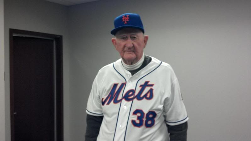
Glad the Mets added numbers on the front in 1965, though if I'd been around in 1962, I might have found it an affront.

Was surprised when orange buttons were added that they weren't already there. As soon as they arrived, they made all the sense in the world to me.

Still say the names on the backs of the home uniforms currently don't look quite right. It might be the absence of the shadow. Everything else currently is suave, smooth, what have you.

42: In the course of a JR Day game, I change my mind 42 times. "Nice tribute." "Overkill." "No, it's the right thing to do." "This is ridiculous." It's just one day is my conclusion, and I can take intention over execution for one day.

Every batter looks to me like Butch Huskey, every pitcher Ron Taylor. That's not a line. I really do see those two guys. Not McDowell, not R. Hodges.

LeiterWagnerFasterStrongr
Apr 16 2012 03:49 PM
Re: Unis

G-Fafif wrote:
I also kind of like what they have now. (I hate that I like anything about them.)


Those weekend cream-blue-and-red pajamas are like Satan-in-Paradise-Lost seductive to my eyes.

TransMonk
Apr 16 2012 04:41 PM
Re: Unis

batmagadanleadoff wrote:
I'm not with you on the Jackie Robinson Day festivities. In fact, I don't think that MLB has gone nearly far enough in honoring him.

Exactly. I wasn't hypothesizing that MLB should do less...just something different now that the novelty and meaning of what they are doing seems to have worn off.

batmagadanleadoff
Apr 16 2012 05:07 PM
Re: Unis

G-Fafif wrote:
In 1992, the Phillies and Cardinals opted for updated versions of what they had pre-1970. I remember the phrase "classic" being showered down on them in praise, as if classic equaled idyllic 1950s or before Astroturf kicked in altogether. Thus is a Padres uniform that is in that style "classic" or is Padres classic the brown and yellow look that declared "Padres"? Eye of the beholder and all that.


You ask the right questions. And probably supply the right answers, too. I wrote in another thread here that the Mets are pinstripes and that the (snow) whites are bullshit, in order to diss the whole black/drop shadow look. I loathed that black look to no end. But I knew all along that I was merely making an emotional argument. Because the Mets might not be pinstripes. Or the Mets might be black tops with drop shadows all over the place and cap logos the color of bruise. The Mets are whatever they wear. And if they wear Mercury Met tops every single day, then that’s what the Mets logically are – the Mercury Mets of New York. Or Anaheim. And the newly retired black/drop shadow look has been around long enough (almost 15 seasons) that there exists an entire generation of hardcore Mets fans, old enough to have graduated college, that, until this season, didn’t know any other Met uni from watching live action. It really is in the eye of the beholder. Me, I think those mid 70’s Winfield era Padres uniforms are classics – to the Padres.