Aug 03 2012 07:57 PM
Edited 1 time(s), most recently on Aug 04 2012 07:39 AM
Here's a story from last Spring. I don't recall it being discussed here, yet.
MUST SEE: Replica Padres Jerseys for 11,000 San Diego Kids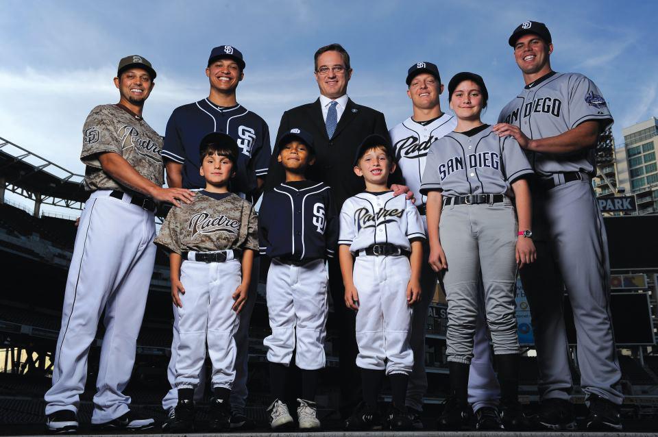
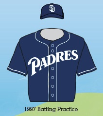
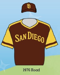
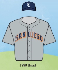
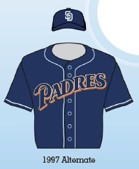
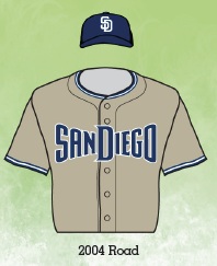
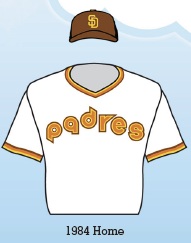
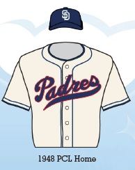
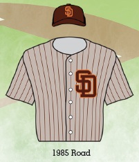
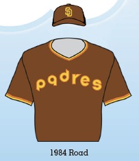
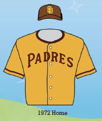
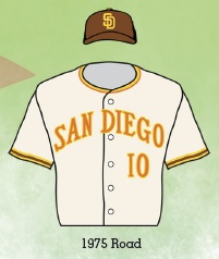
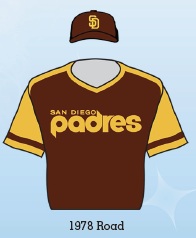
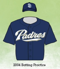
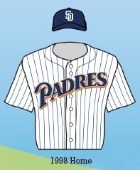
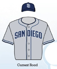
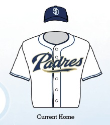
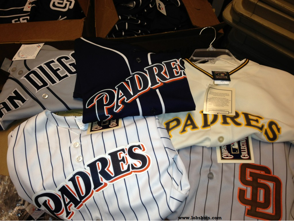
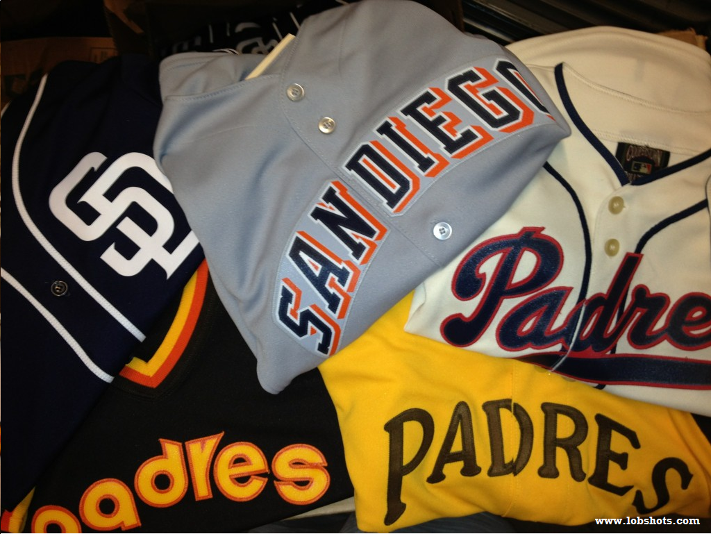
| Back when the Padres unveiled their new 2012 uniforms, they also told us this: The Padres announced that approximately 10,000 youth baseball players from four local Little League districts will wear Padres button-down jerseys and corresponding hats for the upcoming season as part of the club’s ongoing effort to support youth baseball. The teams representing Little League districts throughout San Diego County will have their choice of selecting one style of uniform worn from throughout Padres history to wear during the 2012 season. The club will sponsor teams in each district, supporting children ages 4-12. Well, Padres president and CEO, Tom Garfinkel, recently dropped a few tweets that warmed the hearts of San Diego Little Leaguers and Padres fans alike. I haven’t been shy about my love for throwback uniforms in the past, as seen here and here. So I think these jerseys for kids are so awesome, they make me want adopt a dozen 4 year old ballplayers and go dominate San Diego Little League for the better part of a decade. Coach BP is open for business. For all three images: click to enlarge. So good. Home jerseys. Away jerseys. New jerseys. Old jerseys. A PCL jersey. Button-ups, pull-overs. It’s all just so awesome. Although they don’t look to be stitched, it seems like they’re decent quality iron-ons. We’re talking about Little League unis, so I get it. What are the teams named though? This could get confusing really fast. Padres vs. Padres. I hope it’s something like, “1986 Road” vs. “1983 Home”. What do the pants look like? All white probably. I will leave it to the Paul over at Uni Watch and Chris over at SportsLogos.net to break down the historical accuracy of each jersey. Regardless, they are awesome. Absolutely love that the Padres did this. Now, Mr. Garfinkel… how ’bout those matching hats you mentioned? |
http://www.lobshots.com/2012/01/29/must ... iego-kids/

Looking good in Little League: Padres use vast uniform history to outfit local youth
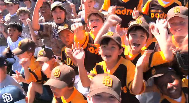
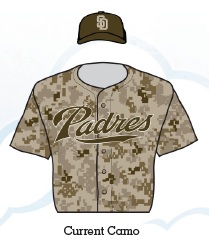
| There were already so many reasons to envy the kids who get to play Little League Baseball in San Diego. But all those lucky little dudes and dudettes in Southern California are now sporting thousands of additional reminders that they're having the time of their lives. As Uni Watch's Paul Lukas reported earlier this week, the Padres have outfitted 800 local t-ball, baseball and softball leagues in uniforms from every stage of the team's 43-year history. The selection of free uniforms spanned 20 different styles from the Friars' unique jersey selection so all the Tanner Boyles in a 10-mile radius of Petco Park are wearing everything from the Ray Kroc's mustard and brown pajamas to the patriotic camouflage fatigues that were just wrongly named the ugliest uniforms in baseball. The team says 11,600 children have received free uniforms. As a Fashion Ump who played most of his Little League career with a lame mesh hat print with the name of a local dentist (our sponsor) on the crown and a logo-less jersey that didn't match the team (grey and blue for the White Sox?), I can't tell you how jealous I am over this great idea. The kids get new and surprisingly authentic remakes of the clothes their heroes wear — or their parents' heroes wore, at least — while the Padres do one of their good deeds for the year (while getting some great brand exposure in the process). (MLB.TV)Writes Lukas: The uniform program is the brainchild of Padres president and COO Tom Garfinkel, who came up with the idea last year during a Little League promotion at Petco Park. "We had about 8,000 Little Leaguers doing a parade around the warning track before the game, and it occurred to me that almost none of them were wearing Padres jerseys," he recalls. "They had jerseys sponsored by local businesses, jerseys from other teams. And I thought, 'Wouldn't it be great if they were all Padres?'" So Garfinkel and his staff made it so. You don't have to think very long to realize that this is a win-win for everyone involved: The kids get sharp-looking new uniforms; their parents get to reconnect with old Padres uniforms they remember from years past; the leagues can repurpose their uniform budgets toward other objectives (many of them have used the savings to improve their fields, upgrade their scoreboards, and so on); and last but not least, the Padres generate a huge amount of goodwill while forging an early bond with their next generation of customers. Other professional teams have equipped local leagues with free equipment and even built facilities, but no team has ever done something like this. Perhaps some of it has to do with the team's wardrobe history (you wouldn't be able to tell the teams apart if the Yankees did this) or the safety of past options (dressing children in the White Sox's infamous shorts would send shares of Bactine and bandages into the stratosphere.) It'll be surprising, though, if more teams don't follow suit, especially in areas (Chicago, Los Angeles) where two teams are battling for young eyeballs or expansion locales (Tampa Bay, Arizona) where they're still building that first or second generation of young fans. |
http://sports.yahoo.com/blogs/mlb-big-l ... 10154.html