Forum Home

Master Index of Archived Threads


Cool Minor League Logos

d'Kong76
Jan 28 2015 12:09 PM

Triple-A affiliate of the Oakland A's, the River Cats have graduated more than 200 players to the Major Leagues, including 2002 American League Cy Young Award winner Barry Zito (A's), 2002 American League Rookie of the Year Eric Hinske (Blue Jays), 2004 American League Rookie of the Year Bobby Crosby, Eric Byrnes, Nick Swisher and many more.

[fimg=800]https://discovergold.files.wordpress.com/2011/04/sacramento-river-cats-logo.jpg[/fimg]

Edgy MD
Jan 28 2015 12:17 PM
Re: Cool Minor League Logos

John Cougar Lunchbucket
Jan 28 2015 12:29 PM
Re: Cool Minor League Logos

To me it looks like every baseball team uses the same design firm. And don't get me wrong -- they are good but to me look a little too computer-illustrated.

It seems like there's no way something like the Met skyline logo over gets designed again.

Frayed Knot
Jan 28 2015 12:37 PM
Re: Cool Minor League Logos

I always liked this little guy.

[fimg=450:3vc9q72p]http://4vector.com/i/free-vector-portland-sea-dogs-0_064892_portland-sea-dogs-0.png[/fimg:3vc9q72p]


I had a real comfy PSD sweatshirt w/this logo until losing it somewhere a bunch of years ago.

Edgy MD
Jan 28 2015 12:43 PM
Re: Cool Minor League Logos

What's kind of gross is the anthropomorphic biscuit in which the patty of butter serves as a tongue.

Benjamin Grimm
Jan 28 2015 12:52 PM
Re: Cool Minor League Logos

I'm pretty sure that if I were to eat that biscuit, I'd want to first remove the eyes.

LeiterWagnerFasterStrongr
Jan 28 2015 12:56 PM
Re: Cool Minor League Logos

Edited 1 time(s), most recently on Jan 29 2015 08:38 AM

Step to the Stockton Ports, Homes? They gonna straight jack up ya pee smell.


John Cougar Lunchbucket wrote:
To me it looks like every baseball team uses the same design firm. And don't get me wrong -- they are good but to me look a little too computer-illustrated.

It seems like there's no way something like the Met skyline logo over gets designed again.

If it seems like it's the same design firm, that's because it kind of is.

Edgy MD
Jan 28 2015 12:59 PM
Re: Cool Minor League Logos

Sort of like how HOK is either the lead or supporting firm on the design of every ballpark.

Everything devolving back to the yellow dog.

d'Kong76
Jan 28 2015 01:03 PM
Re: Cool Minor League Logos

I think this has come up before, and yes there is a certain
sameness to many of the current (modern) logos.
Corporal Klinger's team of choice:
[fimg=800:2gsggv2s]http://content.sportslogos.net/logos/36/937/full/794wsl5qbo9qicg4hvj19nbt3.gif[/fimg:2gsggv2s]

Mets Guy in Michigan
Jan 28 2015 01:24 PM
Re: Cool Minor League Logos


I always liked the Daytona Cubs logo, because it's so strange: Severed head of a bear on spring break, with his cool shades and backward cap -- with the cap logo on the back.

So bad that it's good!

Mets Guy in Michigan
Jan 28 2015 01:29 PM
Re: Cool Minor League Logos


I also liked the old Asheville Tourists logo, with the styling bear and his loud shirt, camera and suitcase. He's ready to have some fun!

Mets – Willets Point
Jan 28 2015 01:56 PM
Re: Cool Minor League Logos

Sadly the Piedmont Boll Weevils are no longer around.

Edgy MD
Jan 28 2015 02:27 PM
Re: Cool Minor League Logos

Mets Guy in Michigan wrote:


I also liked the old Asheville Tourists logo, with the styling bear and his loud shirt, camera and suitcase. He's ready to have some fun!


>>>> "Are you packed for vacation yet, Smokey?"

>>>> "Not yet, Honey. Can't find my vacation spikes."

John Cougar Lunchbucket
Jan 28 2015 02:38 PM
Re: Cool Minor League Logos

Yeah they updated that bear a few years back with a stylish but less retro moon-and-stars thing including this alt-logo


I came here to display the Bowling Green Hot Rods logo. Their unis are pretty cool too.

LeiterWagnerFasterStrongr
Jan 29 2015 08:42 AM
Re: Cool Minor League Logos

I can't imagine why the London, Ontario Frontier League club went defunct a couple of years ago... the branding seems super-well-thought-out.


And have we stumbled upon some kind of weird relaxing-bears minitrend here?

batmagadanleadoff
Jan 29 2015 10:28 AM
Re: Cool Minor League Logos

They don't make 'em like they used to. "Owgust", the beer barrel man of the minor league Milwaukee Brewers (1940's).

[fimg=566:1uhqblk2]http://upload.wikimedia.org/wikipedia/en/1/1d/MilwaukeeBrewers(minor_league_baseball_team)Logo.PNG[/fimg:1uhqblk2]

batmagadanleadoff
Jan 29 2015 10:30 AM
Re: Cool Minor League Logos

The Los Angeles Angels (of the Pacific Coast League) logo:

batmagadanleadoff
Jan 29 2015 10:40 AM
Re: Cool Minor League Logos

I'm gonna pass on all of these newfangled logos. When you see them en masse, you could see how they suffer from sameness, and a lack of imagination. They all look so corporate.

Same goes for MLB post-season tickets, and World Series programs, which used to be designed by the participating teams, until MLB took over those functions, as well.

Benjamin Grimm
Jan 29 2015 10:45 AM
Re: Cool Minor League Logos

This reminds me of a very cool store I visited in Seattle this past summer. It's called "Ebbets Field Flannels" and they sell a wide variety of vintage-style caps, t-shirts, and jerseys. I seem to remember that they had more t-shirts in their store than are pictured on the web site, but I could be wrong.

Ebbets Field Flannels

Gwreck
Jan 29 2015 11:44 AM
Re: Cool Minor League Logos

I was always partial to the Quad Cities River Bandits (original logo). They've since redesigned to one that's similar to what's above.

Ceetar
Jan 29 2015 11:52 AM
Re: Cool Minor League Logos

Hillsboro Hops

batmagadanleadoff
Jan 29 2015 11:56 AM
Re: Cool Minor League Logos

These modern logos aren't exactly easy on the eyes either. They all look too busy and kind of cramped.

d'Kong76
Jan 29 2015 11:58 AM
Re: Cool Minor League Logos

Used to get catalogs from Ebbets Field Flannels years
ago... the store must be amazing.

batmagadanleadoff
Jan 29 2015 12:06 PM
Re: Cool Minor League Logos

Then:

[fimg=333:2ehpahcq]http://cdn1.sbnation.com/assets/3432245/1969n.jpg[/fimg:2ehpahcq][fimg=343:2ehpahcq]http://www.7th-inningstretch.com/YankeesWorldSeriesProgram.jpg[/fimg:2ehpahcq][fimg=338:2ehpahcq]https://encrypted-tbn2.gstatic.com/images?q=tbn:ANd9GcSXfQFyTWNe7Uc3ST6vPbPHCaJwTFjfnOVeBdmSmI43r2sGc5A7wg[/fimg:2ehpahcq]

Now:
[fimg=333:2ehpahcq]https://encrypted-tbn1.gstatic.com/images?q=tbn:ANd9GcRbMY02IrzdVAitH_l4ysRGmz4N-y7_tbQV1ykU-W1XkqQEFe_-Ow[/fimg:2ehpahcq][fimg=337:2ehpahcq]http://upload.wikimedia.org/wikipedia/en/b/bf/2002_World_Series_Program.gif[/fimg:2ehpahcq][fimg=333:2ehpahcq]http://www.baseball-almanac.com/images/2012_World_Series_ProgramHD.jpg[/fimg:2ehpahcq]

Mets Guy in Michigan
Jan 29 2015 12:23 PM
Re: Cool Minor League Logos

The Traverse City Beach Bums are about two hours north and have a beautiful stadium, especially for an independent league team.

The Lansing Lugnuts are two blocks from my office, also with kind of a nice stadium. The name was met with open ridicule at first, but now people kind of like it.

Now, the West Michigan Whitecaps are four miles from my house and used to have a cool logo. Then they followed the lead of the other MiLB clubs and have this:


And, in a tragic attempt to mix with the parent club, they created this alt logo for kid stuff:

Benjamin Grimm
Jan 29 2015 12:43 PM
Re: Cool Minor League Logos

GAH! That's awful!

That combination thing worked much better when the Buffalo Bisons were a Mets affiliate.

Zvon
Jan 29 2015 03:30 PM
Re: Cool Minor League Logos

I always thought the A.C. Surf logo was pretty kool when the team debuted. No laid back bears, animals or flying fish. Just the facts mam.


Then they changed it up, only just a few years later.
[fimg=300]http://assets.nydailynews.com/polopoly_fs/1.1146400!/img/httpImage/image.jpg_gen/derivatives/article_970/skipweb29s-2-web.jpg[/fimg]

d'Kong76
Jan 29 2015 04:28 PM
Re: Cool Minor League Logos

I still wear my Tides hats.

Mets Guy in Michigan
Jan 29 2015 04:33 PM
Re: Cool Minor League Logos


I've always liked the Manatees because they didn't turn him into some pissed off, mean-looking animal.

Granted, there is nothing scary about a huge, slow-moving, lettuce-eating fish-like thing. But they made other harmless animals look mean.

The Manatees used to be a Marlins team with black and teal, but it looked like they changed to the Nats' colors after changing affiliation.

d'Kong76
Jan 29 2015 06:03 PM
Re: Cool Minor League Logos

All the Tides old fashioned logos online are tiny.

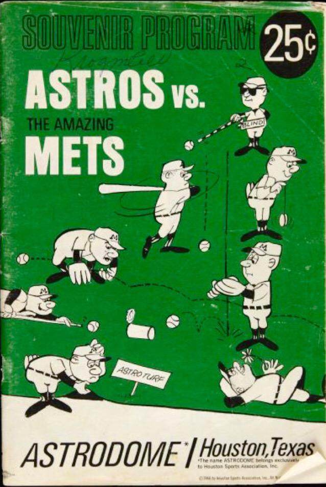
Edgy MD
Feb 18 2015 08:35 AM
Re: Cool Minor League Logos

From the "THINGS WERE BETTER WHEN DIFFERENT TEAMS USED DIFFERENT MARKETING AND DESIGN FIRMS" comes this wonderful unearthing of Houston Astros game day programs from the sixties.

Look at them mocking the Mets! That's fighting art! Look at Casey!

metsmarathon
Feb 18 2015 09:05 AM
Re: Cool Minor League Logos

thats just bad form. the mets never wore a big M on their caps...

batmagadanleadoff
Feb 18 2015 10:42 AM
Re: Cool Minor League Logos

Edgy MD wrote:
From the "THINGS WERE BETTER WHEN DIFFERENT TEAMS USED DIFFERENT MARKETING AND DESIGN FIRMS" comes this wonderful unearthing of Houston Astros game day programs from the sixties.

Look at them mocking the Mets! That's fighting art! Look at Casey!

[fimg=333]https://pbs.twimg.com/media/B-GKUp4CUAAiRD9.jpg[/fimg]


I'm onto those. From roughly 1966-68, the Astros program covers featured a style evocative of European stlye cartooning. They shoulda had Tug McGraw trying to smoke the artificial turf next to the Met trying to peer underneath it.

batmagadanleadoff
Feb 21 2015 11:42 AM
Re: Cool Minor League Logos

New slogan for the 1969 Cubs: Turn on, Tune in, Drop Out of First Place.

[fimg=444]https://pbs.twimg.com/media/B-GE2owCUAAfVFo.jpg:large[/fimg]

When the Cubs went on a road trip, they went on a road trip.

[youtube]oShTJ90fC34[/youtube]

I guess they don't make baseball programs like they used to, either.

Zvon
Feb 21 2015 02:41 PM
Re: Cool Minor League Logos

"Thank you for watching Bad Program Covers.
I am your host Leonard Pinth-Garnell."


"I think we'll all agree those
were outrageously, hilariously,
and excruciatingly baaaaad."

Nymr83
Feb 22 2015 02:39 PM
Re: Cool Minor League Logos

The Traverse City Beach Bums are about two hours north and have a beautiful stadium, especially for an independent league team.

The Lansing Lugnuts are two blocks from my office, also with kind of a nice stadium. The name was met with open ridicule at first, but now people kind of like it.

Now, the West Michigan Whitecaps are four miles from my house and used to have a cool logo. Then they followed the lead of the other MiLB clubs and have this:


This logo is pretty cool.

John Cougar Lunchbucket
Feb 23 2015 11:56 AM
Re: Cool Minor League Logos

New to the AA Southern League this season, and continuing in the vein of goofy logos a la the Lugnuts, Biscuits and Waves, are the Biloxi Shuckers:


Unfortunately for the Shuckers they won't sell a lot of merch since their stadium is apparently way behind schedule and isn't expected to open till June at the earliest, with a plan of playing home games on the road (and in Huntsville). Late fees could bankrupt the city in the meantime.

In other news the New Britian Rock Cats (Rockies Class AA Eastern League) are moving to Hartford next season and there's a contest going on NOW!!!! to re-name the team. Hartford's "big league" franchise back in the 1880s were known as the Dark Blues, which I think would be cool to bring back but you know modern team owners will go for something more sellable.

I was reminded of the Dark Blues name this weekend when I stopped by Troy, NY for a beer. Their team in the same era was known as the Haymakers. Now that's a team name.

Edgy MD
Feb 23 2015 12:23 PM
Re: Cool Minor League Logos

Haymakers is great. It's a diligent hardworking wage-earning man. And it's lights-out punch to the jaw.

I'm a fan of Abraham Lincoln High's nickname, but they've never quite nailed the logo.

[fimg=450:ozfttytx]http://www.ihsa.org/Portals/0/Photos/IHSA%20State/Nicknames/RAILERMAN.jpg[/fimg:ozfttytx]

MFS62
Mar 31 2015 07:40 AM
Re: Cool Minor League Logos

I think we may have a winnahhh.
http://www.msn.com/en-us/sports/mlb/min ... id=DELLDHP

Later

LeiterWagnerFasterStrongr
Mar 31 2015 06:53 PM
Re: Cool Minor League Logos

John Cougar Lunchbucket wrote:
In other news the New Britian Rock Cats (Rockies Class AA Eastern League) are moving to Hartford next season and there's a contest going on NOW!!!! to re-name the team. Hartford's "big league" franchise back in the 1880s were known as the Dark Blues, which I think would be cool to bring back but you know modern team owners will go for something more sellable.


Like, say, the Yard Goats?

Get used to seeing goats. Although the name Yard Goats is technically an old railroad slang term for an engine that switches a train to get it ready for another locomotive, the animal angle lends itself to logos and merchandise. Hartford's stadium could have a petting zoo, at least on some nights.

"When you think of a name, it's about what you can market and what appeals to kids," Restall said. "We can do a lot with this name."


Logo forthcoming.

John Cougar Lunchbucket
Apr 08 2015 10:43 AM
Re: Cool Minor League Logos

LeiterWagnerFasterStrongr wrote:
John Cougar Lunchbucket wrote:
In other news the New Britian Rock Cats (Rockies Class AA Eastern League) are moving to Hartford next season and there's a contest going on NOW!!!! to re-name the team. Hartford's "big league" franchise back in the 1880s were known as the Dark Blues, which I think would be cool to bring back but you know modern team owners will go for something more sellable.


Like, say, the Yard Goats?

Get used to seeing goats. Although the name Yard Goats is technically an old railroad slang term for an engine that switches a train to get it ready for another locomotive, the animal angle lends itself to logos and merchandise. Hartford's stadium could have a petting zoo, at least on some nights.

"When you think of a name, it's about what you can market and what appeals to kids," Restall said. "We can do a lot with this name."


Logo forthcoming.


Geez.

Only semi-related. I love when UniWatch does uni-design contests. The one for a supposed NHL expansion club in Vegas is terrific.

[youtube]QWkJ09_exPQ[/youtube]

Edgy MD
Apr 08 2015 11:05 AM
Re: Cool Minor League Logos

I like the effort, but that logo speaks to me not of a team called the Las Vegas Aces, so much as of a team called Las Vegas Spades.
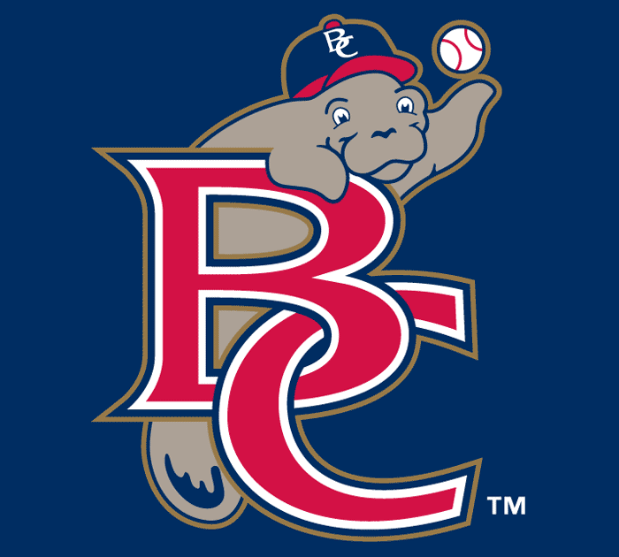
Agreed that the Uni-Watch contests are great, and shows what is lost when very few firms are doing all the thinking.