Forum Home

Master Index of Archived Threads


Yearbook Cover Derby Round 1.01 1989 revised vs 1990 revised


1989 Revised Edition 10 votes

1990 Revised Edition 7 votes

Benjamin Grimm
Mar 23 2018 06:51 AM

First-round polls will be presented in random (but not arbitrary) order. We start with a face-off between perennial chronological rivals, the 1989 revised edition and the 1990 revised edition.

This is the first of 32 first-round polls. Voting for each poll will remain open for seven days. You may change your vote if you wish. New polls will be posted daily, including on weekends.

Which cover will ultimately prevail? Will Maja get involved in this competition? Only time, and your votes, will tell!


1989 Revised Edition


1990 Revised Edition

41Forever
Mar 23 2018 07:25 AM
Re: Yearbook Cover Derby Round 1.01 1989 revised vs 1990 rev

I love the No. 1 logo. The other looks like Buddy trapped in a net.

seawolf17
Mar 23 2018 09:52 AM
Re: Yearbook Cover Derby Round 1.01 1989 revised vs 1990 rev

41Forever wrote:
I love the No. 1 logo. The other looks like Buddy trapped in a net.

Same. What a weird photo to use.

batmagadanleadoff
Mar 23 2018 09:56 AM
Re: Yearbook Cover Derby Round 1.01 1989 revised vs 1990 rev

Buddy trapped inside of a huge net was prophetic symbolism

d'Kong76
Mar 23 2018 10:18 AM
Re: Yearbook Cover Derby Round 1.01 1989 revised vs 1990 rev

That '90 cover is a candidate for worst of the worst covers.

Benjamin Grimm
Mar 23 2018 10:23 AM
Re: Yearbook Cover Derby Round 1.01 1989 revised vs 1990 rev

The Harrelson cover jumped out to a 4-1 lead, but now trails 5-4.

I voted for 1990. It's not particularly good, but at least it has a human being on the cover. And I kind of like those little colored pencil scribbles that were added to the photos. One of the scribbles (to the right of Bud's cap) makes it look like his head is vibrating. And I also like that they decided to enhance his elbow (but no other visible part of his anatomy) with a few penciled lines.

John Cougar Lunchbucket
Mar 23 2018 10:26 AM
Re: Yearbook Cover Derby Round 1.01 1989 revised vs 1990 rev

The design on the Revised 1990 looks very 1980s.

WTF with the green? Is the photo crop supposed to be a sideways home plate? Who the hell approved this?

batmagadanleadoff
Mar 23 2018 10:31 AM
Re: Yearbook Cover Derby Round 1.01 1989 revised vs 1990 rev

John Cougar Lunchbucket wrote:
The design on the Revised 1990 looks very 1980s.

WTF with the green? Is the photo crop supposed to be a sideways home plate? Who the hell approved this?


I think Jeff Wilpon designed that ugly cover.

A Boy Named Seo
Mar 23 2018 10:43 AM
Re: Yearbook Cover Derby Round 1.01 1989 revised vs 1990 rev

Yeah these are both kinda weak. The 90 uses some strange colors and the colored pencil makes it seem like cheap pop art. The #1 is weird, too. #1 since 1984? What are they trying to say? Not sure which I'm gonna vote for yet.

cooby
Mar 23 2018 11:06 AM
Re: Yearbook Cover Derby Round 1.01 1989 revised vs 1990 rev

Top one is boring. Any picture with a face is better.

Lefty Specialist
Mar 23 2018 11:08 AM
Re: Yearbook Cover Derby Round 1.01 1989 revised vs 1990 rev

The '#1 since '84' thing always bothered me. It had no real meaning. They won a lot of games between '84 and '88 but only had one WS to show for it. A pointless promo that I found irritating; I even have a giveaway sportsbag with that dumb logo on it somewhere.

So I'll take Buddy trapped in his Tholian Web.

sharpie
Mar 23 2018 11:27 AM
Re: Yearbook Cover Derby Round 1.01 1989 revised vs 1990 rev

I voted Buddy as well. The 1 logo is stupid.

John Cougar Lunchbucket
Mar 23 2018 11:36 AM
Re: Yearbook Cover Derby Round 1.01 1989 revised vs 1990 rev

The logo 1 is very 70s.


Both of these covers are going to get slaughtered in the next round

A Boy Named Seo
Mar 23 2018 11:45 AM
Re: Yearbook Cover Derby Round 1.01 1989 revised vs 1990 rev

Yeah, Buddy wins my vote in this crappo round.

Benjamin Grimm
Mar 23 2018 12:02 PM
Re: Yearbook Cover Derby Round 1.01 1989 revised vs 1990 rev

As I've looked over the full batch of covers, I noticed more that are bad than are good. In other words, expect more crappy matchups!

G-Fafif
Mar 23 2018 01:42 PM
Re: Yearbook Cover Derby Round 1.01 1989 revised vs 1990 rev

I loved that I found this a tough call, and I look forward to 31 more tough first-round calls. I also loved that they were both covers I don't have. I bought my yearbooks early both years and, except for 1977 (when I didn't get to Shea until August), never made a point of procuring Revised editions.

For all the reasons mentioned, both had their drawbacks. I always found the #1 thing in this context unnecessarily hubristic and sort of blame it for the bad karma that was to come -- like the "Excellence Again and Again" slogan they issued forth from their tower of self-regard. But that Harrelson picture/design, despite Buddy's immediate impact on the club's fortunes, isn't much to get excited about, and I always found the tendency of Met publications trying to gin up excitement on behalf of a new manager a little propagandistic. I mean more so than featuring a player or a picture of the stadium. "Hey, everybody, let's form a cult around the man we put in charge. Let us all regard his authority."

Thus, I went with the 1. It does capture a certain attitude that defined its time.

Zvon
Mar 23 2018 01:52 PM
Re: Yearbook Cover Derby Round 1.01 1989 revised vs 1990 rev

1990 revised: I still liked Davey J. as manager (fired March 1st at 20-22) and was surprised when he was canned, but the fact that they gave the gig to Harrelson smoothed over any anger. And Buddy won 26 of the next 34 games! We were in 1st place going into September, but a 17-16 record to close out the season left us out by 4 games (behind the Buccos). I'd take a 91-71 record any time (especially these days). Strawman's last season in orange and blue.

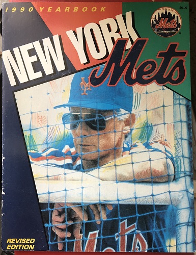
Yea, that pic of Buddy was a bad choice. It is Buddy though, and without the net it would be a nice artsy image. But....there's the damned net dividing my conciousness. The layout is okay, with the angles and the blue, orange, and.....green!? Wha? Well, it's a good contrast to the best logo known to man and the universe.

On a one to ten I'd give this baby a 5.8.

1989 revised: Not much good I can say about 1989. Well, HoJo, but that's about it. We limped thru 1989 but still won a lot of games. Very disappointing after 1988.

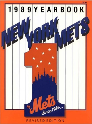
Speaking of logos, I love creating them myself and I love a good one when I see it. This is an excellent one. Like the Mets official logo, this one was arrived at as the result of a logo contest (sponsered by Newsday). Anthony Frisina of Commack, N.Y. won the honor and how cool and exciting that must have been for him. All he left out was the bridge and I'll let that slide (the baseball stitches too, which was wise).

This cover gets an 8.6 in my little yearbook book as well as my vote.

Benjamin Grimm
Mar 23 2018 01:52 PM
Re: Yearbook Cover Derby Round 1.01 1989 revised vs 1990 rev

G-Fafif wrote:
I always found the tendency of Met publications trying to gin up excitement on behalf of a new manager a little propagandistic. I mean more so than featuring a player or a picture of the stadium. "Hey, everybody, let's form a cult around the man we put in charge. Let us all regard his authority."


I've noticed that the Mets have used the yearbook covers to highlight some, but not all, of their new managers. Bud Harrelson, like Joe Torre in 1977, was a mid-year replacement who was featured on a revised edition.

Gil Hodges, George Bamberger, and Jeff Torborg also got the look-at-our-new-manager cover. So did Art Howe, but in the most restrained way imaginable. Willie Randolph appeared on the cover of his first yearbook. Davey Johnson did not. Nor did Joe Frazier or Terry Collins. We'll soon find out how it will go for Mickey Callaway. As I said in the introduction thread for this competition, I predict that the 2018 cover will feature Mickey with Syndergaard and deGrom.

G-Fafif
Mar 23 2018 01:56 PM
Re: Yearbook Cover Derby Round 1.01 1989 revised vs 1990 rev

Benjamin Grimm wrote:
G-Fafif wrote:
I always found the tendency of Met publications trying to gin up excitement on behalf of a new manager a little propagandistic. I mean more so than featuring a player or a picture of the stadium. "Hey, everybody, let's form a cult around the man we put in charge. Let us all regard his authority."


I've noticed that the Mets have used the yearbook covers to highlight some, but not all, of their new managers. Bud Harrelson, like Joe Torre in 1977, was a mid-year replacement who was featured on a revised edition.

Gil Hodges, George Bamberger, and Jeff Torborg also got the look-at-our-new-manager cover. So did Art Howe, but in the most restrained way imaginable. Willie Randolph appeared on the cover of his first yearbook. Davey Johnson did not. Nor did Joe Frazier or Terry Collins. We'll soon find out how it will go for Mickey Callaway. As I said in the introduction thread for this competition, I predict that the 2018 cover will feature Mickey with Syndergaard and deGrom.


Mickey covers the media guide, which doesn't always sync with the yearbook but sometimes does (how's that for equivocation?).

At least a couple of the "here's the manager" covers are classics, despite the concept being (I think) a little off.

RealityChuck
Mar 23 2018 04:43 PM
Re: Yearbook Cover Derby Round 1.01 1989 revised vs 1990 rev

The 1990 edition is just plain ugly. Random panels of color? And green in the upper right? The weirdly boxed photo? Awful.

SteveJRogers
Mar 24 2018 11:54 AM
Re: Yearbook Cover Derby Round 1.01 1989 revised vs 1990 rev

‘89 kind of has that quality the the 1967 one has. Ever upward, all that. Sadly things did fall apart starting that year.

Buddy on the 1990 cover...eh, hasn’t aged well, and very late 1980s “style.”