Mar 24 2018 05:53 AM

1983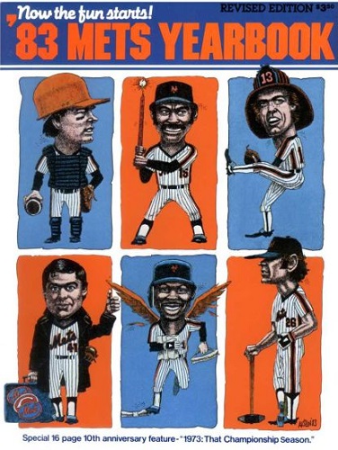
1996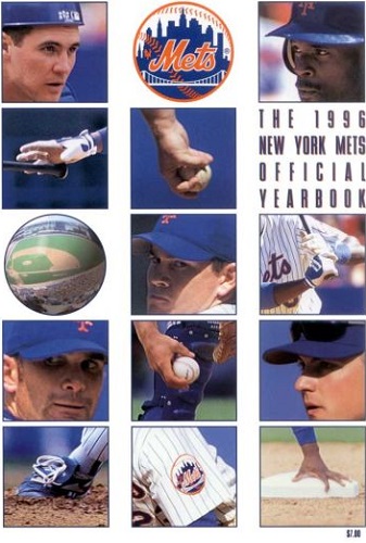


Master Index of Archived Threads
Yearbook Cover Derby Round 1.02 1983 vs 1996
| 1983 | 12 votes |
| 1996 | 5 votes |
| Benjamin Grimm Mar 24 2018 05:53 AM |
|
|
| d'Kong76 Mar 24 2018 07:52 AM Re: Yearbook Cover Derby Round 1.02 1983 vs 1996 |
|
1983, because that is one goofy-ass cover versus a rather boring one.
|
| 41Forever Mar 24 2018 08:04 AM Re: Yearbook Cover Derby Round 1.02 1983 vs 1996 |
|
Went with 1983 because of Seaver!
|
| John Cougar Lunchbucket Mar 24 2018 08:40 AM Re: Yearbook Cover Derby Round 1.02 1983 vs 1996 |
|
Yeah.
|
| G-Fafif Mar 24 2018 09:30 AM Re: Yearbook Cover Derby Round 1.02 1983 vs 1996 |
|
I think the 1983 artist was well known in Canadian circles (did a lot of Expos sketches), indicative that the Mets in the fairly early Doubleday years were open to anything from a marketing standpoint. I first saw this cover on a newsstand and was blown away by the thought that went into each of the caricatures, if not the result. Interesting that this was the revised edition in that by the time there was something to revise, you would have featured Hernandez and Strawberry and downgraded Kingman and Stearns (who was inactive most of the year). The fun was a little ways from starting when this cover was commissioned.
|
| MFS62 Mar 24 2018 10:39 AM Re: Yearbook Cover Derby Round 1.02 1983 vs 1996 |
|
|
And that is why I voted for 1996. And, in case they forgot to remind us (which they should have) 1996 was the tenth anniversary of a World Series victory. Later
|
| Zvon Mar 24 2018 11:34 AM Re: Yearbook Cover Derby Round 1.02 1983 vs 1996 |
|
|
That's enough of a reason right there!^ Also art over lack of substance. I want to try and slide the squares around on the '96 one and get those tiles to line up and form the right picture. [fimg=200]https://www.partypalooza.com/Merchant2/graphics/00000001/SmileyPuzzle_540x540.jpg[/fimg]
|
| SteveJRogers Mar 24 2018 11:43 AM Re: Yearbook Cover Derby Round 1.02 1983 vs 1996 |
|
I dislike ‘96 from the standpoint of “who!?†looking at the pics. I mean WE HERE know those depicted, but not a ton of clues, unless you had the physical copy and you could line up faces, positions, etc.
|
| Benjamin Grimm Mar 24 2018 12:02 PM Re: Yearbook Cover Derby Round 1.02 1983 vs 1996 |
|
On the 1996 cover, I recognize Todd Hundley, but I don't know who the other three faces are. I suppose I might have recognized them twenty years ago, but I'm not even sure of that. There was a period between the end of Channel 9 as a superstation and the advent of Extra Innings and the like when I didn't get to see too many Mets games. And I have no idea whose hands and feet are depicted in the other "body parts" images on that cover.
|
| G-Fafif Mar 24 2018 01:06 PM Re: Yearbook Cover Derby Round 1.02 1983 vs 1996 |
|
Per the revisions of '83, yes, Neil Allen should have been disappeared had the publication deadline extended beyond June 15. And why would you revise a yearbook without waiting?
|
| Edgy MD Mar 24 2018 01:43 PM Re: Yearbook Cover Derby Round 1.02 1983 vs 1996 |
|
1996, because Tom Seaver does not look like Sam Donaldson.
|
| Benjamin Grimm Mar 24 2018 02:17 PM Re: Yearbook Cover Derby Round 1.02 1983 vs 1996 |
|
It really is a bad likeness.
|
| Zvon Mar 24 2018 02:24 PM Re: Yearbook Cover Derby Round 1.02 1983 vs 1996 |
|
|
lololol!
|