Mar 26 2018 04:32 AM

1970
2010


Master Index of Archived Threads
Yearbook Cover Derby Round 1.04 1970 vs 2010
| 1970 | 18 votes |
| 2010 | 2 votes |
| Benjamin Grimm Mar 26 2018 04:32 AM |
|
|
| SteveJRogers Mar 26 2018 05:34 AM Re: Yearbook Cover Derby Round 1.04 1970 vs 2010 |
|
1970, no explanation needed!
|
| 41Forever Mar 26 2018 05:54 AM Re: Yearbook Cover Derby Round 1.04 1970 vs 2010 |
|
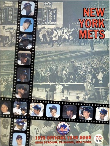
One thing that I always found distracting about the 1970 cover: Wouldn't the photos on the film on the vertical strip appear sideways when projected on a screen? I know, I know. Thinking too hard. But I always wondered why they chose film as a design element.
|
| John Cougar Lunchbucket Mar 26 2018 06:04 AM Re: Yearbook Cover Derby Round 1.04 1970 vs 2010 |
|
They'd never put rioting fans on the cover these days.
|
| Edgy MD Mar 26 2018 06:07 AM Re: Yearbook Cover Derby Round 1.04 1970 vs 2010 |
|
|
Because the camera was held vertically when shooting that roll. Great job mixing color and b/w photography, and underscoring the fans as part of the story.
|
| Benjamin Grimm Mar 26 2018 07:17 AM Re: Yearbook Cover Derby Round 1.04 1970 vs 2010 |
|
The 1970 cover is, incidentally, the inspiration for the Yearbook Cover Derby, when it was the subject of this recent thread.
|
| 41Forever Mar 26 2018 07:40 AM Re: Yearbook Cover Derby Round 1.04 1970 vs 2010 |
|
I just noticed how the price jumped from 75 cents to $12 over that 40-year time period!
|
| Benjamin Grimm Mar 26 2018 07:45 AM Re: Yearbook Cover Derby Round 1.04 1970 vs 2010 |
|
I know what you mean. My first yearbook was the 1971 edition when I was eight years old, and my copy ended up in tatters. I wrote notes in it, I cut pictures out of it, and spent so much time flipping through it that it was literally coming apart. Years later I ordered a replacement edition that has remained in much better shape.
|
| Lefty Specialist Mar 26 2018 07:52 AM Re: Yearbook Cover Derby Round 1.04 1970 vs 2010 |
|
1970 was my first yearbook. No contest.
|
| Benjamin Grimm Mar 26 2018 08:08 AM Re: Yearbook Cover Derby Round 1.04 1970 vs 2010 |
|
Our most lopsided poll so far, and one that has the potential to be unanimous. (1970 has all 12 votes at this point.)
|
| G-Fafif Mar 26 2018 08:33 AM Re: Yearbook Cover Derby Round 1.04 1970 vs 2010 |
|
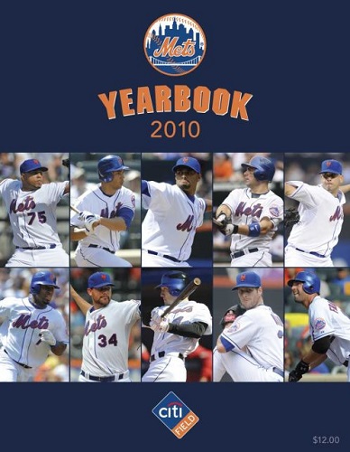
2010 looks like a brochure. In fact, the cover was the same used for season ticket sales material and other stuff. Not an inspiring tableau, though points for capturing a blip when Jeff Francoeur and Oliver Perez were considered marketable.
|
| G-Fafif Mar 26 2018 08:34 AM Re: Yearbook Cover Derby Round 1.04 1970 vs 2010 |
|
|
That was Jeff Francoeur.
|
| A Boy Named Seo Mar 26 2018 08:44 AM Re: Yearbook Cover Derby Round 1.04 1970 vs 2010 |
|
I gave 2010 a sympathy vote. It's super clean, they're embracing the return to blue and orange and have the dudes in all white. Not bad at all. Tough draw, 2k10, keep your head up.
|
| RealityChuck Mar 26 2018 08:49 AM Re: Yearbook Cover Derby Round 1.04 1970 vs 2010 |
|
Two excellent designs. I prefer 2010 because of the clean design; the photo in 1970 makes it too busy. Still, the 1970 one is in the top half of what we've seen so far.
|
| Benjamin Grimm Mar 26 2018 08:49 AM Re: Yearbook Cover Derby Round 1.04 1970 vs 2010 |
|
|
Oops! My bad, I thought that was an FE and not an FR.
|
| cooby Mar 26 2018 09:11 AM Re: Yearbook Cover Derby Round 1.04 1970 vs 2010 |
|
I could tell you who at least most of the guys on the 1970 are, 2010 prolly none of them
|
| SteveJRogers Mar 26 2018 09:19 AM Re: Yearbook Cover Derby Round 1.04 1970 vs 2010 |
|
|
Ditto Jason Bay! I completely agree, does seem more like a prospectus folder, or a campus admissions booklet cover than a publication meant for memorabilia.
|
| Benjamin Grimm Mar 26 2018 09:21 AM Re: Yearbook Cover Derby Round 1.04 1970 vs 2010 |
|
|
Not even Reyes, Wright, Santana, and Beltran?
|
| batmagadanleadoff Mar 26 2018 09:30 AM Re: Yearbook Cover Derby Round 1.04 1970 vs 2010 Edited 4 time(s), most recently on Mar 26 2018 11:15 AM |
|
1970 was my first yearbook, a gift from a relative. I had no advance knowledge that I was about to receive it, and in that moment that I did, I think I might've been the happiest kid in the world. But for all of the warm sentimental value this yearbook holds to me, and the coverage of the Mets most amazin' season, I'm not convinced it should win this round, at least not as handily as most of you do. The design is cluttered and the triptych background doesn't work for me: the three panels don't have enough separation - they seem to melt into each other. I would've preferred just one background image, perhaps the now iconic mound hug including Ed Charles's dance of joy, but there were obviously plenty of pics to choose from. I'm voting almost entirely on design and aesthetics, and so I won't give much extra credit simply because the 1970 yearbook covers such an extremely historical season. Ofherwise, we might as well rank the yearbooks according to the previous seasons' W-L records and stipulate that the 1987's are the best and that the Mullin covers are the worst.
|
| cooby Mar 26 2018 09:48 AM Re: Yearbook Cover Derby Round 1.04 1970 vs 2010 |
||
|
Okay, exactly those four!
|
| d'Kong76 Mar 27 2018 09:29 AM Re: Yearbook Cover Derby Round 1.04 1970 vs 2010 |
|
Took '70, one of my favorites. I thought I voted the other day but just voted now.
|
| Edgy MD Mar 27 2018 09:40 AM Re: Yearbook Cover Derby Round 1.04 1970 vs 2010 |
|
|
Man, that Citi Field logo alone should sink 2010's candidacy.
|
| Zvon Mar 27 2018 03:33 PM Re: Yearbook Cover Derby Round 1.04 1970 vs 2010 |
|||||
|
1970 was also my first ever Mets yearbook. And I loved it, poured over it, absorbed it, learned so much about the players on the team then.
Yea, that's Frenchy. All I recall of his time here was that he yakked a little more than he raked. I had no problem remembering his KABOOM pic tho.
That must have been so cool to get by surprise.
An inspirational idea. I'll make a 1970 like remake for 2018 but it doesn't see the light of day unless we make the post season this year.
 Wha?! There's no sympathy in baseball! Nor in YCD!
|
| batmagadanleadoff Mar 28 2018 09:58 AM Re: Yearbook Cover Derby Round 1.04 1970 vs 2010 |
|
|
I changed my vote and gave it to the 1970 yearbook. Not that it'll have much of an impact on this battle. I'm still having internet problems here which is a story and a half. So I'm meanwhile using my smartphone for web access, and on that smaller screen, the yearbooks don't present as well. Condensed for a smartphone, the 1970 yearbook really suffers. The background photos lose much of their detail and look like pixel mush. I realized this when I took a lot at my real world copy, which presents much better in my hands. I'm still sticking, though, to my points about a) not giving extra credit to yearbooks based on the success of the seasons they represent. Which is different from acknowledging that the yearbooks need to do a good job of depicting the seasons they depict; and therefore b) that I'm not so sure that the 1970 design automatically rates as one of the best. Also, it's absolute murder typing posts on a smartphone. Every single word is a struggle.
|
| A Boy Named Seo Mar 28 2018 10:19 AM Re: Yearbook Cover Derby Round 1.04 1970 vs 2010 |
||
|
Sad, little logo still makes me hungry for pizza.
|