Mar 27 2018 06:52 AM

1963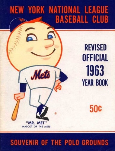
2017


Master Index of Archived Threads
Yearbook Cover Derby Round 1.05 1963 vs 2017
| 1963 | 13 votes |
| 2017 | 5 votes |
| Benjamin Grimm Mar 27 2018 06:52 AM |
|
|
| Edgy MD Mar 27 2018 06:59 AM Re: Yearbook Cover Derby Round 1.05 1963 vs 2017 |
|
I don't like either of those much. The first has too much white space waiting to be filled in. The second needs a face or two. Excitement isn't in backs. And the notion that Wright and Reyes are represented by fans just says we're hanging on to a past that we can't quite turn the page on.
|
| batmagadanleadoff Mar 27 2018 07:13 AM Re: Yearbook Cover Derby Round 1.05 1963 vs 2017 |
|
|
Which season story should a yearbook cover tell: the yearbook's season or the season before? I suppose it depends on the year.
|
| Benjamin Grimm Mar 27 2018 07:17 AM Re: Yearbook Cover Derby Round 1.05 1963 vs 2017 |
|
I went with 2017. It's colorful and dynamic. 1963, the year that Willard Mullin apparently took a break (although the did the Yankees yearbook cover that year) is a particularly unimaginative cover. Just a stock image of Mr. Met.
|
| Lefty Specialist Mar 27 2018 07:58 AM Re: Yearbook Cover Derby Round 1.05 1963 vs 2017 |
|
Well, I guess in '63 there weren't a lot of 1962 highlights to put on the cover, and with a team that bad you couldn't plan on putting any particular players on it either. Ergo, giant Mr. Met.
|
| 41Forever Mar 27 2018 08:02 AM Re: Yearbook Cover Derby Round 1.05 1963 vs 2017 |
|
I went with 2017. I see what they were doing there -- players names on the jerseys for both the fans and their heroes. Bonding!
|
| Edgy MD Mar 27 2018 08:39 AM Re: Yearbook Cover Derby Round 1.05 1963 vs 2017 |
||
|
Well, the yearbook's season, I think, but if the previous season was particularly lovely, the story you're hoping to tell about the current season is "This season is going to be filled with all the thrills of last year's season, and then some!"
|
| TheOldMole Mar 27 2018 08:40 AM Re: Yearbook Cover Derby Round 1.05 1963 vs 2017 |
|
1963 has the innocence. 2017 too busy. In general I like art over photography for the covers.
|
| John Cougar Lunchbucket Mar 27 2018 09:02 AM Re: Yearbook Cover Derby Round 1.05 1963 vs 2017 |
|
2017 theme was "looking ahead," the only thing missing was a speeding train in the background. I do like that they incoroprated solidarity between fans and players.
|
| cooby Mar 27 2018 09:11 AM Re: Yearbook Cover Derby Round 1.05 1963 vs 2017 |
|
A speeding train about to wreck
|
| d'Kong76 Mar 27 2018 09:15 AM Re: Yearbook Cover Derby Round 1.05 1963 vs 2017 |
|
Went with '63, I'm particularly fond of that Mr. Met era/look.
|
| SteveJRogers Mar 27 2018 09:43 AM Re: Yearbook Cover Derby Round 1.05 1963 vs 2017 |
|
2017 is a better version of the college brochure that the 2010 one is.
|
| Lefty Specialist Mar 27 2018 12:24 PM Re: Yearbook Cover Derby Round 1.05 1963 vs 2017 |
|
|
Wow, that's it! I was wondering what it looked like and you nailed it.
|
| G-Fafif Mar 27 2018 01:04 PM Re: Yearbook Cover Derby Round 1.05 1963 vs 2017 |
|
|
This is a battle for the ages. Or a battle of the ages.
It didn't work in the movie, and it won't necessarily work here. That said, I also think I will need corrective surgery for all the leaning I do toward my sentimental/nostalgic impulses in this competition, thus I'm going to try to straighten out my balance just a tad and surprise myself (in light of how instinctively I tend to dismiss the Mets' modern efforts) with a vote for 2017. A good look at what it seemed to be trying to accomplish won me over.
|
| Benjamin Grimm Mar 27 2018 01:27 PM Re: Yearbook Cover Derby Round 1.05 1963 vs 2017 |
|
Well said. Your point about the "one central image" resonates with my impressions of the two 1987 covers, neither of which have appeared yet in this competition. All that a 1987 cover needs is a full-size image of Jesse Orosco with his arms in the air, and the words "WORLD CHAMPIONSHIP EDITION" but no, we got a logo and then an unimpressive montage. But we'll get to that soon. The original 1987 cover comes up next Monday, and the revised cover a couple of weeks later.
|
| Edgy MD Mar 27 2018 01:40 PM Re: Yearbook Cover Derby Round 1.05 1963 vs 2017 |
|
I like numbers, and am a big reader of Mets by the Numbers, but we've really made them into more than they are, and this cover is an example. Numbers are an introduction into a player's wider story. The first word, not the last.
|
| MFS62 Mar 27 2018 02:47 PM Re: Yearbook Cover Derby Round 1.05 1963 vs 2017 |
|
I handled the 1963 yearbook in the Polo Grounds, too.
|
| G-Fafif Mar 27 2018 03:32 PM Re: Yearbook Cover Derby Round 1.05 1963 vs 2017 |
|
|
/adds touching MFS62's 1963 yearbook to bucket list
|
| Zvon Mar 27 2018 04:05 PM Re: Yearbook Cover Derby Round 1.05 1963 vs 2017 |
|
Mr. Mets debut! Say no more. 1963 ftw.
|


