Apr 03 2018 04:54 AM

1985
1994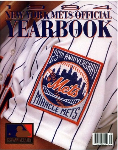


Master Index of Archived Threads
Yearbook Cover Derby Round 1.12 1985 vs 1994
| 1985 | 11 votes |
| 1994 | 7 votes |
| Benjamin Grimm Apr 03 2018 04:54 AM |
|
|
| Edgy MD Apr 03 2018 05:28 AM Re: Yearbook Cover Derby Round 1.12 1985 vs 1994 |
|
1994 looks more like an apparel catalog, and betrays the absence of marquee figures, but it's far superior composition, so I give them that.
|
| John Cougar Lunchbucket Apr 03 2018 05:36 AM Re: Yearbook Cover Derby Round 1.12 1985 vs 1994 |
|
85 accomplished a contemporary design that doesn't look awful today, and I like how they use the racing stripe and pinstripe as though they belong together, which they really never did.
|
| 41Forever Apr 03 2018 06:06 AM Re: Yearbook Cover Derby Round 1.12 1985 vs 1994 |
|
I love uniforms and especially the little details, such as the patches.
|
| Edgy MD Apr 03 2018 06:29 AM Re: Yearbook Cover Derby Round 1.12 1985 vs 1994 |
|
I'm making a yearbook in 1985, it'd be hard not to make that cover all about Gooden. Or maybe Gooden and Straw, seeing how the team was defending consecutive Rookie of the Year wins.
|
| Benjamin Grimm Apr 03 2018 06:55 AM Re: Yearbook Cover Derby Round 1.12 1985 vs 1994 |
|
Our first poll was close, but was followed by ten consecutive landslides. It looks like we may finally have another competitive poll. 1994 currently leads 1985 by a tally of 4 to 3.
|
| SteveJRogers Apr 03 2018 07:59 AM Re: Yearbook Cover Derby Round 1.12 1985 vs 1994 |
|
As much as I want all things in ‘94 baseball erased from history books, the cover is strikingly more dynamic. Plus it was a chance to honor the ‘69 crew without reminding the buyer of what was happening on the field that year.
|
| Benjamin Grimm Apr 03 2018 08:07 AM Re: Yearbook Cover Derby Round 1.12 1985 vs 1994 |
|
I just noticed that 125th Anniversary logo on the 1994 cover. 1994 was 24 years ago, so that means that next year is the 150th Anniversary of 1869, which is the year of the Cincinnati Red Stockings and the first professional baseball team.
|
| Lefty Specialist Apr 03 2018 08:25 AM Re: Yearbook Cover Derby Round 1.12 1985 vs 1994 |
|
Toughie, but I went with '94. I don't like Keith's head between Doc's legs.
|
| A Boy Named Seo Apr 03 2018 09:00 AM Re: Yearbook Cover Derby Round 1.12 1985 vs 1994 |
|
I like both like and dislike aspects of each. Everything is sweet w/ the uniform background of 85, but the 3 pics dropped in the way they are lacking imagination. The sleeve patch pic on 94 is really nice, but the fonts at the top absolutely suck in both color and style. Neither of these is gonna go the distance in this comp.
|
| Benjamin Grimm Apr 03 2018 09:08 AM Re: Yearbook Cover Derby Round 1.12 1985 vs 1994 |
|
|
I hadn't noticed that until you pointed it out! That is rather unfortunate.
|
| RealityChuck Apr 03 2018 10:23 AM Re: Yearbook Cover Derby Round 1.12 1985 vs 1994 |
|
At least they used decent photos in 1985. But the design of 1994 is superior.
|
| cooby Apr 03 2018 10:25 AM Re: Yearbook Cover Derby Round 1.12 1985 vs 1994 |
|
First one that I really can't decide
|
| d'Kong76 Apr 03 2018 10:49 AM Re: Yearbook Cover Derby Round 1.12 1985 vs 1994 |
|
I've often felt that the barcode on publications should be relegated to the
|
| G-Fafif Apr 03 2018 12:57 PM Re: Yearbook Cover Derby Round 1.12 1985 vs 1994 Edited 1 time(s), most recently on Apr 03 2018 01:08 PM |
|
The marketing department had a tough task after dreadful 1993. Theoretically they could have imitated the 1985 cover. They still had a first baseman, a manager and Doc, if not the racing stripe. But times had changed too much to make that appealing, thus the turning back time to 1969 via that closeup of the patch. When I saw it 24 years ago, I had the same thought I did when I first encountered 1979's yearbook: I guess they don't want us to think about the state of the current team, so they'll mesmerize us with a logo. After commemorating the 25th anniversary in the 25th season, they commemorated the 25th anniversary of their first championship in the actual 25th anniversary year. (Math, huh?) As with the logo they wore in 1986, seeing the Miracle Mets patch always takes me back to what 1994 there was. Compared to 1993, it was a wonderland, and I don't mind being reminded of it, despite the strike that ended it prematurely. Still, like '79, it seems like a give-up on the present -- and if they were really that concerned with celebrating '69, maybe offer up the specter of Seaver and company in conjunction with that patch.
|
| Benjamin Grimm Apr 03 2018 01:01 PM Re: Yearbook Cover Derby Round 1.12 1985 vs 1994 |
|
If this Yearbook Cover Derby has nothing else going for it, G-Fafif's daily comparisons of the two competing covers is always worth the price of admission. Maybe even worth twice the price of admission!
|
| G-Fafif Apr 03 2018 01:11 PM Re: Yearbook Cover Derby Round 1.12 1985 vs 1994 |
|
|
Thank you for providing such a stimulating exercise. As much fun as Mets baseball, and weather isn't a factor.
|
| batmagadanleadoff Apr 03 2018 01:37 PM Re: Yearbook Cover Derby Round 1.12 1985 vs 1994 |
|
|
I've been meaning to write the same post for several days, now. He's just killing it on these yearbook threads. When this contest is over, his posts could be edited to make one helluva magazine article, assuming people still read those anymore. The imagined piece would, ideally, appear in a Mets yearbook -- the yearbook about yearbooks -- if only the thin-skinned Mets could absorb some smart criticism.
|
| Benjamin Grimm Apr 03 2018 01:45 PM Re: Yearbook Cover Derby Round 1.12 1985 vs 1994 |
|
If not a magazine article, it would make for a fine blog post.
|