Apr 04 2018 04:34 AM

1981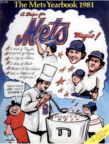
1998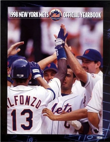


Master Index of Archived Threads
Yearbook Cover Derby Round 1.13 1981 vs 1998
| 1981 | 10 votes |
| 1998 | 6 votes |
| Benjamin Grimm Apr 04 2018 04:34 AM |
|
|
| SteveJRogers Apr 04 2018 05:40 AM Re: Yearbook Cover Derby Round 1.13 1981 vs 1998 |
|
Respect for Bill Gallo over Bobby V photobombing a random celebration.
|
| Edgy MD Apr 04 2018 06:23 AM Re: Yearbook Cover Derby Round 1.13 1981 vs 1998 |
|
I'm going for the Gallo too, although Mazzilli, Flynn, and Allen look like largely indistinguishable brown-haired young men.
|
| John Cougar Lunchbucket Apr 04 2018 07:09 AM Re: Yearbook Cover Derby Round 1.13 1981 vs 1998 |
|
I like Gallo but that's probably not his best work! The concept is pretty clever.
|
| Benjamin Grimm Apr 04 2018 08:02 AM Re: Yearbook Cover Derby Round 1.13 1981 vs 1998 |
|
I like the idea of a single photo on the cover (see 1971 and 1978 for example) but 1998 doesn't have a particularly good photo.
|
| d'Kong76 Apr 04 2018 08:52 AM Re: Yearbook Cover Derby Round 1.13 1981 vs 1998 |
|
Took ultra-corny '81 over the rather-boring '98.
|
| Benjamin Grimm Apr 04 2018 08:54 AM Re: Yearbook Cover Derby Round 1.13 1981 vs 1998 |
|
It's nice to see Basement Bertha and Yuchie again.
|
| Edgy MD Apr 04 2018 09:04 AM Re: Yearbook Cover Derby Round 1.13 1981 vs 1998 |
|
Even if Yuchie inexplicably has his hand on the rim of a hot pot.
|
| RealityChuck Apr 04 2018 09:08 AM Re: Yearbook Cover Derby Round 1.13 1981 vs 1998 |
|
1998. Far better design. classy and understated. 1981 looks like the cover of a high school literary magazine.
|
| G-Fafif Apr 04 2018 09:49 AM Re: Yearbook Cover Derby Round 1.13 1981 vs 1998 |
|
I'm pretty sure the congregation that constitutes the 1998 cover came from the home plate congratulating of Bernard Gilkey, who had just blasted the game-winning three-run homer in the eleventh inning, Saturday, September 13, 1997. It was a dramatic home run if not the most dramatic of the day. That one belonged to Carl Everett, whose ninth-inning grand slam tied things at six, after the Mets entered the frame down 6-0 and Everett was on strike two with two outs (and had sent one deep but foul in the same at bat). Fonzie was the on-deck hitter, which explains the batting helmet. I think I detect Olerud's ears on the left; he was removed earlier in the game, which would explain why they're not adjacent to a hard hat. It was an overcast late afternoon start; looks a little bright for a game that ended in twilight, but I imagine they had ways of adjusting contrasts and whatnot. If I'm correct in placing it, it's a very genuine photograph, worthy of Topps In Action status.
|
| A Boy Named Seo Apr 04 2018 09:55 AM Re: Yearbook Cover Derby Round 1.13 1981 vs 1998 |
|
98's a strange choice, a real crappy picture. My eyes are drawn to the dark arm in the center of the photo that blocks Rey's face. You don't know who it belongs to, cause Fonzie's blocking that guy. At first I thought it was Fonzie's arm, but it doesn't match the rest of Fonzie. And the creepy, tickly hands Edgy mentioned. There was a better version of this photo, maybe 2 seconds earlier or later, possibly from a different angle. But we got this one.
|
| batmagadanleadoff Apr 04 2018 10:08 AM Re: Yearbook Cover Derby Round 1.13 1981 vs 1998 |
|
Looking back with hindsight, I'm surprised the '98 yearbook cover didn't celebrate the Introduction of the Mets horrible black uniform tops.
|
| A Boy Named Seo Apr 04 2018 10:08 AM Re: Yearbook Cover Derby Round 1.13 1981 vs 1998 |
|
Greg's comparison made me like each of them a bit more. So who is Basement Bertha? A Gallo recurring character? Based on a real someone or no?
|
| G-Fafif Apr 04 2018 10:16 AM Re: Yearbook Cover Derby Round 1.13 1981 vs 1998 Edited 1 time(s), most recently on Apr 04 2018 11:55 AM |
|
|
Bertha was Gallo's Everyfan, his vehicle for commenting on the better-known figures he was portraying. With a first name like Basement, you knew she'd be (ahem) drawn to Casey Stengel's cellar-dwelling Metsies from the get-go. Her outfit and persona weren't exactly contemporary way back when, but she probably didn't seem as alien to Gallo's readers c. 1962 as she might to somebody suddenly seeing her today.
|
| G-Fafif Apr 04 2018 10:37 AM Re: Yearbook Cover Derby Round 1.13 1981 vs 1998 |
|
|
Noteworthy that they're wearing the snow whites, which were supposed to be Sunday-only when introduced in 1997. They first wore them for Jackie Robinson Night, a Tuesday, and, in a foreshadowing of the black jerseys, got carried away with their new wardrobe (much as managers become obsessed with their new-toy relievers and use them to excess). As much black as they wore from 1998 forward, the snow whites, until late in their run that ended in 2014, generally got Opening Day, with the pinstripes all but disappearing from consciousness.
|
| SteveJRogers Apr 04 2018 10:51 AM Re: Yearbook Cover Derby Round 1.13 1981 vs 1998 |
|
It is a shame 1998 did not get a revised treatment.
|
| Benjamin Grimm Apr 04 2018 11:37 AM Re: Yearbook Cover Derby Round 1.13 1981 vs 1998 |
|
|
I love that take on Basement Bertha! I've been familiar with her for virtually my whole life, so it didn't occur to me how strange she would look to someone who doesn't know her. 1981 is, undoubtedly, a weird cover and I don't know what its chances are in later rounds, but I do kinda like it. At least, it got my vote in this round. I hadn't realized until today, but the yearbooks had gone with artwork on their covers from 1962 through 1968, then switched to photo covers through the 1970s (with the exception of the Bicentennial Mr. Met in 1976) and then reverted to drawings and paintings for a four-year stretch from 1980 to 1983. After that, it was either photos or logos all the way, with the exception of the 1987 revised edition, which we haven't seen yet. The 1981 cover is the final one to feature spoken dialog in a word balloon. I doubt it will ever happen again, although I'd love for the 2027 yearbook to feature a Willard Mullin style cartoon of Baby Met grown up to be a senior citizen.
|
| batmagadanleadoff Apr 04 2018 12:12 PM Re: Yearbook Cover Derby Round 1.13 1981 vs 1998 |
|
I'm not a fan of those early '80s illustrated Mets yearbook covers. I generally love good artworked covers and I lament the near extinction of an illustrated magazine cover these days, where the formula for most every magazine today seems to be to slap a photo of a celebrity on the front.
|
| Lefty Specialist Apr 04 2018 12:30 PM Re: Yearbook Cover Derby Round 1.13 1981 vs 1998 |
|
This one's tough. All respect to Bill Gallo, but that's a goofy cover. The 1998 cover looks like an in-flight magazine but I think I like it better anyway.
|
| cooby Apr 04 2018 12:32 PM Re: Yearbook Cover Derby Round 1.13 1981 vs 1998 |
|
I always liked that Gallo cover. A LOT. I chose the Rey one though. Never saw that yearbook and wishing I had it.
|
| G-Fafif Apr 04 2018 12:43 PM Re: Yearbook Cover Derby Round 1.13 1981 vs 1998 |
|
|
Next year's Yearbook Interior Derby will bear this out. Loved the spreads on Old Timers Day, All-Star Game, Hall of Fame ceremonies. Loved Rusty in a Mets uniform posing with Singleton, Foli and Jorgensen from the Expos, Seaver and Qualls (of the White Sox) standing awkwardly, players getting treatment from trainers who you didn't assume were disabling their patients, the players' kids, the fans and their banners... Interesting that the illustrated covers of the early '80s tried to evoke ye good olde days just as the Mets were pulling conclusively out of the past.
|
| 41Forever Apr 04 2018 12:49 PM Re: Yearbook Cover Derby Round 1.13 1981 vs 1998 |
|
I never noticed the tickling arm. Now I can't unsee it.
|
| 41Forever Apr 04 2018 12:51 PM Re: Yearbook Cover Derby Round 1.13 1981 vs 1998 |
|
|
I vividly remember those! I used to love the All-Star game sections.
|
| Benjamin Grimm Apr 04 2018 12:55 PM Re: Yearbook Cover Derby Round 1.13 1981 vs 1998 |
|
|
The News never replaced Gallo as the sports cartoonist. (I wonder how many, if any, papers have one anymore.) The News does have an editorial page cartoonist. His name is Bill Bramhall and he's generally pretty good. I don't know about the Post.
|
| G-Fafif Apr 04 2018 01:00 PM Re: Yearbook Cover Derby Round 1.13 1981 vs 1998 |
|
I don't think the Post has been in the sports cartooning business since the heyday of my man John Pierotti. Paul Rigby, the Page Six political cartoonist, did a team caricature to celebrate the coming of the 1977 season (both ours and the MFYs'), the first year the Post was a Murdoch publication.
|
| dgwphotography Apr 04 2018 01:38 PM Re: Yearbook Cover Derby Round 1.13 1981 vs 1998 |
|
My first thought is that either of these covers will make to the next round, while a more deserving cover with a tougher draw will be one and done...
|
| Edgy MD Apr 04 2018 01:54 PM Re: Yearbook Cover Derby Round 1.13 1981 vs 1998 |
|
|
I think so. I thought it might actually be a shot from the Mlicki Game, but that would have been in road grays.
|
| Benjamin Grimm Apr 04 2018 01:57 PM Re: Yearbook Cover Derby Round 1.13 1981 vs 1998 |
|
|
Could be, since there's still a long way to go, but that hasn't happened yet. These polls so far have been heavily lopsided, with the losers getting very little love at all.
|
| Lefty Specialist Apr 04 2018 05:37 PM Re: Yearbook Cover Derby Round 1.13 1981 vs 1998 |
|
Yuchie probably got third-degree burns from hanging on to the rim of that soup pot like he did.
|