Apr 05 2018 07:15 AM

1964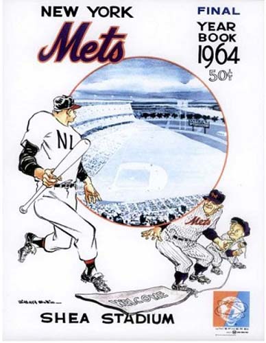
2016


Master Index of Archived Threads
Yearbook Cover Derby Round 1.14 1964 vs 2016
| 1964 | 14 votes |
| 2016 | 3 votes |
| Benjamin Grimm Apr 05 2018 07:15 AM |
|
|
| Edgy MD Apr 05 2018 07:21 AM Re: Yearbook Cover Derby Round 1.14 1964 vs 2016 |
|
I'm going to chew on this a mite bit. That may be the weakest of the Mullin covers, but the perspective seems off on the 2016 cover, which is a little bit visually challenging.
|
| Benjamin Grimm Apr 05 2018 07:26 AM Re: Yearbook Cover Derby Round 1.14 1964 vs 2016 |
|
I love the Mullin covers, although admittedly this isn't the best of them. But I doubt that I'll ever vote against a Mullin cover unless there are two of them competing against each other.
|
| dgwphotography Apr 05 2018 07:46 AM Re: Yearbook Cover Derby Round 1.14 1964 vs 2016 |
|
My God, 2015 seems so long ago....
|
| MFS62 Apr 05 2018 08:20 AM Re: Yearbook Cover Derby Round 1.14 1964 vs 2016 |
|
Willard Mullin over, well, just about any other graphic.
|
| SteveJRogers Apr 05 2018 08:28 AM Re: Yearbook Cover Derby Round 1.14 1964 vs 2016 |
|
2016 looks more like a poster than a memorabilia publication cover.
|
| G-Fafif Apr 05 2018 09:03 AM Re: Yearbook Cover Derby Round 1.14 1964 vs 2016 |
|
2016's cover is actually a triptych. Fold it out and meet nine more National League champion Mets, their manager, plus two new acquisitions and one DL holdover. Matz, Granderson, Syndergaard, Flores, Collins and d'Arnaud form the second serious as death clump (actually, Grandy is grinning), Duda, Conforto, Wheeler, Colon, Cabrera, Walker and Lagares (a smaller smile) the other. Depending on how you define the cover, it probably set a record for most Mets pictured.
|
| 41Forever Apr 05 2018 09:53 AM Re: Yearbook Cover Derby Round 1.14 1964 vs 2016 |
|
I like the 2016 cover. I do suspect that the players were shot individually and PhotoShopped together -- the lighting seems a little odd.
|
| John Cougar Lunchbucket Apr 05 2018 10:05 AM Re: Yearbook Cover Derby Round 1.14 1964 vs 2016 |
|
i always liked 64 because it played to the the idea that the Mets once upon a time considered humor and solidarity with fans as worthy pillars upon which it could build a brand. By 2016 we're completely out of humor. This cover seems to say THERE NOTHING FUCKING FUNNY ABOUT BASEBALL, IT'S ABOUT SUCCESS WHICH THESE GUYS ACHIEVED LAST YEAR AND YOU, THE FAN, SHOULD WANT SO BUY THIS SLICK TESTAMENT TO OUR BRAND VALUE, WHICH AS YOU KNOW IS SUCCESS, FORGED HERE IN OUR GRAY BASEMENT STUDIO.
|
| Edgy MD Apr 05 2018 10:34 AM Re: Yearbook Cover Derby Round 1.14 1964 vs 2016 |
|
Well, then you got me. 1964 is my vote.
|
| cooby Apr 05 2018 10:41 AM Re: Yearbook Cover Derby Round 1.14 1964 vs 2016 |
|
Looks like they’re pulling away the welcome mat
|
| Benjamin Grimm Apr 05 2018 10:42 AM Re: Yearbook Cover Derby Round 1.14 1964 vs 2016 |
|
There's something strange about center field in that photo. It's oddly truncated. I'm not at all sure what's going on.
|
| dinosaur jesus Apr 05 2018 10:42 AM Re: Yearbook Cover Derby Round 1.14 1964 vs 2016 |
|
That 1964 cover is so screwed up, it's hard to figure out what's going on. It's like they took a simple gag and tried to work so many things into it that it turned surreal. The welcome mat gag is actually pretty clever--the Mets are pulling the rug out from under the rest of the league and showing that they're not doormats anymore. But a doormat should be in front of a door. Instead, there's a circle with a view of Shea. Maybe it was originally supposed to be a door, and they decided to evoke the World's Fair by making it look like the World's Fair globe (though it doesn't really). But then it doesn't register as a door, which makes the doormat nonsensical. And Casey is supposed to be hiding behind the door/globe, but it looks instead like he's straining to support it on his shoulders, like Atlas. Which means the huge visiting player is Hercules, and Casey is going to try to trick him into taking the globe from him? Probably not, but who knows? The visiting player is supposed to be distracted by the magnificence of Shea, so Casey and the kid can take advantage of him. And why shouldn't he be distracted? Shea seems to be contained within a floating bubble, as if a portal to another dimension had suddenly appeared. (It looks like the crystal egg in an H. G. Wells story, in which you can see Mars.) I'd like to think that that bubble is still bobbing around somewhere, and inside it's still Shea Stadium in 1964.
|
| Edgy MD Apr 05 2018 10:45 AM Re: Yearbook Cover Derby Round 1.14 1964 vs 2016 |
|
dj pretty much sums up what I was saying far more eloquently.
|
| d'Kong76 Apr 05 2018 11:40 AM Re: Yearbook Cover Derby Round 1.14 1964 vs 2016 |
|
My least favorite of the Mullin run but it still blows away the NL Champs.
|
| RealityChuck Apr 05 2018 11:48 AM Re: Yearbook Cover Derby Round 1.14 1964 vs 2016 |
|
Neither is particularly good, but Mullen is a pretty mediocre artist. He should not have been doing covers.
|
| batmagadanleadoff Apr 05 2018 11:53 AM Re: Yearbook Cover Derby Round 1.14 1964 vs 2016 |
|
If Willard Mullin came back to life and went back to doing his thing, illustrating and getting his political cartoon style pieces into the sports section of one of the NYC tabloids, the philistine Wilpons would never think to have him do the current Mets yearbook covers.
|
| batmagadanleadoff Apr 05 2018 11:53 AM Re: Yearbook Cover Derby Round 1.14 1964 vs 2016 |
|
|
I think that this is crazy talk.
|
| Benjamin Grimm Apr 05 2018 11:58 AM Re: Yearbook Cover Derby Round 1.14 1964 vs 2016 |
|
Yeah, I think Mullin is great. I wish he had done every cover for the last 57 seasons.
|
| d'Kong76 Apr 05 2018 12:02 PM Re: Yearbook Cover Derby Round 1.14 1964 vs 2016 |
|
|
Heart palpitations, where are my pills...
|
| Zvon Apr 05 2018 03:37 PM Re: Yearbook Cover Derby Round 1.14 1964 vs 2016 |
|
|
That's an architects drawing. 
|
| batmagadanleadoff Apr 05 2018 03:43 PM Re: Yearbook Cover Derby Round 1.14 1964 vs 2016 |
||
|
That's right. That was a conceptual drawing of Flushing Stadium that was circulating since 1962, appearing in media, promotional materials, Rheingold sponsored schedules, etc.. Given the lead time needed to publish a yearbook in 1964, that rendering might've been the best the organization could've come up with.
|
