Apr 06 2018 05:14 AM

1980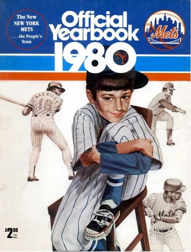
1999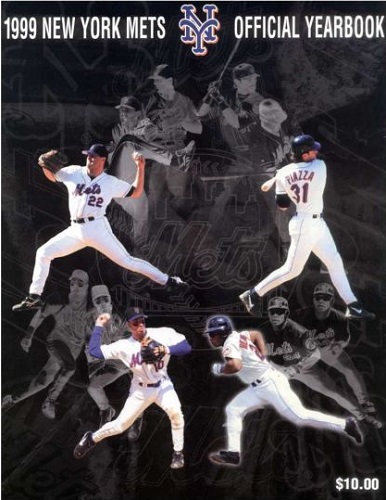


Master Index of Archived Threads
Yearbook Cover Derby Round 1.15 1980 vs 1999
| 1980 | 3 votes |
| 1999 | 16 votes |
| Benjamin Grimm Apr 06 2018 05:14 AM |
|
|
| SteveJRogers Apr 06 2018 05:26 AM Re: Yearbook Cover Derby Round 1.15 1980 vs 1999 |
|
Meh to both, but 1999 gets the nod due to two HOFers and a better “ace†depicted.
|
| John Cougar Lunchbucket Apr 06 2018 05:44 AM Re: Yearbook Cover Derby Round 1.15 1980 vs 1999 |
|
I felt like the Rockwellian image was overdone. No kid wore his shoelaces that way in 1980. And check out the slogan they trotted out once and only once: "The People's Team" Soon enough they'd stumble onto "Magic" and make it disappear.
|
| Edgy MD Apr 06 2018 06:07 AM Re: Yearbook Cover Derby Round 1.15 1980 vs 1999 |
|
Both better in concept than execution. 1980 ... why is the kid in color and the Mets figures in black and white? Why does Craig Swan look like a late middle-aged guy climbing up his basement stairs?
|
| 41Forever Apr 06 2018 06:26 AM Re: Yearbook Cover Derby Round 1.15 1980 vs 1999 Edited 1 time(s), most recently on Apr 06 2018 07:03 AM |
|
The 1980 cover is my least favorite. You don't become the People's Team by proclaiming it yourself. You have to earn that. And the drawing? Yuck. I suspect they were going for something like the 1968 All-Star Game cover -- and missed wildly.
|
| MFS62 Apr 06 2018 06:53 AM Re: Yearbook Cover Derby Round 1.15 1980 vs 1999 |
|
Let's party like its 1999.
|
| Benjamin Grimm Apr 06 2018 06:59 AM Re: Yearbook Cover Derby Round 1.15 1980 vs 1999 |
|
That 1980 cover is hideous. The weird looking kid in the weird looking chair in the weird contorted position. And the three figures of Mets players look like somebody traced them from photographs. The NY insignia in the boy's cap filling the zero in the year is also weird.
|
| John Cougar Lunchbucket Apr 06 2018 08:19 AM Re: Yearbook Cover Derby Round 1.15 1980 vs 1999 |
|
"Masterbating while using photoshop" I'm gonna steal that line and pretend it was mine someday
|
| d'Kong76 Apr 06 2018 08:20 AM Re: Yearbook Cover Derby Round 1.15 1980 vs 1999 |
|
That kid is freakishly disturbing. He always was. My guess is he's wrap-
|
| batmagadanleadoff Apr 06 2018 08:33 AM Re: Yearbook Cover Derby Round 1.15 1980 vs 1999 |
|
I hated that kid and that cover, too. So much so, that I didn't buy that yearbook, just on the basis of that ugly cover. It was the first time that I didn't buy a Mets yearbook in the same year of its publication since I became a fan. (Though I'd end up acquiring it many years later to fulfill my completist sensibilities).
|
| G-Fafif Apr 06 2018 12:22 PM Re: Yearbook Cover Derby Round 1.15 1980 vs 1999 |
|
The 1980 cover always struck me as a rush job in the most literal sense. The team was sold in late January, a new GM (who oversaw everything, at least at first) took over in February, the season opened in early April. "Fellas, what are we gonna do for a yearbook cover?" was probably not among the first hundred questions asked. I appreciated the concept here, the idea that the Mets stood for good ol' baseball, but was that where their perception problems languished after the late '70s? "The People's Team" I took as a shot at the MFYs, a precursor of Curtis Granderson's pithy "True New Yorkers" are Mets fans comment and a reflection of New York being a National League town and whatever goodwill there was to be ladled from residual affection for the Mets' roots. Somewhere I have a button, bought at Shea in 1980, hailing the New Mets (25 years before Beltran and Boras). I think they were rushing around, trying to come up with something that said there's a reason you used to like us, there's a reason you used to come out to Shea, we're not the fucking de Roulets...give us and ours a try. And it was probably before Della Femina hit on The Magic is Back.
|
| MFS62 Apr 06 2018 06:28 PM Re: Yearbook Cover Derby Round 1.15 1980 vs 1999 |
|
|
[Ben wrote] It's yet another example from that era of somebody masturbating while using Photoshop |
| cooby Apr 08 2018 01:19 PM Re: Yearbook Cover Derby Round 1.15 1980 vs 1999 |
|
Little boy
|
| RealityChuck Apr 08 2018 05:02 PM Re: Yearbook Cover Derby Round 1.15 1980 vs 1999 |
|
Much better graphics in 1999.
|
