Apr 08 2018 05:01 AM

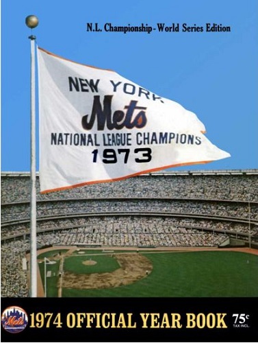
1974
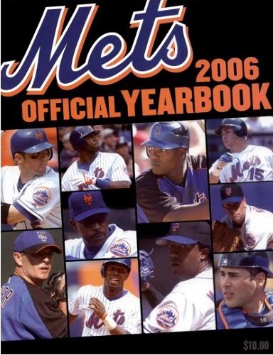
2006


Master Index of Archived Threads
Yearbook Cover Derby Round 1.17 1974 vs 2006
| 1974 | 13 votes |
| 2006 | 3 votes |
| Benjamin Grimm Apr 08 2018 05:01 AM |
|
|
| MFS62 Apr 08 2018 05:45 AM Re: Yearbook Cover Derby Round 1.17 1974 vs 2006 |
|
This is a toughie because they are both good.
|
| Benjamin Grimm Apr 08 2018 06:27 AM Re: Yearbook Cover Derby Round 1.17 1974 vs 2006 |
|
The 2006 cover is appealing, but it's little different from most of the other covers from the recent era. I do appreciate that we're moving past the era of overly digitally edited images, so I guess this cover gets points for that. But I prefer the simplicity of a championship flag flying over Shea Stadium. I could very well have gone with 2006, but 1974 gets my vote.
|
| dgwphotography Apr 08 2018 06:41 AM Re: Yearbook Cover Derby Round 1.17 1974 vs 2006 |
|
As one of my first yearbooks, 1974 is a sentimental favorite.
|
| Edgy MD Apr 08 2018 06:51 AM Re: Yearbook Cover Derby Round 1.17 1974 vs 2006 |
|
I don't like it. The perspective of the flag is cold and removed and terrifyingly high. "N.L. Championship - World Series Edition" doesn't know whether it wants to be centered or flush right and winds up being neither. It uses a hyphen where it means to use an m-dash, because somebody just doesn't give a shit. It's a subtitle that is up top where the publication's title should be, and it frankly isn't particularly clear about what it's trying to say.
|
| G-Fafif Apr 08 2018 08:03 AM Re: Yearbook Cover Derby Round 1.17 1974 vs 2006 |
|
2006 offers quite the collection of talented players. If you wish to order one, be sure to flip through the accompanying catalogue and call the toll-free number to get yours today.
|
| Edgy MD Apr 08 2018 08:36 AM Re: Yearbook Cover Derby Round 1.17 1974 vs 2006 |
|
That yearbook frequently appears on ebay as a 1973.
|
| Benjamin Grimm Apr 08 2018 09:14 AM Re: Yearbook Cover Derby Round 1.17 1974 vs 2006 |
|
I think the m-dash thing will really come back to haunt this 1974 cover if it advances to the second round.
|
| SteveJRogers Apr 08 2018 10:49 AM Re: Yearbook Cover Derby Round 1.17 1974 vs 2006 |
|
Agreeing with Edgy’s points. ‘74 seems way too understated in terms of telling the story. Granted some 23 years later the title would be reflected in just a logo on a pinstriped background, but still.
|
| batmagadanleadoff Apr 08 2018 11:59 AM Re: Yearbook Cover Derby Round 1.17 1974 vs 2006 |
|
|
What does this mean? And how do you know that the picture is from game three of the WS? And if it's evening, why is the sky so blue? And how come you're not complaining that there was no right field flagpole at Shea Stadium and that the flags flew in center field? Or that the field looks like a ghost town with not a single player on it? Is that the ultimate game of shadow-ball taking place on a diamond? And are you gonna deduct points from this post because I used an em dash?
|
| d'Kong76 Apr 08 2018 12:34 PM Re: Yearbook Cover Derby Round 1.17 1974 vs 2006 |
|
I'll always love the 1974 cover. I had the team picture from the back of this book
|
| batmagadanleadoff Apr 08 2018 12:38 PM Re: Yearbook Cover Derby Round 1.17 1974 vs 2006 |
|
|
Me too. I'll go so far as to say that it's my favorite Mets yearbook cover of the 70s and perhaps, my all time non-illustrated Mets yearbook cover favorite. I'll have to give that last claim some more thought.
|
| cooby Apr 08 2018 01:16 PM Re: Yearbook Cover Derby Round 1.17 1974 vs 2006 |
|
Pennant
|
| Zvon Apr 08 2018 01:54 PM Re: Yearbook Cover Derby Round 1.17 1974 vs 2006 |
||
|
Me three. It encapsulates the essential.
|
| SteveJRogers Apr 08 2018 02:31 PM Re: Yearbook Cover Derby Round 1.17 1974 vs 2006 |
||
|
What in the hell are you talking about? 1) I was taking a little piss out of the composition of the cover. 2) As far as I can tell, no one, not even the MFY, Canadiens, or Celtics, would be so in your face arrogant as to raise a flag banner as they try to improve on what they had won the previous series. 3) Even if the sky color was changed for the composite photo, its still a plain Shea, with no lights on, both would be indicators of being on a pre-WS game October evening.
|
| SteveJRogers Apr 08 2018 02:38 PM Re: Yearbook Cover Derby Round 1.17 1974 vs 2006 |
|
4) You can see at least umps on the field, and you can make out what probably is the 1969 banner there in RF, so what ARE you babbling about?
|
| G-Fafif Apr 08 2018 02:40 PM Re: Yearbook Cover Derby Round 1.17 1974 vs 2006 |
|
The Mets quietly raised an NL East flag during the final regular-season series of 2015. No ceremony, just acknowledgment that the division had been won. It went into storage after the season, replaced in right field by the NL pennant.
|
| RealityChuck Apr 08 2018 05:03 PM Re: Yearbook Cover Derby Round 1.17 1974 vs 2006 |
|
1974. The flag says it all.
|
| SteveJRogers Apr 08 2018 05:37 PM Re: Yearbook Cover Derby Round 1.17 1974 vs 2006 |
|
|
[Carson]I DID NOT know that![/Carson] Still doesn't take away from my thoughts =;)
|
| 41Forever Apr 08 2018 07:15 PM Re: Yearbook Cover Derby Round 1.17 1974 vs 2006 |
|
Both are good. I like the composite photo of the pennant and the stadium. One of my favorites when I was a kid.
|