Apr 09 2018 04:34 AM

1969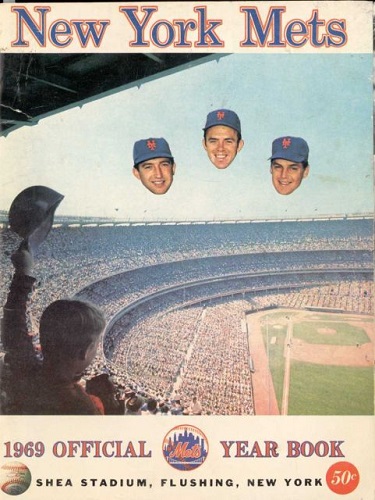
2011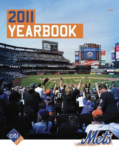


Master Index of Archived Threads
Yearbook Cover Derby Round 1.18 1969 vs 2011
| 1969 | 5 votes |
| 2011 | 14 votes |
| Benjamin Grimm Apr 09 2018 04:34 AM |
|
|
| John Cougar Lunchbucket Apr 09 2018 05:29 AM Re: Yearbook Cover Derby Round 1.18 1969 vs 2011 |
|
I never got the disembodied head thing. The helmet-day thing might work better without them.
|
| Lefty Specialist Apr 09 2018 06:09 AM Re: Yearbook Cover Derby Round 1.18 1969 vs 2011 |
|
I chose 1969 for the creepiness of the Koosman, Grote and Seaver dirigibles. And because, hey, 1969.
|
| Benjamin Grimm Apr 09 2018 07:05 AM Re: Yearbook Cover Derby Round 1.18 1969 vs 2011 |
|
Although I have more affection for Shea than for Citi, I went with 2011. It's a better photo, and 1969 loses points for the creepy floating heads. Both are about the fan experience at the ballpark, but I think 2011 does it better.
|
| MFS62 Apr 09 2018 07:07 AM Re: Yearbook Cover Derby Round 1.18 1969 vs 2011 |
|
1969 was the better year, but not the better cover.
|
| dgwphotography Apr 09 2018 07:11 AM Re: Yearbook Cover Derby Round 1.18 1969 vs 2011 |
|
I don’t get the floating heads thing either, but 2011 loses points for the citi logo, and Shea will always beat shitty field
|
| 41Forever Apr 09 2018 07:15 AM Re: Yearbook Cover Derby Round 1.18 1969 vs 2011 |
|
Interesting that in 1969, we get a view from the upper deck, but in 2011 it's the expensive seats behind home plate. And it's nice that that kid is is saluting the disembodied heads of his heroes. It's like no one can see them but him.
|
| SteveJRogers Apr 09 2018 08:56 AM Re: Yearbook Cover Derby Round 1.18 1969 vs 2011 |
|
I’m going with the first instance of color photography on the cover, Shea, and first player photos.
|
| RealityChuck Apr 09 2018 09:34 AM Re: Yearbook Cover Derby Round 1.18 1969 vs 2011 |
|
Two excellent examples. I finally went for 2011 since disembodied heads are creepy.
|
| Valadius Apr 09 2018 09:37 AM Re: Yearbook Cover Derby Round 1.18 1969 vs 2011 |
|
2011. 1969 would have had my vote if not for the creepy heads that look like they've been clipped out of a magazine by a serial killer or a teenage fangirl.
|
| d'Kong76 Apr 09 2018 10:36 AM Re: Yearbook Cover Derby Round 1.18 1969 vs 2011 |
|
I don't find the floating noggins creepy but rather goofy looking. 1969 is
|
| G-Fafif Apr 09 2018 12:09 PM Re: Yearbook Cover Derby Round 1.18 1969 vs 2011 |
|
Three 1968 All-Stars are rising over Shea Stadium and with them our hopes. At least that's my interpretation of the floating heads. It's the first time the Mets have featured players on the cover of their yearbook. Maybe they wanted to hedge (or head) their bets by doing it this way. They weren't yet established veteran stars, so let's not use their bodies.
|
| cooby Apr 09 2018 12:17 PM Re: Yearbook Cover Derby Round 1.18 1969 vs 2011 |
|
69 for the sheer hilarity of it
|
| batmagadanleadoff Apr 09 2018 12:51 PM Re: Yearbook Cover Derby Round 1.18 1969 vs 2011 |
|
The floating disembodied heads don't bother me as much as they seem to bother some of youse. Still, they don't mix well with rest of the design cover. I would've voted for the '69 cover if not for the heads. It's a nice enough shot and I like the effect that the film stock gives off, which Is reminiscent of the photography of its time and doesn't remind me of a Kodak Instamatic.
|
| G-Fafif Apr 09 2018 01:47 PM Re: Yearbook Cover Derby Round 1.18 1969 vs 2011 |
|
The protective screen behind home plate seems to have been magically removed from the 2011 cover. Enjoy sitting close at your own risk.
|
| d'Kong76 Apr 09 2018 01:52 PM Re: Yearbook Cover Derby Round 1.18 1969 vs 2011 |
|
It's there, look at the sky to the left of CitiField on the scoreboard and
|
| G-Fafif Apr 09 2018 01:56 PM Re: Yearbook Cover Derby Round 1.18 1969 vs 2011 |
|
|
Ah, OK, I see it. Thanks for the guidance. The 2011 Mets: We wouldn't pretend something that's there isn't.
|
| Benjamin Grimm Apr 09 2018 02:08 PM Re: Yearbook Cover Derby Round 1.18 1969 vs 2011 |
|
2011 has a healthy 13 to 5 lead. I have a hunch that it may end up being the only cover from the current decade to advance to the second round. (2010 and 2017 have already been eliminated, and 2013 and 2016 are currently in dire straits.)
|
| cooby Apr 09 2018 02:31 PM Re: Yearbook Cover Derby Round 1.18 1969 vs 2011 |
|
Damn. Isnt there some way we can keep the 1969 one in play? It's just too funny to forget
|
| Benjamin Grimm Apr 09 2018 02:38 PM Re: Yearbook Cover Derby Round 1.18 1969 vs 2011 |
|
It will live forever in our hearts.
|
| Zvon Apr 09 2018 04:01 PM Re: Yearbook Cover Derby Round 1.18 1969 vs 2011 |
|
|
lmao. This is just classic. If 2011 didn't include the best logo known to man and the universe to offset the DOMINO'S FIELD LOGO I would have gone with '69. Yea, it's only on the scoreboard, and the '69 does have the logo as well, but that beautiful image of Shea get's me. The disembodied heads look so creepy. If they decapitated the entire team and floated 'em it may have come across better. Picture those old Topps team cards for the Chicago Cubs. For a number of years it was only just their heads pictured. [fimg=300]https://pulpephemera.files.wordpress.com/2015/10/1971-topps-chicago-cubs-team-502.jpg[/fimg]
|
| Edgy MD Apr 09 2018 04:27 PM Re: Yearbook Cover Derby Round 1.18 1969 vs 2011 |
|
|
I take a back seat to no man in my love and defense of Shea, but I want to go on record with my position that Shea with the guillotined heads of Tom Seaver, Jerry Koosman, and Jerry Grote suspended from the rafters does NOT beat Citi Field.
|