Apr 11 2018 04:24 AM

1971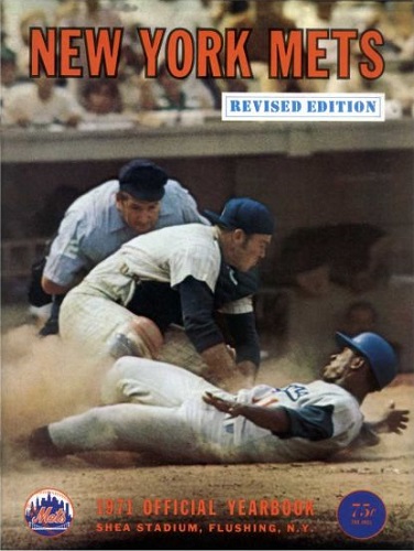
2009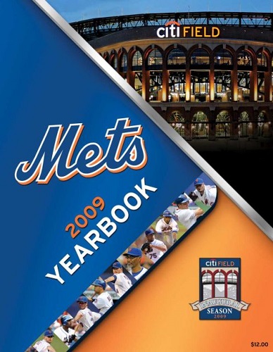


Master Index of Archived Threads
Yearbook Cover Derby Round 1.20 1971 vs 2009
| 1971 | 14 votes |
| 2009 | 5 votes |
| Benjamin Grimm Apr 11 2018 04:24 AM |
|
|
| Benjamin Grimm Apr 11 2018 04:39 AM Re: Yearbook Cover Derby Round 1.20 1971 vs 2009 |
|
1971 was my first Mets yearbook. I was eight years old and I utterly destroyed my first copy with all of the attention I gave it. (Many years later I bought a replacement copy. I still have the original.)
|
| John Cougar Lunchbucket Apr 11 2018 04:50 AM Re: Yearbook Cover Derby Round 1.20 1971 vs 2009 |
|
I just determined the time and place of that 71 cover: July 25, 1970, 6th inning.
|
| batmagadanleadoff Apr 11 2018 07:06 AM Re: Yearbook Cover Derby Round 1.20 1971 vs 2009 |
|
|
That's Shag Crawford doing the home plate umping. The '71 is the first Mets yearbook I got at the ballgame, which I probably devoured during BP, including the informational blurb providing details of the cover photo.
|
| Frayed Knot Apr 11 2018 07:15 AM Re: Yearbook Cover Derby Round 1.20 1971 vs 2009 |
|
So the 'Revised Edition' was the one they put out after they went to the replay review on that play at the plate?
|
| Edgy MD Apr 11 2018 07:19 AM Re: Yearbook Cover Derby Round 1.20 1971 vs 2009 |
|
I like how Mota is signaling himself safe but Crawford hasn't made his call yet. An obvious parallel with 1978 but this time the guy is out.
|
| SteveJRogers Apr 11 2018 08:00 AM Re: Yearbook Cover Derby Round 1.20 1971 vs 2009 |
|
Action photo over a prospectus folder cover!
|
| RealityChuck Apr 11 2018 08:01 AM Re: Yearbook Cover Derby Round 1.20 1971 vs 2009 |
|
1971. The action photo works far better than the static (and ultimately too busy) graphic.
|
| MFS62 Apr 11 2018 08:03 AM Re: Yearbook Cover Derby Round 1.20 1971 vs 2009 |
|
The 1971 action shot would be good on the back page of the daily paper, but not on a year book.
|
| A Boy Named Seo Apr 11 2018 08:08 AM Re: Yearbook Cover Derby Round 1.20 1971 vs 2009 |
|
I'm trying to think if I've ever seen that 71 before. I don't remember the "REVISED EDITION" stamp. Awesome photo.
|
| 41Forever Apr 11 2018 08:37 AM Re: Yearbook Cover Derby Round 1.20 1971 vs 2009 |
|
The 1971 yearbook was my first one. Seven-yer-old me probably learned more about reading by studying that yearbook than I did from any text we had in school.
|
| Edgy MD Apr 11 2018 08:43 AM Re: Yearbook Cover Derby Round 1.20 1971 vs 2009 |
|
The layout of the 2009 cover is visual reference to the much-reviled Citi Field Dominos logo.
|
| A Boy Named Seo Apr 11 2018 09:33 AM Re: Yearbook Cover Derby Round 1.20 1971 vs 2009 |
|
|
Ah, yes. The reference suxxx, too.
|
| John Cougar Lunchbucket Apr 11 2018 09:37 AM Re: Yearbook Cover Derby Round 1.20 1971 vs 2009 |
|
|
I like this idea. Now, get to work on it.
|
| Benjamin Grimm Apr 11 2018 10:00 AM Re: Yearbook Cover Derby Round 1.20 1971 vs 2009 |
|
What year was the famous collision between John Stearns and Dave Parker?
|
| SteveJRogers Apr 11 2018 10:06 AM Re: Yearbook Cover Derby Round 1.20 1971 vs 2009 |
|
|
“We learned more from a baseball team’s yearbook baby, then we ever learned in school...†Doesn’t have the same feel as “three minute record†;)
|
| G-Fafif Apr 11 2018 01:08 PM Re: Yearbook Cover Derby Round 1.20 1971 vs 2009 |
|
That silver bar separating the artist's rendering of Citi Field from the rest of the 2009 cover is symbolic. It's there to tell us you need the correct ticket to ascend to the exclusive provinces of the new world class home of the New York Mets. Even the players who are taking that UP escalator toward the Ebbets Club are running into the barrier and needing to show they belong.
|
| cooby Apr 11 2018 01:49 PM Re: Yearbook Cover Derby Round 1.20 1971 vs 2009 |
|
Grote
|
| Frayed Knot Apr 11 2018 02:27 PM Re: Yearbook Cover Derby Round 1.20 1971 vs 2009 |
|
|
To the max
|