Apr 14 2018 04:21 AM

1972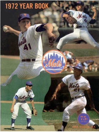
2008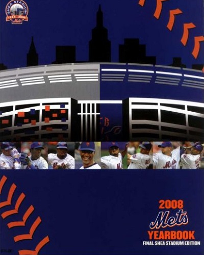


Master Index of Archived Threads
Yearbook Cover Derby Round 1.23 1972 vs 2008
| 1972 | 14 votes |
| 2008 | 3 votes |
| Benjamin Grimm Apr 14 2018 04:21 AM |
|
|
| SteveJRogers Apr 14 2018 06:39 AM Re: Yearbook Cover Derby Round 1.23 1972 vs 2008 |
|
Sweet full bleed color action shots > financial prospectus cover.
|
| Edgy MD Apr 14 2018 06:46 AM Re: Yearbook Cover Derby Round 1.23 1972 vs 2008 |
|
Steve's got it. 2008 definitely says, "An investment in the Mets is a safe, conservative addition to your portfolio. From energy innovation to agrobusiness expansion, the Mets are securing smart foundations for a prosperous tomorrow."
|
| Benjamin Grimm Apr 14 2018 06:46 AM Re: Yearbook Cover Derby Round 1.23 1972 vs 2008 |
|
I love the jigsaw-puzzle feel of the 1972 cover. It gets my vote.
|
| 41Forever Apr 14 2018 07:53 AM Re: Yearbook Cover Derby Round 1.23 1972 vs 2008 |
|
I disagree on this one. I like the 2008 cover, with the divided Shea. The Shea patch was one of the best patch designs the Mets have ever had and the cover echos that.
|
| d'Kong76 Apr 14 2018 08:35 AM Re: Yearbook Cover Derby Round 1.23 1972 vs 2008 |
|
Despite the corporate feel, the 2008 isn't that bad. I took 1972 though, tough to
|
| SteveJRogers Apr 14 2018 08:59 AM Re: Yearbook Cover Derby Round 1.23 1972 vs 2008 |
|
Its a shame it wasn’t until 1977 that the Mets swapped covers when the Revised version came out (next year would be jarring looking at Fregosi on the cover during the pennant run when he was gone by early July) because a Mays cover riding the year out would have been sweet.
|
| G-Fafif Apr 14 2018 10:48 AM Re: Yearbook Cover Derby Round 1.23 1972 vs 2008 |
|
2008, as pictured above, is a revised edition without saying exactly that. It's the FINAL SHEA STADIUM edition. Manuel is in for Randolph (who was on the one they sold at the beginning of the season) and Wright is wearing the Final Season patch (which he wasn't on the earlier cover). I can't speak for the contents, though I imagine if they changed the cover, they probably slipped Willie out of the manager's page.
|
| RealityChuck Apr 14 2018 12:48 PM Re: Yearbook Cover Derby Round 1.23 1972 vs 2008 |
|
1972 did a great job of matching up action pictures, one of the few where it really works.
|
| Zvon Apr 14 2018 03:48 PM Re: Yearbook Cover Derby Round 1.23 1972 vs 2008 |
|
|
These early 70's YB covers, these that I bought myself at Shea, are just too nostalgic to be overcome.
lol. Yep, that about covers it.
|
| Benjamin Grimm Apr 14 2018 03:51 PM Re: Yearbook Cover Derby Round 1.23 1972 vs 2008 |
|
Here's something that's nothing short of fascinating that I just discovered.
|
| G-Fafif Apr 14 2018 04:00 PM Re: Yearbook Cover Derby Round 1.23 1972 vs 2008 |
|
|
It has! I've noticed the space along the way, especially today with '72, but I never thought of it as a thing. But I guess it is.
|
| cooby Apr 14 2018 05:02 PM Re: Yearbook Cover Derby Round 1.23 1972 vs 2008 |
|
72 was my first
|
| Edgy MD Apr 14 2018 05:50 PM Re: Yearbook Cover Derby Round 1.23 1972 vs 2008 |
||
|
Everything about the game evolves this way. Base Ball became Base-Ball became Baseball. Home Run became Home-Run became Homerun. First Baseman became First-Baseman became Firstbaseman. Etc. Sometimes they skip the intermediate hyphenation step, but you get the drift. The world is contracting.
|
| d'Kong76 Apr 14 2018 05:53 PM Re: Yearbook Cover Derby Round 1.23 1972 vs 2008 |
|
Edgy sits back and says, "amiright?"
|
| 41Forever Apr 14 2018 07:24 PM Re: Yearbook Cover Derby Round 1.23 1972 vs 2008 |
|
|
Damn! I never noticed that.
|
| Valadius Apr 16 2018 09:59 AM Re: Yearbook Cover Derby Round 1.23 1972 vs 2008 |
|
I get plenty of annual reports from hospitals and health care advocacy groups. I want something that says baseball, not how many donated kidneys you received.
|