Apr 16 2018 04:27 AM

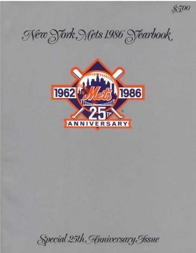
1986
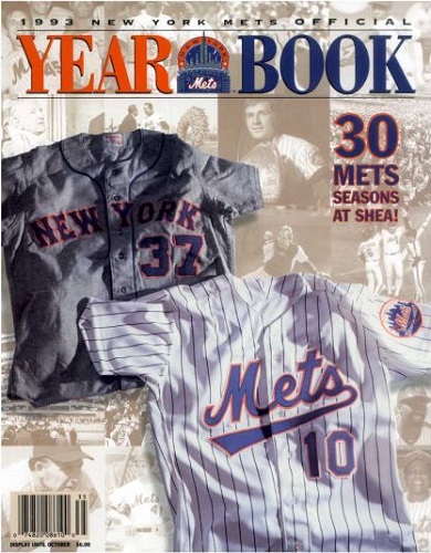
1993


Master Index of Archived Threads
Yearbook Cover Derby Round 1.25 1986 vs 1993
| 1986 | 12 votes |
| 1993 | 7 votes |
| Benjamin Grimm Apr 16 2018 04:27 AM |
|
|
| 41Forever Apr 16 2018 06:36 AM Re: Yearbook Cover Derby Round 1.25 1986 vs 1993 |
|
Normally I like covers that focus on uniform elements. But those tail jerseys were an abomination. The Mets wordmark was constant since 1962 and they went and screwed it up. Who signed off on that?
|
| batmagadanleadoff Apr 16 2018 07:24 AM Re: Yearbook Cover Derby Round 1.25 1986 vs 1993 |
|
Is this the Mets yearbook cover derby or the Mets jersey derby? What are we supposed to be judging here? Anyway, the 1993 Mets jerseys with the tails/flourishes aren't ugly. They're classic baseball jersey design -- perhaps the most common uni front design in the sport's history -- the team name in cursive script and underlined. If the Mets went with that design in 1962 ( and actually, they did, up until the 11th hour) ugly would've been about the last word used to describe the trademark. Pointless? Probably. This is around the time eff Wilpon asserted himself as the team's 100% de facto owner and perhaps he wanted to mark his territory with a radical (and otherwise needless) break from tradition. The 1993 gets my vote over the boring 1986 cover. Sometimes, understated elegance doesn't cut it. And no bonus points for winning it all that season. We're voting yearbook covers here, not uniforms. And not W-L records.
|
| John Cougar Lunchbucket Apr 16 2018 07:32 AM Re: Yearbook Cover Derby Round 1.25 1986 vs 1993 |
|
Don't like either one. The silver cover thing, were the Mets getting a little too far into the 80s luxury aesthetic. I'm sure there was a copy of the 86 Yearbook in Brian Flanagan's apartment in "Cocktail."
|
| Benjamin Grimm Apr 16 2018 07:32 AM Re: Yearbook Cover Derby Round 1.25 1986 vs 1993 |
|
I voted 1993. That 1986 cover is dull and unimaginative. The 1993 cover isn't all that either, but it's a lot better than a solid-colored cover with a logo in the upper half.
|
| Edgy MD Apr 16 2018 07:43 AM Re: Yearbook Cover Derby Round 1.25 1986 vs 1993 |
|
I don't know. That shiny silver finish made it feel collectable. I felt like I was part of a class act. It spoke to me of a one-of-a-kind treasure trove of carefully curated memories and landmarks inside.
|
| Centerfield Apr 16 2018 08:31 AM Re: Yearbook Cover Derby Round 1.25 1986 vs 1993 |
|
I feel like it's hard to separate the results.
|
| seawolf17 Apr 16 2018 08:49 AM Re: Yearbook Cover Derby Round 1.25 1986 vs 1993 |
|
|
This. And I think I have like eight copies of that 1986 book floating around because I loved it.
|
| d'Kong76 Apr 16 2018 09:08 AM Re: Yearbook Cover Derby Round 1.25 1986 vs 1993 |
|
Went with the patch.
|
| RealityChuck Apr 16 2018 09:46 AM Re: Yearbook Cover Derby Round 1.25 1986 vs 1993 |
|
Two good designs, but I went with the simplicity and elegance of 1986.
|
| Valadius Apr 16 2018 09:49 AM Re: Yearbook Cover Derby Round 1.25 1986 vs 1993 |
|
1986 could have benefited from one more element on the cover. 1993 for me.
|
| SteveJRogers Apr 16 2018 10:09 AM Re: Yearbook Cover Derby Round 1.25 1986 vs 1993 |
|
Going with the simplistic style and elegant script of 1986.
|
| Centerfield Apr 16 2018 12:31 PM Re: Yearbook Cover Derby Round 1.25 1986 vs 1993 |
|
Struggling here. The '86 cover stinks, but it has a super awesome piece. But it definitely comes across as a HS kid who didn't do his semester project and pieced it together at the last minute.
|
| G-Fafif Apr 16 2018 12:51 PM Re: Yearbook Cover Derby Round 1.25 1986 vs 1993 |
|
The 25th anniversary logo was genuinely exciting to behold. (Still slightly regret not grabbing a $5 pennant featuring it when I saw it at, I think, JC Penney's 32 years ago, though the ones I bought several months later that say WORLD CHAMPIONS are fine consolation prizes.) The Mets had never before produced anything like that logo. They'd never turned 25 before. Or 24 and thus celebrated their 25th season. This was the first team-specific commemorative patch they ever wore. The World's Fair patch promoted somebody else's neighborhood shindig and the MLB patch wasn't for the Mets (though it does nicely mark any picture in which it appears as from 1969). The silver-anniversary edition of the yearbook was the ideal place to spotlight it. I believe it intentionally strove for simple elegance and achieved it.
|
| Benjamin Grimm Apr 16 2018 12:56 PM Re: Yearbook Cover Derby Round 1.25 1986 vs 1993 |
|
|
And on a day that 2011 eliminated 1969!
|
| G-Fafif Apr 16 2018 01:02 PM Re: Yearbook Cover Derby Round 1.25 1986 vs 1993 |
||
|
TWO REASONS THERE MIGHT BE A WORLD CHAMPIONSHIP CURSE! CLICK HERE!
|
| SteveJRogers Apr 16 2018 01:30 PM Re: Yearbook Cover Derby Round 1.25 1986 vs 1993 |
|
|
Doubtful, there are plenty that still harbor ill will towards the black jerseys, despite early success with 1999 and 2000, as well as 2006.
|