Apr 19 2018 05:48 AM

1975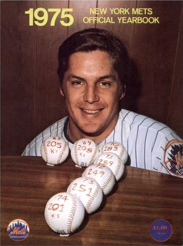
2005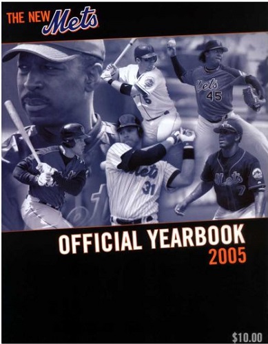


Master Index of Archived Threads
Yearbook Cover Derby Round 1.28 1975 vs 2005
| 1975 | 10 votes |
| 2005 | 5 votes |
| Benjamin Grimm Apr 19 2018 05:48 AM |
|
|
| John Cougar Lunchbucket Apr 19 2018 05:57 AM Re: Yearbook Cover Derby Round 1.28 1975 vs 2005 |
|
I never much liked the 75 cover. It's like they made Seav sit on the floor. And even then I found the round-number celebration was a little weird, overlooking the remarkable consistency. Plus he made it to 9 yet they never did it again.
|
| Lefty Specialist Apr 19 2018 06:11 AM Re: Yearbook Cover Derby Round 1.28 1975 vs 2005 |
|
I like the little pieces of chewing gum they put on the table to keep the balls from rolling away. And doing a 9 with baseballs is a lot harder than doing a 7.
|
| 41Forever Apr 19 2018 06:17 AM Re: Yearbook Cover Derby Round 1.28 1975 vs 2005 |
|
It's hard to vote against The Franchise. Ever. But I've always thought that was an odd cover. I'd hope that it was a spontaneous thing and then someone said, "Hey, let's throw that on the year book cover!" Because if that was planned, it's awful. You can see the tape holding down the balls. Then again, you have to almost admire an era when everything isn't marketed to death.
|
| Benjamin Grimm Apr 19 2018 06:30 AM Re: Yearbook Cover Derby Round 1.28 1975 vs 2005 |
|
Yes, that was Pedro's first year. And Beltran's too. Unlike in 2018, they didn't hesitate to use spring training uniforms on the yearbook cover.
|
| Edgy MD Apr 19 2018 07:09 AM Re: Yearbook Cover Derby Round 1.28 1975 vs 2005 |
|
The 2005 cover is part of a very consistent look to all their marketing materials around that time. Sleek and serious and a little bit mean. Well executed across the board. The monochromatic blue dulls the dismaying effect of all those uniform variations, but it's really hard to hide Pedro's uggo spring training togs.
|
| SteveJRogers Apr 19 2018 09:30 AM Re: Yearbook Cover Derby Round 1.28 1975 vs 2005 |
|
Still hard not to go with The Franchise’s lone solo cover.
|
| d'Kong76 Apr 19 2018 09:39 AM Re: Yearbook Cover Derby Round 1.28 1975 vs 2005 |
|
Went with Tom's not-so terrific cover. I'd rather forget that orange on
|
| G-Fafif Apr 19 2018 11:22 AM Re: Yearbook Cover Derby Round 1.28 1975 vs 2005 |
|
I learned early that 200 strikeouts was the mark of a very good pitcher. I learned it because Tom Seaver struck out 200 or more batters every year. But I'm not sure that I was acutely aware Seaver simply pitching as Seaver was the stuff of records until I saw the cover of the 1975 yearbook. It may have been the most informational cover in Mets history.
|