Apr 21 2018 04:18 AM

1965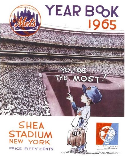
2015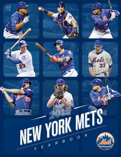


Master Index of Archived Threads
Yearbook Cover Derby Round 1.30 1965 vs 2015
| 1965 | 11 votes |
| 2015 | 2 votes |
| Benjamin Grimm Apr 21 2018 04:18 AM |
|
|
| bmfc1 Apr 21 2018 06:40 AM Re: Yearbook Cover Derby Round 1.30 1965 vs 2015 |
|
1965's cover is one of the best. In 1965, placing a drawing on top of a picture wasn't easy. I hope that there is no one here who will ask "the most what?".
|
| cooby Apr 21 2018 08:02 AM Re: Yearbook Cover Derby Round 1.30 1965 vs 2015 |
|
Really the little kid ones don't do anything for me, but the Worlds Fair emblem swung me toward 1965
|
| 41Forever Apr 21 2018 08:11 AM Re: Yearbook Cover Derby Round 1.30 1965 vs 2015 |
|
2015 is good for a modern cover. But hard to beat a new Shea.
|
| d'Kong76 Apr 21 2018 08:52 AM Re: Yearbook Cover Derby Round 1.30 1965 vs 2015 |
|
Yeah, I haven't really liked much from the 2000's but this one's kinda snappy.
|
| batmagadanleadoff Apr 21 2018 09:22 AM Re: Yearbook Cover Derby Round 1.30 1965 vs 2015 |
|
I'm with youse. I figured that if everyone's tastes are sorta like mine, the Mullins would romp in the first round. They still all might. But I like that 2015 cover. I don't have any recollection of it even though I'm certain I own a copy. It's probably one of those yearbooks I bought mainly out of habit and barely looked at. It reminds me of this pop art piece from the early 60s consisting of disembodied heads -- I can't remember the name of the work or the artist at the moment. If there was ever a yearbook candidate for a revised edition, 2015 might be the archetype. Cuddyer would be out, and Noah, Conforto, Matz and Babe Ruth Cespedes would be in.
|
| G-Fafif Apr 21 2018 11:03 AM Re: Yearbook Cover Derby Round 1.30 1965 vs 2015 |
|
2015 is a pretty smooth cover. Perhaps inspired by Hollywood Squares or The Brady Bunch. It was actually well thought out for a contemporary iteration. The corners and the center players are in blue jerseys, the top and side middle Mets are in pinstripes. They could have had fun with the tic-tac-toe nature of the design but didn't want to be too silly, apparently. That's what's missing from this decade's output, most of which hasn't been atrocious. Other than 2017's subtle but smart "we've got each other's backs" motif, there's no trace of whimsy, no playfulness, no "isn't baseball the most?" David and Curtis smiling at the bottom of the staircase the Mets were ready to start ascending in 2014 was pleasant in an obligatory sort of way. The 2012 and 2013 historical pastiches were treats as treasure hunts, but little about it popped. The 2015 team turned out to be more fun than a barrel of Mackeys (if not Mookies). Their yearbook could have been an emblem of the fun to come. Instead, it just looks handsome and then sits politely. C'mon 2015, show us your personality. It's dying to come out.
|
| Zvon Apr 21 2018 11:31 AM Re: Yearbook Cover Derby Round 1.30 1965 vs 2015 |
|
'65 wins by a logo!
|
| SteveJRogers Apr 21 2018 03:02 PM Re: Yearbook Cover Derby Round 1.30 1965 vs 2015 |
|
Mullin over an average cover of recent times.
|