|
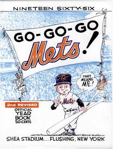
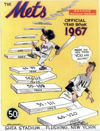
The Mets as how they wished to see themselves vs the Mets as what they aspired to become. Mets fans loving the Mets for who they were vs the Mets striving to grow into something Mets fans deserved. The Mets at the end of their infancy vs the Mets taking their first tentative steps toward maturity.
On all those grounds it's a tough call. Both covers really tell the story of the franchise on a granular level.
Graphically, I think 1966 is more striking, blending several elements into a coherent image. 1967 dares to bring us information and honesty -- and employs as its predominant color a hue that isn't readily associated with the Mets. But yellow is sunny and inherently optimistic, which is what the outlook of the upward climb is.
I love that those weird guys brandishing the banner are all GO-GO-GO Mets! no matter the record. I love that the Mets advertise their records a year earlier -- all of them. In 1967, Mullin is wrapping up the legacy of the first half-decade of Mets baseball as a keepsake for those of us to come: this is who we've been, here is where we plan on going.
And here we are, keeping it going ourselves. Yeah, I gotta go with '67.
| 


