Forum Home

Master Index of Archived Threads


Magazine Cover Derby Round 1.08


Iwo Jima (Jock Magazine) 10 votes

Look Who's In Cincy (Sports Illustrated) 4 votes

The Amazin' (Mess) Mets (Sports Illustrated) 6 votes

The Dark Knight of Gotham (Sports Illustrated) 1 votes

Benjamin Grimm
Mar 28 2019 06:23 AM

http://ultimatemets.com/covers/images/magazines/MCD.png>


Vote for the cover that you like the best. Voting will run for seven days.


Iwo Jima

Jock Magazine, October 1969.

http://ultimatemets.com/covers/magazines/19691000_JOCK.jpg>


Look Who's In Cincy

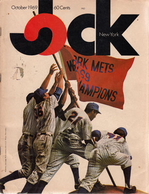
Sports Illustrated, June 27, 1977.

http://ultimatemets.com/covers/magazines/19770627_SI.jpg>


The Amazin' (Mess) Mets

Sports Illustrated, July 9, 1990.

http://ultimatemets.com/covers/magazines/19900709_SI.jpg>


The Dark Knight of Gotham

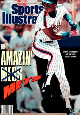
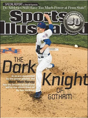
Sports Illustrated, May 20, 2013.

http://ultimatemets.com/covers/magazines/20130520_SI.jpg>

Benjamin Grimm
Mar 28 2019 06:26 AM
Re: Magazine Cover Derby Round 1.08

Even though it pictures Seaver in a Reds uniform, I included "Look Who's In Cincy" because it represents a major turning point in Mets history.

41Forever
Mar 28 2019 06:37 AM
Re: Magazine Cover Derby Round 1.08

I went with Darryl. I love the intensity of that photo, and the headline shows improvement and success.


I was always disappointed in the Harvey cover. The photo just seems hard to see and gets lost. SI has done some amazing portrait covers and that subject seemed like a good opportunity for one.


I've never heard of Jock magazine and have never seen that cover. Great find!

kcmets
Mar 28 2019 06:49 AM
Re: Magazine Cover Derby Round 1.08

I don't remember JOCK either. I just read a blurb on Collector's Weekly that it

was their first cover (and it came with a poster of that picture?) and the magazine

only lasted about a year. Went with that one.

Johnny Lunchbucket
Mar 28 2019 07:33 AM
Re: Magazine Cover Derby Round 1.08

I'm afraid what I'd find if I searched for "Jock" magazine today. And that logo, um...


Harvey cover is WAY too overdesigned that goes without saying; but the Strawberry cover is too. I think crossouts only work with a freehand kinda font. Also the pun just isn't so great that you have to go such lengths to make it. I'd have played it straight there: THE REBOUNDING METS or something.


As a cover, the Seaver is a good cover. He casts the perfect expression of a determined, exhausted and dislocated guy; there's immediacy to the headline and the RED just screams like blood. Back then it was still possible people learned of big trades in a weekly magazine.

Edgy MD
Mar 28 2019 07:54 AM
Re: Magazine Cover Derby Round 1.08

I came across that JOCK cover a few weeks ago and I thought "That's some artwork. I bet that will go far in the cover derby." I even thought that might be a good model for a statue at Citi.


And then I reversed course. I wondered if a proud marine like Seaver, or even a not-so-proud marine like McGraw, would find it in good taste. And a WWII marine vet like Hodges might be a little put out. That Iwo Jima isn't something worthy of parody.


I mean, if that went up as a statue at Citi Field, it'd be really cool for the first few weeks, and then by year two it'd become kind of embarrassing, and maybe pathetic by year four or five. It'd be like making a statue out of Don Zimmer in his army helmet on the Yankee bench. Ya gotta do two things. Ya gotta believe, and ya gotta be careful with war metaphors.

batmagadanleadoff
Mar 28 2019 08:12 AM
Re: Magazine Cover Derby Round 1.08

Benjamin Grimm wrote:

Even though it pictures Seaver in a Reds uniform, I included "Look Who's In Cincy" because it represents a major turning point in Mets history.


I agree. I've always considered that cover more of a Mets cover than a Reds cover. The trade was such a painful event in Mets history, and the cover and Seaver's expression seems to capture the poignancy of it all. Seaver is now a Red, but apparently, grudgingly so. Plus, the red in the Reds uniform contrasts nicely with the green background of the Olympic Stadium dugout.. This cover gets my vote. Plus, it's a vote against this absurd policy of upliftingness.


This is a minor point but that Strawberry cover always annoyed me, the way the top of Straw's head and helmet is cropped out. It's one of those annoying flaws, that once I noticed it that's all I seem to see with that cover.


The Harvey cover, when contrasted with the Seaver cover, illustrates the demise of SI, with its cluttered composition, and practically an entire page worth of text on the cover and (though you can't tell from that photo) the shrunken footprint and cheaper quality paper stock.

kcmets
Mar 28 2019 09:03 AM
Re: Magazine Cover Derby Round 1.08

=batmagadanleadoff post_id=5345 time=1553782323 user_id=68]This cover gets my vote. Plus, it's a vote against this absurd policy of upliftingness.


There's no such policy in place, it's all in your downdroppingness mind.

batmagadanleadoff
Mar 28 2019 09:15 AM
Re: Magazine Cover Derby Round 1.08

=kcmets post_id=5357 time=1553785429 user_id=53]
=batmagadanleadoff post_id=5345 time=1553782323 user_id=68]This cover gets my vote. Plus, it's a vote against this absurd policy of upliftingness.


There's no such policy in place, it's all in your downdroppingness mind.

No, its not in my mind. It exists and you know it exists. Just because you might not adhere to it, and I definitely don't, it's there. But there you go, denying what everyone can read for themselves, just to take a position that contradicts mine.

Edgy MD
Mar 28 2019 09:33 AM
Re: Magazine Cover Derby Round 1.08

It's entertaining to think these were taken in consecutive at-bats by different photographers seated near each other.


http://ultimatemets.com/covers/magazines/19900709_SI.jpg> http://ultimatemets.com/covers/magazines/19891100_BD.jpg>

Edgy MD
Mar 28 2019 09:35 AM
Re: Magazine Cover Derby Round 1.08


This cover gets my vote. Plus, it's a vote against this absurd policy of upliftingness.

There's no such policy in place, it's all in your downdroppingness mind.

No, its not in my mind. It exists and you know it exists. Just because you might not adhere to it, and I definitely don't, it's there. But there you go, denying what everyone can read for themselves, just to take a position that contradicts mine.

"Everyone" does not equal "you," Homes.

G-Fafif
Mar 28 2019 09:55 AM
Re: Magazine Cover Derby Round 1.08

Every one of these covers is a real moment in time. Two players at their Mets peak, one having put it all behind him and the team itself inspiring creative directors all over town by its exploits.


I went with Jock, probably because the fact that magazine existed and the Mets' success drove it has always fascinated me. 1969 couldn't have been any better for glossy paper stock.


The Reds cover forever haunts me. Agreed it belongs here, just as Marv Albert and Art Shamsky belonged at the Big O to broadcast Seaver's first Cincy start on the Saturday that followed the Wednesday Night Massacre.


Darryl uncoiling was Fun-Tak'd across from my desk for about five years. It was replaced by Junior beating the MFYs in the 1995 playoffs.


The Harvey cover was validation if not a harbinger of things to come beyond August of 2013. I remember thinking, as I occasionally do, "he/they oughta be on the cover of SI," and son of a gun, it happened. I had the same sense with the 1999 infield.

Edgy MD
Mar 28 2019 10:07 AM
Re: Magazine Cover Derby Round 1.08

It kind of says something about the difference in the SI photo philosophy. That shot has to be from the first inning. The mound is impeccable, his home whites are spotless, there's no tobacco juice on his chin ... even the resin bag doesn't have a little poof of an aura from it's soft explosion upon being dropped.


A classic Sports Illustrated cover would capture the pitcher throwing deep into the game. In the heat of battle but finding something more.


https://dasg7xwmldix6.cloudfront.net/episodes/234943_OWyUE8bS.jpg>

Centerfield
Mar 28 2019 11:29 AM
Re: Magazine Cover Derby Round 1.08

Nobody has ever looked as good loading as Darryl. Ever.


http://ultimatemets.com/covers/magazines/19900709_SI.jpg>

Lefty Specialist
Mar 30 2019 08:12 AM
Re: Magazine Cover Derby Round 1.08

I went Iwo.

Zvon
Mar 31 2019 12:37 PM
Re: Magazine Cover Derby Round 1.08

The pic of Straw is classic, as is TDK, but I have to go with the one that is niiiiiice artwork, IWO.

A Boy Named Seo
Apr 02 2019 12:53 PM
Re: Magazine Cover Derby Round 1.08

I voted Darryl. Always looked beautiful in motion, and nice that this cover was a response to the "Mess" cover, even if getting their shit together was just for a minute.


Totally agree w/ Edgy on the Iwo Jima cover. Cool concept for a second, but that never makes it to a cover in woke 2019.

Benjamin Grimm
Apr 04 2019 06:34 AM
Re: Magazine Cover Derby Round 1.08

http://ultimatemets.com/covers/images/magazines/1.08w.png>


Rankings so far:

1. Casey of the Mets (Sports Illustrated)

2. Mets in the Stretch (Life)

3. The Movin' Mets (Sports Illustrated)

4. Iwo Jima (Jock Magazine)

5. Tom Seaver & The Art Of Pitching (Sport Magazine)

6. Big Gun: Dave Kingman (The Sporting News)

7. Mr. Long Ball (Sports Illustrated)

8. The Baseball Battle for New York (Sports Illustrated)