Forum Home

Master Index of Archived Threads


Logo Creep 2020

Edgy MD
Jan 06 2020 10:37 AM

Mets introduce Carlos Beltran as manager:


[FIMG=600]https://metsmerizedonline.com/wp-content/uploads/2019/11/carlos-beltran.jpeg[/FIMG]


Mets introduce Dellin Betances as bullpenner:


[FIMG=600]https://metsmerizedonline.com/wp-content/uploads/2020/01/dellin-betances.png[/FIMG]


I assume that the difference is the new year, but wtf? Is all of MLB going to be swooshed from this point onward and I'm just supposed to be OK with that?


I'd be surprised if the shit in the stores wasn't all swooshed as well.


It also looks like the lettering in the front shrunk as well, though that might be an illusion.

seawolf17
Jan 06 2020 10:38 AM
Re: Logo Creep 2020

Yeah, but with the introduction of the Nike money, they're lowering retail and ticket prices by 25%!


(Oh, wait.)

Johnny Lunchbucket
Jan 06 2020 10:48 AM
Re: Logo Creep 2020

it's awful

batmagadanleadoff
Jan 06 2020 11:27 AM
Re: Logo Creep 2020

This was inevitable. And not new. New Era's logo has been appearing on MLB caps since the 2016 playoffs.


https://uni-watch.com/new-era-logo-faq/

Edgy MD
Jan 06 2020 11:34 AM
Re: Logo Creep 2020

And that's why it's called creep. Drop a half-inch logo onto the side of a cap, where there's nothing, give it some time to get ensconced in the culture, and then POW! — a three-inch logo displayed above the team lettering, where it's unavoidable.

batmagadanleadoff
Jan 06 2020 11:38 AM
Re: Logo Creep 2020

Edgy MD wrote:

And that's why it's called creep....


I know. And hey, even the Yankees have to swoosh.

https://uni-watch.com/2019/06/06/exclusive-first-look-at-nikes-2020-mlb-jerseys/

G-Fafif
Jan 06 2020 01:04 PM
Re: Logo Creep 2020

I'd prefer to think of the swoosh as a checkmark, and that it's there to raise consciousness on behalf of checklist cards, surely a worthier cause than Nike.

Centerfield
Jan 07 2020 08:22 AM
Re: Logo Creep 2020

Logos, especially small ones, I can kinda deal with. Though obviously I prefer not to have them.


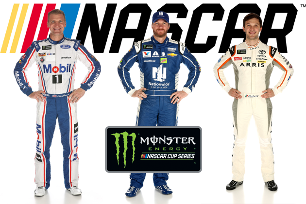
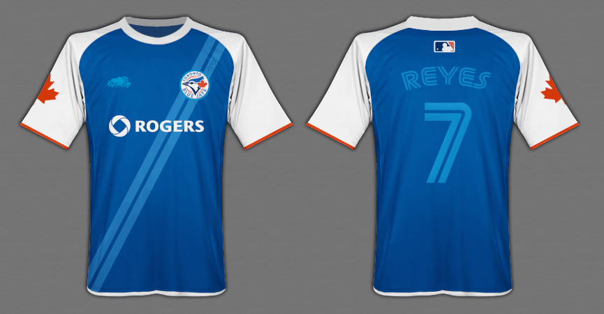
But the NBA broke the ice with advertisements on the uniform itself.


https://vafloc02.s3.amazonaws.com/isyn/images/f884/img-2419884-f.jpg>


It's just a matter of time before our ballplayers will be dressed like racecar drivers. But I guess it won't matter because we'll all be on fire.

A Boy Named Seo
Jan 07 2020 09:09 AM
Re: Logo Creep 2020

Yeah, that's definitely coming. The opening games in other countries where they slam ads on the side of the sleeves and helmets, etc., is a taste of shit to come.


https://offload.uni.watch/2019/02/25130105/CcY0G6NW0AEaZvV.jpg>

Centerfield
Jan 07 2020 10:19 AM
Re: Logo Creep 2020

It's awful.

Ceetar
Jan 07 2020 10:40 AM
Re: Logo Creep 2020

it'sonly a matter of time before we get a Honda promotion where we've got the New York YanKeys taking the field in custom jerseys.


It'll be a promotion for their new keyless system. "These are the only keys you need!" with clips of ballplayers walking up to car doors and just opening them and getting in.

nymr83
Jan 07 2020 10:44 AM
Re: Logo Creep 2020

just look at European soccer jerseys. the sponsor IS the jersey and maybe if you are lucky there is a team patch.

Edgy MD
Jan 07 2020 10:46 AM
Re: Logo Creep 2020

And that's what we need to agitate against.

Centerfield
Jan 07 2020 11:19 AM
Re: Logo Creep 2020

=nymr83 post_id=29386 time=1578419040 user_id=54]
just look at European soccer jerseys. the sponsor IS the jersey and maybe if you are lucky there is a team patch.


Wow. When did this happen? That is just ridiculous. They are walking billboards.

Lefty Specialist
Jan 07 2020 11:44 AM
Re: Logo Creep 2020

Yeah, this is the camel's nose in the tent. It can only get worse. MLB never passes up the opportunity to make an easy buck.

A Boy Named Seo
Jan 07 2020 11:55 AM
Re: Logo Creep 2020

=Centerfield post_id=29390 time=1578421199 user_id=65]
=nymr83 post_id=29386 time=1578419040 user_id=54]
just look at European soccer jerseys. the sponsor IS the jersey and maybe if you are lucky there is a team patch.


Wow. When did this happen? That is just ridiculous. They are walking billboards.


US soccer, too. It was widely accepted by the fanbase that that's what soccer jerseys look like.

41Forever
Jan 07 2020 12:32 PM
Re: Logo Creep 2020

It was originally going to be Under Armor, but the deal fell through and Nike stepped up and grabbed it.


I don't like the swoosh on the front, but it's better than having the "jumpman" logo, which is what University of Michigan football endures.


Between the New Era logo, Nike logo, Stance sock logos -- a lot of maker's marks. Not even counting the shoes and equipment.

Frayed Knot
Jan 07 2020 12:55 PM
Re: Logo Creep 2020

Edited 2 time(s), most recently on Jan 07 2020 01:24 PM


just look at European soccer jerseys. the sponsor IS the jersey and maybe if you are lucky there is a team patch.


Wow. When did this happen? That is just ridiculous. They are walking billboards.


I don't ever remember that NOT being the case with Euro-soccer (although there are more knowledgable futbol guys here than me).

There is always a team crest (left chest I believe) with the EPL logo (think MLB logo or NFL 'shield') on the other side but the main

sponsor (and there are several) is the big one right up front and center.

I guess it's the price they pay for having games that last less than two hours an no in-game commercials except for during halftime.


[FIMG=450]https://www.imagehandler.net/?istyle=0000&fmt=jpg&w=2000&h=2000&cmp=85&c=999&img=A1025006000&iset=0100&iindex=0007&retBlank=1x1[/FIMG]


This is the home jersey of current EPL-leading (by a lot!) Liverpool FC (team nicknames are less official over there). As you can see, New Balance is up there bigger than the

MLB/Nike swoosh (the EPL patch must be on the shoulder) while Standard Chartered (have seen that 1,000 times and have no idea what it is although I'm sure all their fans

do) dominates the front complete with their logo. To further frighten baseball purists, many of these teams main sponsors are on-line betting services and mid-east airlines.

41Forever
Jan 07 2020 01:16 PM
Re: Logo Creep 2020

NASCAR drivers say, "See your future."


http://www.wbwn.com/wp-content/uploads/sites/380/2017/02/Clint-Dale-Daniel.png>

kcmets
Jan 07 2020 01:22 PM
Re: Logo Creep 2020

I don't like the swoosh. Anywhere. I haven't owned a Nike product

since the early 90's.

Frayed Knot
Jan 07 2020 01:27 PM
Re: Logo Creep 2020

[FIMG=800]https://3.bp.blogspot.com/-MTaniAV7954/XSSAH12rl5I/AAAAAAACATU/XYM5-jaYJLoK0_FEdrbvpKChbWLY_qDgwCLcBGAs/s1600/4.jpg[/FIMG]

kcmets
Jan 07 2020 01:48 PM
Re: Logo Creep 2020

Wonder how much each team gets in swoosh revenue. If it's a decent chunk of

change, will it go towards a quality middle reliever or a principal pay down on an

office building in midtown?

A Boy Named Seo
Jan 07 2020 01:53 PM
Re: Logo Creep 2020

If MLB ever ends up looking like the EPL, I'll thankfully be dead already. But NBA-style ads will sadly be invading sooner than later.

Johnny Lunchbucket
Jan 07 2020 02:10 PM
Re: Logo Creep 2020

An MLB team really needs to explore that claret-and-sky blue color scheme so many EPL clubs use.


To the extent its interesting the clubs have more leeway to make their own uni-deals. In MLB that would be rough on the small market clubs

Centerfield
Jan 07 2020 02:30 PM
Re: Logo Creep 2020

Let's do sponsorships.


I'll start. MFY's will wear this logo.


https://img.fragrancex.com/images/products/parent/medium/238m.jpg>

A Boy Named Seo
Jan 07 2020 03:48 PM
Re: Logo Creep 2020

Dodgers:


https://labor411.org/wp-content/uploads/2017/07/farmerjohnbanner.png>

Frayed Knot
Jan 07 2020 05:24 PM
Re: Logo Creep 2020

Johnny Lunchbucket wrote:

An MLB team really needs to explore that claret-and-sky blue color scheme so many EPL clubs use.


I've noted in the past how I think MLB teams are missing out by having an over-reliance on red and blue. Off the top of my head I think only the O's, Giants, Pirates, Rox & A's have NO blue or

red in them while the rest have some form of one or the other with many relying on nothing but blue AND red [Nats, BoSox, Braves, Indians, Rangers, Phils]

And then even those clubs which start out with a color scheme different from the norm [Marlins, Astros, Padres, Rays] seem to morph towards conformity over the years.


To the extent its interesting the clubs have more leeway to make their own uni-deals. In MLB that would be rough on the small market clubs


As it does over there. Uni deals, I'm sure, only account for a tiny portion of it, but the gap in income/budgets between teams in the EPL and in other European leagues is much larger than here.

nymr83
Jan 07 2020 05:50 PM
Re: Logo Creep 2020

=kcmets post_id=29402 time=1578430101 user_id=53]
Wonder how much each team gets in swoosh revenue. If it's a decent chunk of

change, will it go towards a quality middle reliever or a principal pay down on an

office building in midtown?


If every team gets it then it should have no overall effect as the cost of players just incrementally increases with the increased revenue.


So, everyone else gets their reliever and Wilpon pays the Madoff trustees.

Fman99
Jan 08 2020 04:13 AM
Re: Logo Creep 2020

Seattle Mariners:


https://cdn-media.threadless.com/submissions/533473-2de4445886f0a6b1eb241712ef74f367.jpg>

A Boy Named Seo
Jan 08 2020 08:51 AM
Re: Logo Creep 2020

I like this ↑↑↑


Would it be a little Mr. Sparkle ad patch on the breast? Or a whole billboard across the chest, moving the M's logo to the breast soccer-style?

A Boy Named Seo
Jan 08 2020 02:20 PM
Re: Logo Creep 2020

https://www.mlbdailydish.com/2013/1/13/3871502/mlb-soccer-jerseys


http://cdn3.sbnation.com/imported_assets/1389653/blue-jays-865.png>

Edgy MD
Feb 17 2020 08:17 AM
Re: Logo Creep 2020

Photos of these swoosh-breasted uniforms are bringing out something irrationally angry in me.