Jun 10 2022 12:02 PM
Worst Uni nominations. To keep things orderly, please nominate one kit at a time, and stick to threads that were in regular rotation, worn at least a dozen or so times by the team in question. It'd be a shame if a classickly bad look that someone nonetheless believed in and stuck with got ranked behind an ephemeral Arbor Day getup that a squad donned once or twice and agreed not to speak of afterwards.
_________________________________________
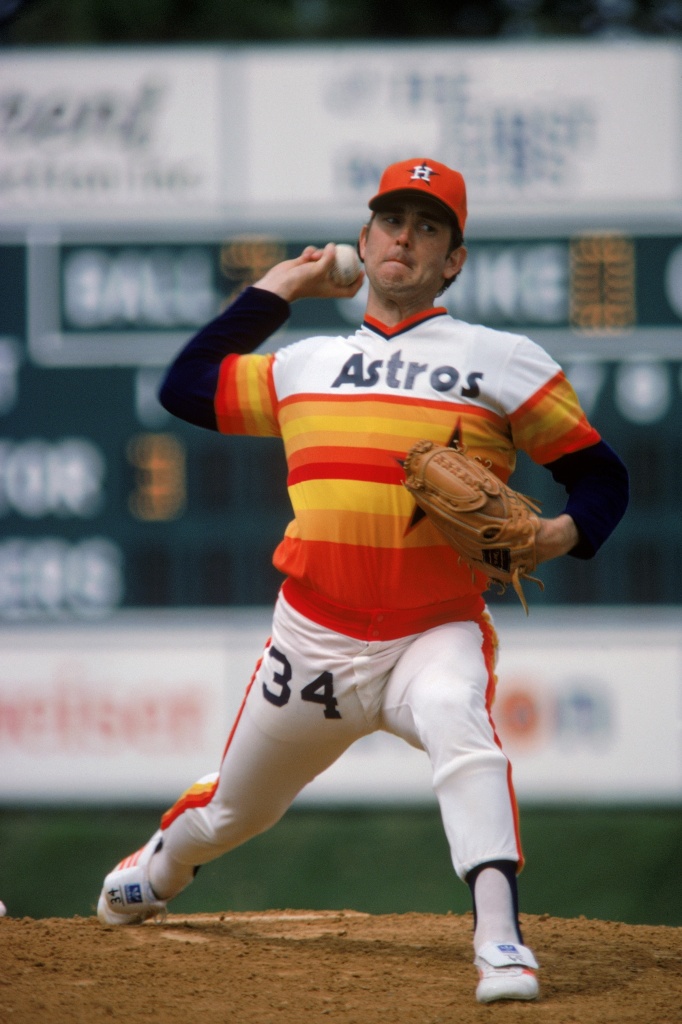
I'll open with the awful Sox uniform that somehow ended up on the best of pitchers. Everything about it says company picnic softeall. The tricolor hat feels like it came out of the bargain bin after a real team returned them because they didn't turn out right.
The horizontal stripes are whatever the opposite of slimming is.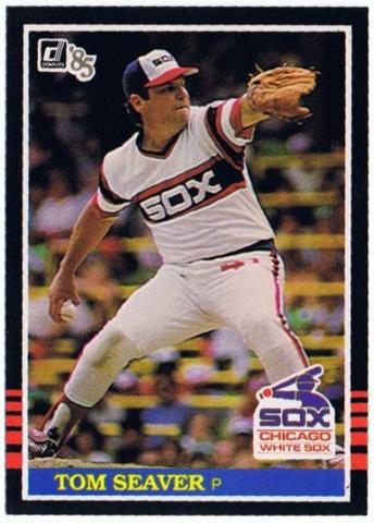
Lamarr Hoyt did a lot of cocaine in those threads.
The team's road uniforms were virtually the same except for the gray foundation, but I chose the homies, because they include the white front panel that makes the hat look like a trucker's, and the brightness of the home whites just adds to the shamelessness.