Nov 26 2007 03:34 PM
I am 110% certain that you will be able to purchase a mug with the logo on it.
I mean c'mon, there's money to be made!
Nice logo though. I'm digging 'Split Shea'.


Master Index of Archived Threads
The Mythical Bicentennial Patch
| G-Fafif Nov 26 2007 02:37 PM |
|
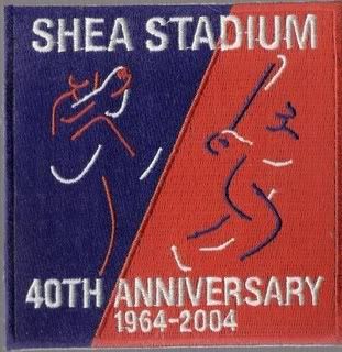
This from the official mets.com release on the Shea commemorative patch to be worn on home uniforms next year:
|
| Benjamin Grimm Nov 26 2007 02:40 PM |
|
I like that Shea logo. If they put it on a coffee mug, I just might buy one.
|
| soupcan Nov 26 2007 03:34 PM |
|
I am 110% certain that you will be able to purchase a mug with the logo on it.
|
| apmorris Nov 26 2007 04:22 PM |
|
brilliant
|
| metirish Nov 26 2007 06:47 PM |
|
That's hardly nitpicking Greg, that's a big difference in celebration right there .I like the patch.
|
| John Cougar Lunchbucket Nov 26 2007 07:10 PM |
|
More evidence that the interns run the show. I agree -- quality patch.
|
| Fman99 Nov 26 2007 09:16 PM |
|
|
I would wear a T-shirt with that patch to my cousin's wedding, were it appropriate to do so.
|
| Mex17 Nov 28 2007 07:51 PM |
|
The Pirates, Padres, and Phillies ought to return to those 1976 logos.
|
| Nymr83 Nov 28 2007 08:40 PM |
|
i like the current Pirates logo better than this one.
|
| SteveJRogers Nov 28 2007 08:42 PM |
|
Patch will be a nice addition to the collection
|
| Edgy DC Nov 28 2007 10:08 PM |
|
I think the patch was inspired by our logo.
|