Forum Home

Master Index of Archived Threads


Citi Field Logo

metsguyinmichigan
Feb 25 2008 09:42 AM

...is posted on Metsblog. Someone who knows how to cut and past photos here can do it.

Awful. Just awful. I hope to hell they don't wear that on a jersey patch next year. Brutally bad, like someone designed it in the taxi on the way to the press conference.

AG/DC
Feb 25 2008 09:45 AM

Get used to it.


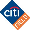
For what it's worth, I don't think they can wear a non-MLB corporate logo on their uniform, even if the corporation's name is on the stadium.

Benjamin Grimm
Feb 25 2008 09:46 AM

Benjamin Grimm
Feb 25 2008 09:47 AM

Nobody's going to buy any merchandise with that logo on it.

metirish
Feb 25 2008 10:07 AM


Absolutely horrible....the poster at metsblog is right, it does look like Domino's pizza logo....

Frayed Knot
Feb 25 2008 10:12 AM

It's not going to be on the uniforms, although I'm sure it'll be all over the stadium itself.

I remember after Enron went all kablooey the stadium in Houston spent weeks prying about 4 zillion of those logos off of seats, walls, gates and just about everything else in that place.

G-Fafif
Feb 25 2008 10:24 AM

Sayeth official press release:

]The logo features Citi's own globally recognized emblem enclosed in a royal-blue diamond. Extending from one side of the diamond is an orange banner with the word "field," written in a font reminiscent of that used at the old Ebbets Field in Brooklyn. The former home of the Brooklyn Dodgers was in many ways an inspiration for the new stadium's design.


Field, also written as it might appear on a sign for an Airport Parking Field, which you might find in a bacon, lettuce and tomato sandwich.

holychicken
Feb 25 2008 10:29 AM

Setting: Citigroup's corporate headquarters.

Time: 7AM this morning.

It is early Monday morning. The normal crowd is slowing filling in the office and cubicle farm some of whom are obviously carrying a bit of bitterness about the weekend ending too quickly, some are sipping coffee, some are bumbling around, some are chatting about what they had done that weekend. Of course, all of the important people are on cell phones.

In walks the head honcho, Charles Prince.


Charles: Hi, everybody!

Everyone: (grumbles) Hey.

Charles: Okay, so today is when we release the citi field logo that we poured so much hard work into. Can I see it please? I would like to know what we are presenting to the world. Hey Dave, do you have it for me?

Dave: Who me? I thought Anne was supposed to do it.

Anne: Nu-uh, I put Frank it charge of it.

Frank is passed out at his desk, as usual

Anne: FRANK! Wake the fuck up. Where is that citifield logo?

Frank: Oh shit. Uh, it is 55% done, I will have it on your desk by tomorrow morning.

Charles: WHAT? We are presenting it TODAY and you aren't finished with it?

Frank: Uh. . .errr. . .

Forces some laughter

Frank: Nah, I am just joking. I have it right here.

Stick crappy orange field on side of citifield logo, shows it to everyone

Charles: BRILLIANT! Give this man a raise!


But seriously, it is like they didn't even try at all. It's just the citi logo with "field" in orange tacked on the side. It couldn't be any more lacking than it is. The name citifield doesn't bother me as much as other as it does other people, but this is just absolutely terrible. Especially after the Shea stadium 1964-2008 emblem looks so cool.

G-Fafif
Feb 25 2008 10:32 AM

Logos for ballparks seem like a relatively recent conceit. Stadiumpage.com has a slew running down its scrollable sidebar:

http://www.stadiumpage.com/

G-Fafif
Feb 25 2008 10:37 AM

HC,

Very funny and reasonably accurate, I imagine.

holychicken wrote:
In walks the head honcho, Charles Prince.


The head honcho, incidentally, shares a first and last name with my father, but not a middle initial (nor, sadly, a joint account).

John Cougar Lunchbucket
Feb 25 2008 10:49 AM

I'm pretty sure Prince was whacked a few months back owing to Citi's disasterous performance. I mean, peeps are calling him the worst CEO ever.

KC
Feb 25 2008 11:03 AM

I think the logo is fine. KC LLC has set C as a BUY at 22.50 for those with
a five or more year plan. The logo will look better if you're a shareholder.

C

AG/DC
Feb 25 2008 11:20 AM

Yeah, former Treasury Secretary Rubin is now the CEO.

He was briefly involved in a minor Deval Patrick scandal, when Ameriquest hit the rocks, largely based on debt to CitiGroup or CitiCorps or CitiWhatever, and Patrick reached out to him as old buddies.

metsmarathon
Feb 25 2008 11:24 AM

G-Fafif wrote:
Sayeth official press release:

]The logo features Citi's own globally recognized emblem enclosed in a royal-blue diamond. Extending from one side of the diamond is an orange banner with the word "field," written in a font reminiscent of that used at the old Ebbets Field in Brooklyn. The former home of the Brooklyn Dodgers was in many ways an inspiration for the new stadium's design.


Field, also written as it might appear on a sign for an Airport Parking Field, which you might find in a bacon, lettuce and tomato sandwich.


is that the right blue and orange?

and, what, no black?! how will we trick the kiddies into buying stadium-logo merchandise?

Nymr83
Feb 25 2008 11:25 AM

i was dreading opening this thread, having now opened this thread and seen the logo, i'm dreading seeig it prominently displayed at the stadium.

seawolf17
Feb 25 2008 11:25 AM

Who gives a rat's ass what the stadium's logo looks like?

There's no black at first, then once we all own Citi Field Logo Hats (TM), then they add change the logo, add black, and we all have to buy new Citi Field Logo Hats (TM).

metsmarathon
Feb 25 2008 11:31 AM

i think a more interesting logo would have used the orange to form basepaths around the diamond, with attendant bases at the corners, perhaps with the red arc positioned so as to imply the top arc of the pitchers' mound...

another logo could follow the same idea of rainbow as mound, giving more of a birds-eye perspective of the diamond, with field scratched out again in the blue field with orange basepaths. or, perhaps this would be a better application of 'field' diagonally in the first base path... ?

yeah... i like the idea of the last one... not sure really where to put 'field' but the whole citi-pitcher's mound -perspective view thing i like.

G-Fafif
Feb 25 2008 11:32 AM

Could be worse:


And no, Citi logo not a major detriment to happiness. Just rather limp.

Willets Point
Feb 25 2008 11:41 AM

G-Fafif wrote:
Could be worse:


And no, Citi logo not a major detriment to happiness. Just rather limp.


Would be cooler if there was an arrow in the word field.

AG/DC
Feb 25 2008 11:42 AM

It looks like it was designed by placing one Post-It on top of another.

]Extending from one side of the diamond is an orange banner with the word "field," written in a font reminiscent of that used at the old Ebbets Field in Brooklyn.

It's a real exotic throwback when you pull out that long-fogotten "Arial" font.

Benjamin Grimm
Feb 25 2008 11:45 AM

You know, I have to admit, when I saw FIELD written in that interesting font I immediately thought, "Wow! That looks like it could have been displayed at Ebbets Field!" I mean, where else do you see a plain san-serif font like that?

Also, I was at first confused by the references to Anne Frank in holychicken's post.

metsmarathon
Feb 25 2008 11:48 AM

as i look at the other logos, i'm starting to think that maybe the logo isn't all bad...

i mean, the crossed bats, the banners, the stuffy lettering, the appearance of ornate embroidery, etc, all look kindof dated and unimaginative, old-timey and not in a good way.

the wrigley logo is great, in that it has none of this.

the safeco logo is good too, but looks more a product of its times. and i actually dig the tropicana logo, if only because it adheres so well to its corporate origins.

and i think i like that it looks different from just about every logo that's been put out for every college, professional, and overly funded amateur sports team in the past 10-15 years.

oe: petco and dodger stadium have that logo-factory look to them.

G-Fafif
Feb 25 2008 12:21 PM

Willets Point wrote:
="G-Fafif"]Could be worse:


And no, Citi logo not a major detriment to happiness. Just rather limp.


Would be cooler if there was an arrow in the word field.


Don't know if the situation has changed, but I remember reading when FedEx Field opened that there was no sign of a Redskins logo anywhere in the vicinity of the stadium, including the parking lots. You wouldn't have known who played there just by driving by, but you might have dropped off a package that had to be there absolutely, positively overnight.

Valadius
Feb 25 2008 12:30 PM

It's absolutely horrendous. Reminds me of the Enron logo.