City Connect Hint Drops
-
Johnny Lunchbucket
- Posts: 9830
- Joined: Fri Dec 28, 2018 8:02 am
Re: City Connect Hint Drops
I gotta say I'm excited about this reveal
Re: City Connect Hint Drops
Me too , like legit excited
-
batmagadanleadoff
- Posts: 7714
- Joined: Fri Dec 28, 2018 10:43 am
Re: City Connect Hint Drops
Going off what A Boy Named Sao said, it looks like a men's softball tournament uni. The only thing missing is the beer belly.
I vote Fugly, which is a contraction of fu**ing ugly.
Well, it IS one step up from that White Sox shorts uni.
Later
I vote Fugly, which is a contraction of fu**ing ugly.
Well, it IS one step up from that White Sox shorts uni.
Later
"It is better to light a candle than curse the darkness". William Lonsdale Watkinson
I have never insulted anyone. I simply describe them, accurately.
"They fear love because it creates a world they can't control" - George Orwell
I have never insulted anyone. I simply describe them, accurately.
"They fear love because it creates a world they can't control" - George Orwell
-
Johnny Lunchbucket
- Posts: 9830
- Joined: Fri Dec 28, 2018 8:02 am
-
Benjamin Grimm

- Posts: 7259
- Joined: Wed Dec 19, 2018 3:01 pm
Re: City Connect Hint Drops
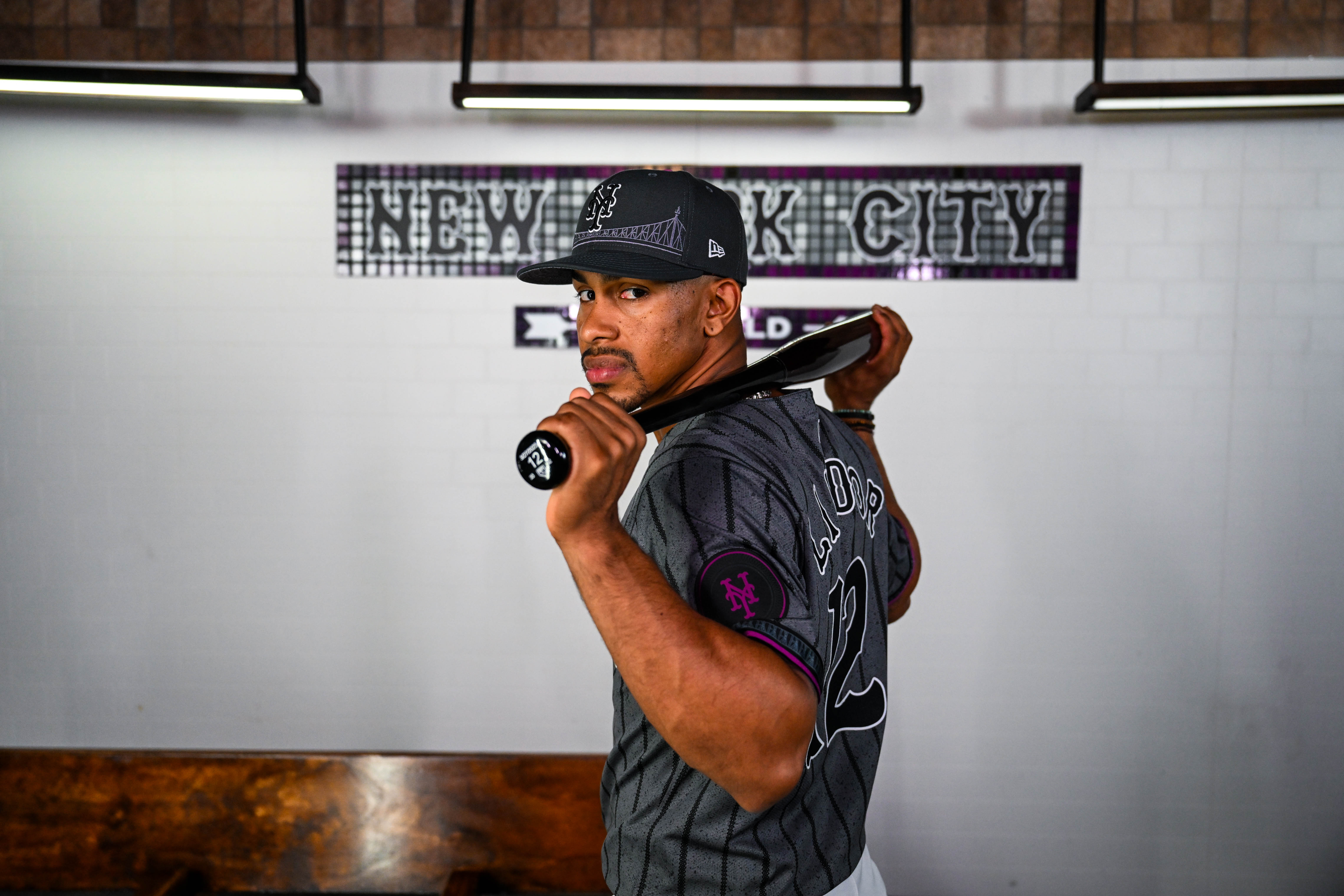
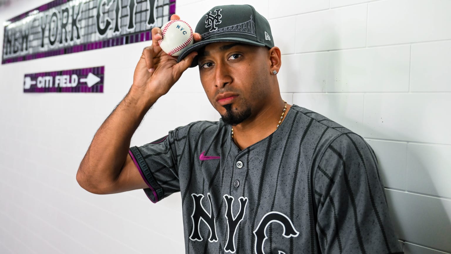
Exclusive: Unveiling the Mets’ full City Connect uniforms, and telling the story behind the designs
Andy Martino's thoughts:
• The dark gray of the jerseys — which feature “NYC” in big lettering on the front — represent the concrete that makes up the city’s sidewalks.
• The pinstripes on the jersey are, of course, a nod to the Mets’ pinstripes — but, on closer inspection, are composed of circles and diamonds. These represent the express and local trains of the New York City subway system.
• The circular sleeve patch is a take on the classic New York City subway token.
• The purple on the hat’s button, the jersey and the piping of the white pants is a reference to the 7 Line.
• An image of the Queensboro Bridge is stitched into the hat, under the interlocking NY. The bridge appears more subtly on the pants and sleeves as a cross section image.
• The sweatband inside the hat includes a multicolored take on the NYC subway map.
• The back of the jersey uses the team’s classic road font in the player’s name and number.
Andy Martino's thoughts:
Perhaps because I’m the type of person who talks and tweets too much about baseball uniforms, the Mets offered me an in-person peek this week at their City Connects.
My (naturally subjective) verdict: the team and its partners at Nike have come up with a look that works on both a visceral and conceptual level.
In an MLB season defined by widely panned uniform changes, these are, simply put, nice to look at. Their debut will bring a burst of much-needed good news during an aesthetic down period for the sport, in which sweat stains, small names, and see-through pants have dominated discussion of apparel.
The gray tops and white pants with purple accents avoid potentially cringy City Connect traps like overly bold colors and monochromatic jerseys and pants.
The lettering on the back provides an antidote to the problem of undersized names that has emerged this year. That was caused by the decision to move the MLB logo down from the collar, where it occupies some of the space in which names once appeared.
The names on the Mets’ City Connect jerseys are the same height as on their typical 2024 uniforms. But because the road font is wide, those names appear larger and are easier to read — they are closer, then, to how big league names should pop on the back of a uniform.
Perhaps this can point a way forward league-wide as a workaround to the small-name problem.
The upshot: The Mets’ City Connects are different without being garish, edgy without trying too hard. It’s easy to imagine New Yorkers wanting to walk the streets wearing the hat and especially the jersey.
If players and fans react to these uniforms the way I did, they could move into a lasting place in the team’s rotation.
-
Johnny Lunchbucket
- Posts: 9830
- Joined: Fri Dec 28, 2018 8:02 am
Re: City Connect Hint Drops
It looks like the backs are nice. The bridge on the hat is a miss.
-
Benjamin Grimm
- Posts: 7259
- Joined: Wed Dec 19, 2018 3:01 pm
Re: City Connect Hint Drops
As for me, I'm disappointed that they didn't incorporate the UniSphere. I like that the purple is inspired by the 7 subway. I like the dark grey color of the jerseys; I think they should have that color on their road uniforms. I agree with Martino's point about the pants not matching; some of these City Connect outfits where the pants match the shirts make the players look like they're wearing pajamas. It's nice that the Mets avoided that.
A lot of the City Connect uniforms are hideous or stupid. This is neither. Not great, but not bad at all.
A lot of the City Connect uniforms are hideous or stupid. This is neither. Not great, but not bad at all.
-
Benjamin Grimm
- Posts: 7259
- Joined: Wed Dec 19, 2018 3:01 pm
Re: City Connect Hint Drops
I'm lukewarm about the bridge on the cap. Not the choice I would have made, but not horrible. I think I would have left it out. (I'll refrain from mentioning the UniSphere again. Oops.)Johnny Lunchbucket wrote: ↑Fri Apr 19, 2024 10:36 am It looks like the backs are nice. The bridge on the hat is a miss.
-
Bob Alpacadaca
- Posts: 167
- Joined: Sun Aug 22, 2021 9:21 pm
Re: City Connect Hint Drops
I like these. I think the bridge on the cap is a nice touch and better than what the Giants tried to do.
I’m ok with the NYC and the gray. Would have loved the Unisphere, but these exceeded expectations.
I’m ok with the NYC and the gray. Would have loved the Unisphere, but these exceeded expectations.
-
Johnny Lunchbucket
- Posts: 9830
- Joined: Fri Dec 28, 2018 8:02 am
Re: City Connect Hint Drops
I'm worried these might look super-dark on the field, like those Arizona unis of a few years back

Re: City Connect Hint Drops
Pretty generic, but I prefer that to embarrassing...which these certainly had the potential to be.
I do appreciate the background texture. It gives them a little grit that fits in with the style of NYC.
I do appreciate the background texture. It gives them a little grit that fits in with the style of NYC.
i am a patient boy...i wait, i wait, i wait, i wait
-
batmagadanleadoff
- Posts: 7714
- Joined: Fri Dec 28, 2018 10:43 am
Re: City Connect Hint Drops
They forgot to attach a small parachute to the top of the caps to symbolize the guy that parachuted into Shea for game 6 of the '86 WS. And they could've also stapled large metal blue or orange corrugated shingles to the back of the shirt to represent, I mean symbolize, the blue and orange corrugated shingles that decorated the Shea exterior. How symbolic would that be? I would've Iiked to see the logos of the many, many newspapers that existed in NYC during the 60s.That would symbolize the NYC press. It covered the Mets. I would've also embroidered Willard Mullin's famous signature on the inside of the shirt. That'd be a secret symbol. Like the Easter eggs that get snuck onto a DVD.
Re: City Connect Hint Drops
Not terrible, agree with Buket about the bridge
-
Benjamin Grimm
- Posts: 7259
- Joined: Wed Dec 19, 2018 3:01 pm
Re: City Connect Hint Drops
And while I like the shade of grey, the reason for it is kind of lame. To represent the concrete of the city? Concrete sidewalks are hardly unique to New York. I believe I've seen them elsewhere.
-
Johnny Lunchbucket
- Posts: 9830
- Joined: Fri Dec 28, 2018 8:02 am
Re: City Connect Hint Drops
Only to be used for Saturday games which are all day games this yearJohnny Lunchbucket wrote: ↑Fri Apr 19, 2024 10:51 am I'm worried these might look super-dark on the field, like those Arizona unis of a few years back
Re: City Connect Hint Drops
-
Johnny Lunchbucket
- Posts: 9830
- Joined: Fri Dec 28, 2018 8:02 am
Re: City Connect Hint Drops
Uni storytelling invariably takes the point of view that the design choices are the only possible way to evoke the things they're meant to stand for.
-
Benjamin Grimm
- Posts: 7259
- Joined: Wed Dec 19, 2018 3:01 pm
Re: City Connect Hint Drops
Paul Lukas on UniWatch:
"More of a uniform, less of a costume" is an interesting point.Is this a terrible design? No. It’s probably better than most CC releases although that’s not saying much. More of a uniform, less of a costume. But like most CC designs, it doesn’t feel very well matched to the team — no blue, no orange. It looks more like a generic “NYC” jersey that a tourist would buy in Times Square, which I’m sure is exactly the point. This page even quotes the team’s chief marketing officer, Andy Goldberg, describing the jersey as looking “like something you’d wear on the street,” which was probably the guiding principle.
-
whippoorwill

- Posts: 4042
- Joined: Fri Dec 28, 2018 5:17 pm
Re: City Connect Hint Drops
Can I just ask what City Connect is?
-
Benjamin Grimm
- Posts: 7259
- Joined: Wed Dec 19, 2018 3:01 pm
Re: City Connect Hint Drops
From the Wikipedia page:
I learned today that each City Connect uniform has a three-year lifespan. The uniform unveiled today will be in rotation through 2026. After that, the Mets will debut a new City Connect.
I'm not surprised that the Yankees aren't participating, because they always take themselves too seriously. And the A's, of course, don't really have a city to connect to yet.City Connect is a brand name for a line of alternate uniforms made by Nike, Inc. for Major League Baseball (MLB) teams. The uniforms feature different color schemes, typefaces, and graphic elements compared with the teams' typical home and away uniforms. The uniforms are designed to reflect the cultural aspects of each team's home city.[1] Of MLB's 30 teams, 20 have a City Connect uniform as of 2023, with an additional eight teams scheduled to debut theirs in 2024. The New York Yankees and Oakland Athletics are the only two teams without a City Connect uniform.
I learned today that each City Connect uniform has a three-year lifespan. The uniform unveiled today will be in rotation through 2026. After that, the Mets will debut a new City Connect.
-
whippoorwill
- Posts: 4042
- Joined: Fri Dec 28, 2018 5:17 pm
Re: City Connect Hint Drops
So that’s what it is…
That’s a neat idea.
Good for the Mets for beating the Yankees to the NYC version!
That’s a neat idea.
Good for the Mets for beating the Yankees to the NYC version!
-
Johnny Lunchbucket
- Posts: 9830
- Joined: Fri Dec 28, 2018 8:02 am
Re: City Connect Hint Drops
If the MFYs were participating in CC the front of the jersey would have read QUEENS and not NYC, probably. I'm sure the Mets see this as a big win for them.
Re: City Connect Hint Drops
I like that the font on the NYC references the classic center-serif font of the Mets road jerseys.
I like all of my ideas better, but I imagine I'm not alone there.
I like all of my ideas better, but I imagine I'm not alone there.
A Shaolin monk does not sell himself for a handful of rice.