-
Marshmallowmilkshake
- Posts: 2805
- Joined: Fri Sep 27, 2019 9:02 pm
Post
by Marshmallowmilkshake » Mon Feb 12, 2024 3:53 pm
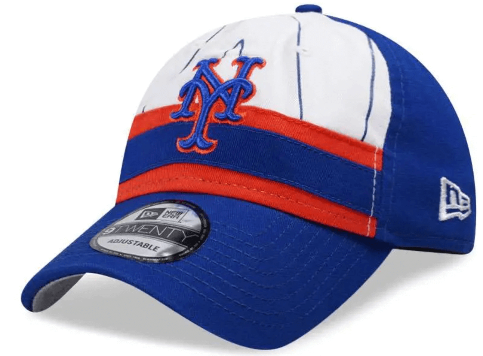
Uniwatch posted a photo of what it believes to be the Mets' new batting practice cap. This is the 9Twenty unstructured version, so the 59Fifty version the players wear will look a little better. But I don't know about these. With the racing stripe and pinstripes, are they trying to recall the 1980s era teams?
Can anyone make this image smaller -- or tell me how to do it? THANKS!
-
MFS62
- Posts: 10492
- Joined: Fri Dec 28, 2018 8:08 am
Post
by MFS62 » Mon Feb 12, 2024 4:35 pm
The only good think I can say about it is at least it has a curved brim.
Later
“The measure of a man is what he does with power”- Plato
Apparently one did. He can't get away from the tell.
I have never insulted anyone. I simply describe them, accurately.
-
metirish
- Posts: 5714
- Joined: Fri Dec 28, 2018 12:50 pm
Post
by metirish » Mon Feb 12, 2024 5:19 pm
The orange and blue across the front is awful
-
Edgy MD
- Posts: 33954
- Joined: Fri Dec 28, 2018 3:36 pm
- Location: Baltimore, MD, USA
-
Contact:
Post
by Edgy MD » Mon Feb 12, 2024 5:29 pm
Even if everything else about this design was inspired, they've gone off-palette with that orange bar. It's way too red, and so clashes with orange shadow around the blue logo.
This is another thing that nobody called me about, and I'm thinking I might have to let some folks go if that keeps up.
This post may be recorded for training or quality-assurance purposes.
-
Marshmallowmilkshake
- Posts: 2805
- Joined: Fri Sep 27, 2019 9:02 pm
Post
by Marshmallowmilkshake » Thu Feb 15, 2024 2:29 pm

The Mets road BP cap is really cool -- and confirms the idea that the team was shooting for a 1980s vibe. The home cap evokes the racing stripes, and the road has the 1987 road script!
-
Edgy MD
- Posts: 33954
- Joined: Fri Dec 28, 2018 3:36 pm
- Location: Baltimore, MD, USA
-
Contact:
Post
by Edgy MD » Thu Feb 15, 2024 3:05 pm
The Yankees hat has almost as much metigree as the Mets hat.
Though, you know, I don't mean that really in a good way.
This post may be recorded for training or quality-assurance purposes.
-
metirish
- Posts: 5714
- Joined: Fri Dec 28, 2018 12:50 pm
Post
by metirish » Thu Feb 15, 2024 3:17 pm
Have to say I kinda like Toronto and Detroit
-
metsmarathon
- Posts: 2398
- Joined: Fri Dec 28, 2018 9:35 pm
Post
by metsmarathon » Thu Feb 15, 2024 3:31 pm
god, the mets one would be so much better if the racing stripe were styled more mid-cap like detroit or cleveland.
i'm digging hte vertical stripes on minnesota's hat. the white sox are among my favorites. the brewers and phillies are fun. the yankee designs are probably the only ones worse than ours. except maybe cleveland. because, dear lord, that winged-g logo is embarrassing.
-
metirish
- Posts: 5714
- Joined: Fri Dec 28, 2018 12:50 pm
Post
by metirish » Thu Feb 15, 2024 3:51 pm
Houston looks good, but very close to some they've worn in the past ?
-
A Boy Named Seo
- Posts: 2522
- Joined: Fri Dec 28, 2018 11:49 am
- Location: Nuevo Mehhico
Post
by A Boy Named Seo » Thu Feb 15, 2024 4:03 pm
metsmarathon wrote: ↑Thu Feb 15, 2024 3:31 pm
god, the mets one would be so much better if the racing stripe were styled more mid-cap like detroit or cleveland.
1000000000% this but still pretty uggo, isn't it.
I think the 7 Line did a 1987 away cap just like that one. Better, but I'm still not buying.
great googly moogly!