High Fashun
- batmagadanleadoff
- Posts: 9470
- Joined: Fri Dec 28, 2018 10:43 am
Re: High Fashun
Just work the old patch into a uni concept. Change the slogan. It's got the Mets/NY colors built in.


Re: High Fashun
Well, I don't remember the last time I saw the fountains operating, but I'm obviously not a frequent visitor.
I remember once Sri Lanka blew off in a wind storm, which had to be terrifying, especially for the Sri Lankans.
Love the patch.
Got my hair cut correct like Anthony Mason
Re: High Fashun
It's a nice throwback.
So are our current uniforms (not saying/just saying). If you're going to do something new, do something new.
So are our current uniforms (not saying/just saying). If you're going to do something new, do something new.
Re: High Fashun
A guy already rocking the look behind home plate today.
Got my hair cut correct like Anthony Mason
Re: High Fashun
Brings back old memories. I worked at the NY World's Fair (both years) when in college.batmagadanleadoff wrote: ↑Tue Apr 06, 2021 9:49 pm Just work the old patch into a uni concept. Change the slogan. It's got the Mets/NY colors built in.

Later
“The measure of a man is what he does with power”- Plato
Apparently one did. He can't get away from the tell.
I have never insulted anyone. I simply describe them, accurately.
Apparently one did. He can't get away from the tell.
I have never insulted anyone. I simply describe them, accurately.
Re: High Fashun
Fun fact #1: Those three orbits around the globe represent the orbits of John Glenn, Yuri Gagarin, and the Telstar satellite. There is some disagreement about the factiness of this fact, but it's facty enough for me.
Fun fact #2: The original lighting effect at night included lights representing each of the capitals of the nations of the world. Included among these is Kahnawake Indian Reservation, which, while being an important place in Mohawk culture, is not really analogous to any First Nation capital, but it was included at the request of the Mohawk ironworkers who worked on the construction.
Fun fact #2: The original lighting effect at night included lights representing each of the capitals of the nations of the world. Included among these is Kahnawake Indian Reservation, which, while being an important place in Mohawk culture, is not really analogous to any First Nation capital, but it was included at the request of the Mohawk ironworkers who worked on the construction.
Got my hair cut correct like Anthony Mason
Re: High Fashun
The Athletic ranked caps. The Mets were in Tier 2, although the writer said that he could be convinced that they should be in Tier 1.
The Nationals were DEAD LAST.
The Nationals were DEAD LAST.
Re: High Fashun
I don't like Nats hats one bit — The DC hat beats the Walgreen's W, but still feels like a federal agency insignia. (DEPARTMENT OF CORRECTIONS.) But it seems to me that a ranking placing anybody but the Marlins in last should include a lot of explanation.
And that is true more or less for every Marlins cap since their inception. I'm certainly willing to listen to arguments such as the Nats getting extra points deducted for replacing the joyful goofiness of Expos hats.
And that is true more or less for every Marlins cap since their inception. I'm certainly willing to listen to arguments such as the Nats getting extra points deducted for replacing the joyful goofiness of Expos hats.
Got my hair cut correct like Anthony Mason
- Benjamin Grimm
- Posts: 9073
- Joined: Wed Dec 19, 2018 3:01 pm
Re: High Fashun
I prefer the Walgreens cap to the one with the Capitol Building on it. Simpler is better. The ideal baseball cap has the initial letter(s) of the city the team represents. The Orioles should have a B. The A's should have an O. (At least as long as they remain in Oakland.) The Blue Jays should have a T. (You see where I'm going with this...)
Re: High Fashun
iconic is not necessarily better than 'good'.
Watching Yankee games always feels like i'm watching a black and white broadcast, it's got no color, no pop. just bland and boring.
Watching Yankee games always feels like i'm watching a black and white broadcast, it's got no color, no pop. just bland and boring.
Please listen to my podcast? You Did What Now?
Please listen to our podcast? Mets On Tap
www.ceetar.com/optimisticmetsfan
Barley Prose
Please listen to our podcast? Mets On Tap
www.ceetar.com/optimisticmetsfan
Barley Prose
- dinosaur jesus
- Posts: 246
- Joined: Wed Jan 02, 2019 12:35 pm
Re: High Fashun
The Mets’ NY was better than the Yankees’ when Christy Mathewson wore it, and it’s better now.
- A Boy Named Seo
- Posts: 2505
- Joined: Fri Dec 28, 2018 11:49 am
- Location: Nuevo Mehhico
Re: High Fashun
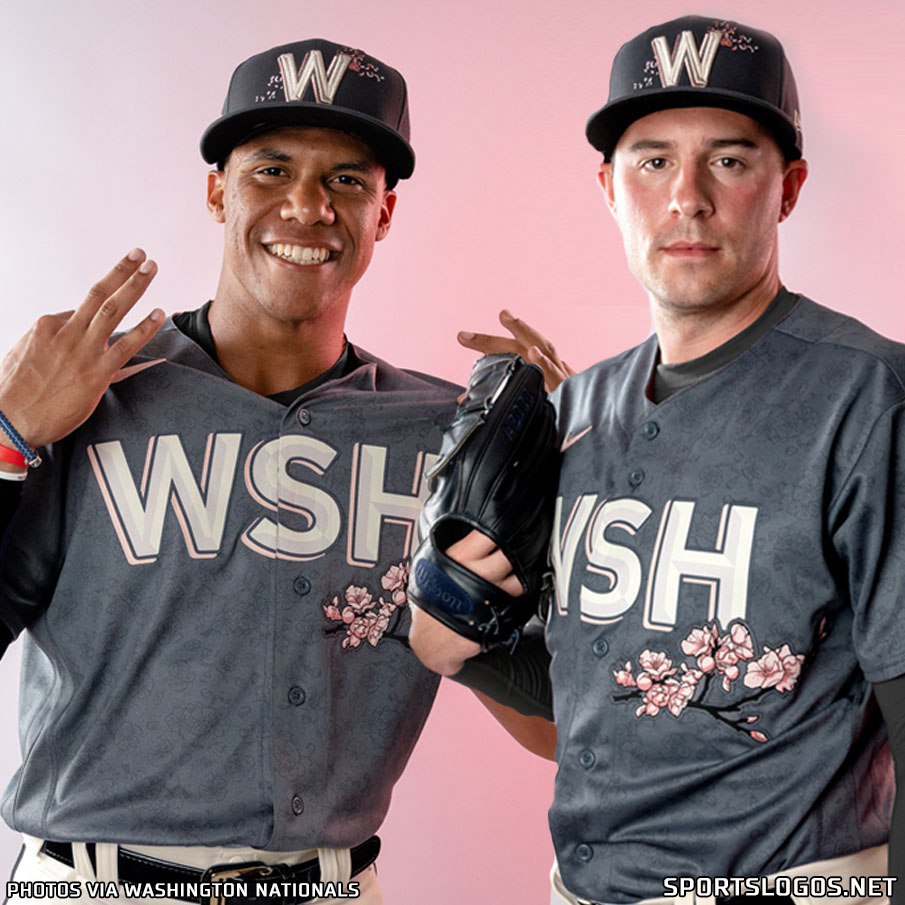
City Connect year two is underway and the Nats (IMO) hit a leadoff homer with this excellent cherry blossom range. It ticks my boxes as it's wildly creative, a huge departure from their normal logo set and colors, and evokes something that is uniquely regional. I dig the soft charcoal outlines of flowers on the gray shirt, too. The big block "W" and the "WSH" are just ok, but they seem to recall the Senators so it works for me.
We have to wait one more year for the Mets:
https://news.sportslogos.net/2022/03/29 ... /baseball/

We have to wait one more year for the Mets:
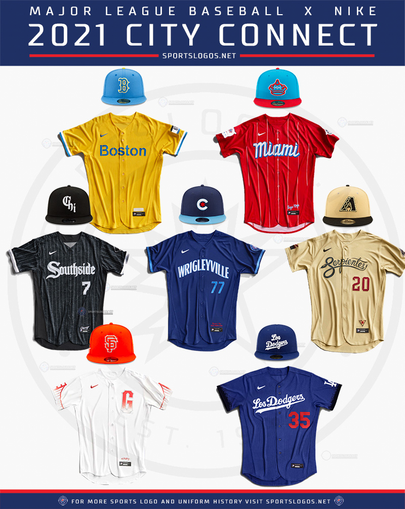
Last year's for those that need a refresher:For the 2022 season, seven new teams are joining the seven already on board from last season. These seven new clubs are the Colorado Rockies, Houston Astros, Kansas City Royals, Los Angeles Angels, Milwaukee Brewers, San Diego Padres, and Washington Nationals. These seven join the Arizona Diamondbacks, Boston Red Sox, Chicago Cubs, Chicago White Sox, Los Angeles Dodgers, Miami Marlins, and San Francisco Giants. They kicked off the inaugural campaign a year ago.

https://news.sportslogos.net/2022/03/29 ... /baseball/
great googly moogly!
- metsmarathon
- Posts: 2373
- Joined: Fri Dec 28, 2018 9:35 pm
Re: High Fashun
oh, those washington unis are OUTSTANDING!
Re: High Fashun
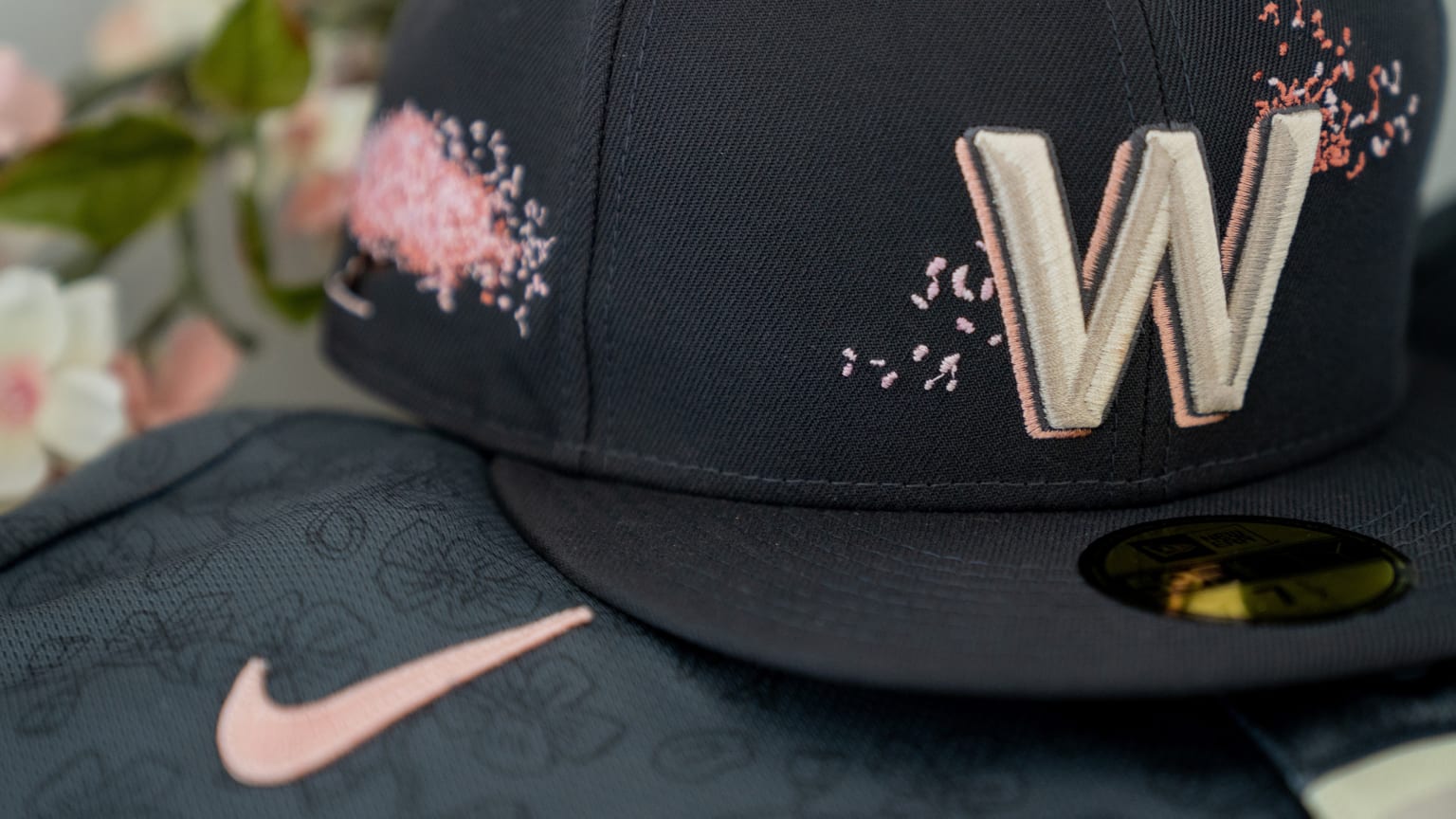
The blossoms on the hats are kind of rendered too small to be distinguishable as such even in these photos, though, no?
If I hadn't been told what it was, I'd guess it was confetti from a baby shower, or possibly pointillist accents from a graffito.
The tops are terrific, though.
If I hadn't been told what it was, I'd guess it was confetti from a baby shower, or possibly pointillist accents from a graffito.
The tops are terrific, though.
Got my hair cut correct like Anthony Mason
- A Boy Named Seo
- Posts: 2505
- Joined: Fri Dec 28, 2018 11:49 am
- Location: Nuevo Mehhico
Re: High Fashun
Not far off. They're apparently petals blowing in the wind!Edgy MD wrote: ↑Tue Mar 29, 2022 11:37 am The blossoms on the hats are kind of rendered too small to be distinguishable as such even in these photos, though, no?
If I hadn't been told what it was, I'd guess it was confetti from a baby shower, or possibly pointillist accents from a graffito.
The tops are terrific, though.
great googly moogly!
- kcmets
- Posts: 12046
- Joined: Wed Dec 26, 2018 7:36 pm
- Location: Logged on and hangin' with Bing [Bot]
Re: High Fashun
I can only muster a meh (perhaps an eh) for the WSH blossom tops. They
look like prettied up Crooklyn Nets jerseys to me.
look like prettied up Crooklyn Nets jerseys to me.
#lgm #ygb #ymdyf
- Johnny Lunchbucket
- Posts: 12395
- Joined: Fri Dec 28, 2018 8:02 am
Re: High Fashun
I like the cherry blossom idea and the sublimated pattern is handsome. Not sure that giant WSH is best but overall, not bad
- batmagadanleadoff
- Posts: 9470
- Joined: Fri Dec 28, 2018 10:43 am
Re: High Fashun
The giant-sized WSH on those new cherry blossom Nats uniforms and caps might be the best new thing I've seen on a baseball uni in years.
Awesome.
If it was up to me, I'd ditch the cherry blossoms and otherwise make those big WSH lettered unis their regular everydays.
Awesome.
If it was up to me, I'd ditch the cherry blossoms and otherwise make those big WSH lettered unis their regular everydays.
- Marshmallowmilkshake
- Posts: 2743
- Joined: Fri Sep 27, 2019 9:02 pm
Re: High Fashun
I kind of like them. Nice that they stayed away from government-related things.
But not being in Washington, I don't know the answer to this: How long are the cherry trees in bloom? Are they still blooming when the season starts?
I still like the Marlins look best, followed by the White Sox and Cubs. The Dodgers look terrible. There are lot of things they could have done with LA and California, or even with a Latino theme. Doesn't seem original to put "Los" in front of Dodgers when teams around the country already do that to celebrate that culture. Missed opportunity.
Re: High Fashun
Turn the WSH jerseys inside out and they read DRY.
Hope for the best. Expect the Mets.
- Benjamin Grimm
- Posts: 9073
- Joined: Wed Dec 19, 2018 3:01 pm
Re: High Fashun
Yeah, the Dodgers really blew it. They could have had their uniform read HOLLYWOOD (looking like the famous sign) and had palm trees or something. Although if it was up to me, I would have based the uniform on the La Brea Tar Pits.
Re: High Fashun
Full bloom is usually around two weeks. Peak bloom tends to fall around Opening Day or shortly after.Marshmallowmilkshake wrote: ↑Tue Mar 29, 2022 1:30 pmBut not being in Washington, I don't know the answer to this: How long are the cherry trees in bloom? Are they still blooming when the season starts?
One logistical problem with the Washington jerseys is that they appear to be a home uniform with a gray foundation. Boundaries falling!
Got my hair cut correct like Anthony Mason
