1971


The year of 1971 gave us a culture in transition. The Beatles were no more, the Pentagon Papers were published, and
CBS was purging it's roster of its high-rated-but-cornpone-y rural programming for more urban and sophisticated fare. Goodbye to
The Beverly Hillbillies and Hello to
All in the Family.
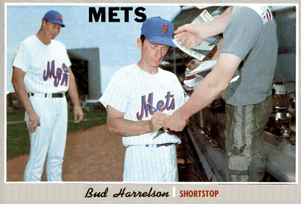
Topps, long working with a mostly exclusive license to print official MLB-branded cards, was going through a transition of its own. After a decade in which heroic portraits of the early sixties yielded mostly to no-less-action-filled figure poses that characterized the later sixties, the company went full on into action shots for their 1971 set. As bold as this was, they didn't really have the equipment and talent to pull it off, and their wide-angle shots were often confusing and below the standard of the zoom quality that the same fans were seeing in their morning papers, especially considering the 2.5" x 3.5" size of their canvasses.
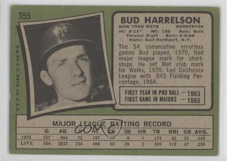
Such is what we get here on 1971 Topps 355, featuring a glossy front that announces a "Bud Harrelson" as the featured player, but a photo that takes a small amount of sophistication for the pee-wee card buyer to suss out just
which of the five figures Mr. Harrelson may be. As if that doesn't provide enough ambiguity, the signature printed on the card is that of some guy named "Derrel." "Perhaps this is Bud's brother, or maybe his father — probably his father," the young student of cardboard might think, and perhaps only after showing the card to an older brother or father or uncle just back from Vietnam, is the mystery cleared up.
Cards that once taught you through their clarity were now seeking to teach you with their ambiguity as well. If you were forced to work out for yourself that Bud was in fact the guy making the tag and that he and "Derrel" were the same, well, that sort of knowledge was more likely to stick, and a little self-reliance was a good preparation for the turbulent decade to come.
The printed autograph also increased the ambiguity if you were one of the fortunate youths to get your card signed in person, and found the man's just referred to himself as "Bud" with his in-person signature. Because, of course he did.

To some, this is nothing, but I imagine being a kid of the era having the good fortune of collecting Harrelson's
Bud Hancock on my card, only to take it home and stare at it thinking, "Damn it,
one of these signatures is a
great big lie."
I'd look at it for hours, unable to reconcile the paradox before me.
Even the back is barely meeting you half way. No particular contrasting Topps design announces the card's number. They just give you three digits that could be anything — the distance to left field at Dodger Stadium, an interstate spur, a Bible verse. Who knows? And now that they've finally given Bud the satisfaction of an established big-leaguer by removing his minor league stats from the back of the card, they also remove the stat lines from his first several seasons, as if he's somehow still (or again) a rookie.
And lest the point be missed, this is a guy coming off his first All-Star season — a year that would see him finish 20th in National League MVP voting.
One might think the single line of stats would allow room for some interesting abstract, but the portrait that dominates the card only allows for a cold listing of four detached facts. The first three are relevant and fresh — his record 54 game errorless streak, his first time clearing the wall with a homer, and his club record for walks in a season, but then they have to fucking run out his fielding percentage championship from the California League for the third time, as if he's some huckleberry that is such an indifferent figure in the league that you have to reach back to his time the bushes to find anything worth crowing about.
Bad show, Topps editors.


So Topps tried again, adding Bud to their limited edition "Greatest Moments" series. This card really tells you how stretched Topps photography staff was at the time, using the
exact same photo as Bud's regular 1971 card above, and using that photo
on both sides. It is, nonetheless a clearly more engaging design, and the card here is currently
going for $990 on Ebay. Do I hear $1000?
Despite the re-used photo, either better resolution or a stronger contrast lent by the black-and-white print provides some detail that one has to struggle to glean from the first card. We are no longer forced to guess that it's Ken Boswell as well as Nolan Ryan sharing the card with Bud, as Boswell's "12" is much clearer. We can also work out with a high degree of confidence that the baserunner is a Houston Astro. In fact, we have enough facts to work with — day game at Shea, probably from 1970, Nolan Ryan on the mound, Harrelson and Boswell up the middle on the infield — to confidently conclude that it's this
May 30 tilt, featuring an exciting three-run late rally giving the Mets the victory.
Joe Morgan and Jimmy Wynn both stole second in that game, and the profile and build of the player sliding in safely (despite Ryan's attempting to influence the umpire with an out call) certainly suggests to me more Morgan than Wynn, so Bud is seemingly sharing his 1971 card with two Hall-of-Famers. (Not merely his card, but his
cards!)
Now let us be fair. Topps did a better job here, and the error-less streak certainly is a cool thing in Met history, as the record would later be held by both Kevin Elster and Rey Ordóñez at different times playing as Mets, but is a 54-game error-less streak really a "Greatest
Moment?" I think not. Even in the fullness of time, calling two months a "moment" is just a careless use of language.
But that color tinted portrait of Bud next to the black and white photo — the fakeness of him striking a batting pose with no helmet and left field in the background defeated by the brutal realism of his thousand-mile stare and the flake of mud on his brim — that can make me forgive a LOT of sins. And with the classick
Daily News masterhead on the back, this is pretty much a swoon-worthy card, if not perhaps $990 worth of swoon.


But wait! There's more! Apparently, Topps let Kellogg's get a piece of the action in 1971, and the latter produced a limited-edition run of 3D cards to draw your grubby little hands into their boxes of Fruit Loops and Sugar Smacks. The novelty of 3D — to the extent that the effect of these cards worked as such — was enough of a draw that you can imagine nobody put too much thought into the black-on-white back design. And it shows, even re-using the same posed photo from the front to make a portrait shot. But man, nobody told the editorial team to phone it in, because not only did they beat Topps at their own game by including Bud's stats for each year of his career, but the editorial abstract is beefy, relevant, and well stylized. If your young eyes could read type that small, this card will make you a Bud Harrelson
expert. It even includes novel facts both interesting but obscure enough to have already come up among grown-assed adults in this thread — Bud's problems keeping his weight up and his being mentored by Roy McMillan — as well as his errorless streak and his 1968 knee surgery.
High five to the Kellogg's editorial staff! If you pulled this card out of your 1971 Frosted Flakes, good for you!
What am I saying?
GRRRRREAT for you!!


