2021 Tabloid Cover Derby Round 2.07 MIDNIGHT SPECIAL! vs 00 DAYS WITHOUT TEAM FIASCO
- Benjamin Grimm
- Posts: 8463
- Joined: Wed Dec 19, 2018 3:01 pm
2021 Tabloid Cover Derby Round 2.07 MIDNIGHT SPECIAL! vs 00 DAYS WITHOUT TEAM FIASCO
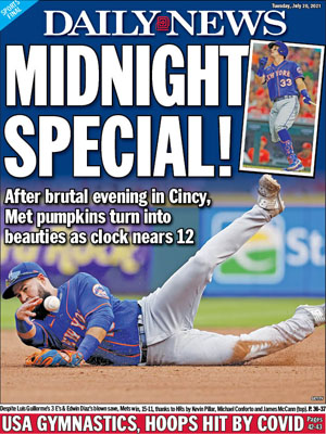
MIDNIGHT SPECIAL!
New York Daily News, July 20, 2021.
Winner of Round 1.16
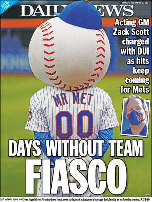
00 DAYS WITHOUT TEAM FIASCO
New York Daily News, September 2, 2021.
Winner of Round 1.21
Re: 2021 Tabloid Cover Derby Round 2.07 MIDNIGHT SPECIAL! vs 00 DAYS WITHOUT TEAM FIASCO
"00 Days Without Team Fiasco" is the Metsiest headline ever.
Re: 2021 Tabloid Cover Derby Round 2.07 MIDNIGHT SPECIAL! vs 00 DAYS WITHOUT TEAM FIASCO
I went for 00 DAYS WITHOUT TEAM FIASCO, but as conceptually inspired as it is, its got it's problems.
1) There's something unsettling about staring at the back of Mr. Met's head.
2) Even if there wasn't, that's a lot of wasted real estate. You could have blown that shot up further and cut him off five or six inches above the shoulder and had a better version of the same effect.
3) You couldn't find an inset photo of Zack Scott's face without a mask?
4) TEAM FIASCO is an awkward substitute for AN ACCIDENT.
5) The great tradition of putting the funny take in the headline and the actual lede in the subhead can be really be joneshwyed up if you are forced to lay it out so the subhead becomes a superhead. That's one more reason to trim off Mr. Met's head. It would create room for the subhead at the bottom.
Subtle things on plus side:
1) The ZVON-level goofiness of Scott's head bursting out of the inset frame.
2) The orange line on the Mets outfield wall pulling extra duty, acting like a border separating the top logo from the story. I think this is what tempted the layout artist to use so much Mr. Met head.
- Benjamin Grimm
- Posts: 8463
- Joined: Wed Dec 19, 2018 3:01 pm
- Johnny Lunchbucket
- Posts: 11489
- Joined: Fri Dec 28, 2018 8:02 am
Re: 2021 Tabloid Cover Derby Round 2.07 MIDNIGHT SPECIAL! vs 00 DAYS WITHOUT TEAM FIASCO
This was a travesty of a result. Obviously Russian fraud