Post
by Edgy MD » Tue Jan 04, 2022 12:02 pm
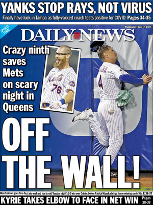
OFF THE WALL! has a dazzling action shot, but it's deployment is second rate.
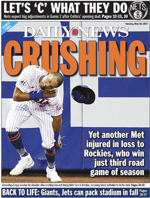
Look how much more saturated the blue of the wall is on CRUSHING. Even more so in the blue of Johneshwy's socks. THRILL to the centered, bold, orange headline of CRUSHING miraculously placed between Fargas and the offending wall in three-dimensional space. WEEP at the handsome drop-shadowing which gives the orange strong contrast against both blue and white.
That goofy, goofy inset photo of Mazeika tells us nothing. Who is that guy? What did he do? Why is he allowed to wear a Mets jersey? Why is the color so washed out in the photo? Why is it angled? I DON'T KNOW!
SING about how the text doesn't crowd away the character of the photo in CRUSHING like it so annoyingly does in OFF THE WALL!, where the text pushes from the left margin and all the content wants to fall off to the RIGHT. CRUSHING comfortably puts the subhead beneath the text on the wall where the flat panel of the blue wall and black base make for an excellent canvas.
Yeah, it's a story about an embarrassing loss vs. a walkoff win, but CRUSHING is the class of the field. YOU KNOW I'M RIGHT!!
This post may be recorded for training or quality-assurance purposes.