2023 Tabloid Cover Derby Round 3.03 COOKIE MONSTERS vs THIS MUCH!

Post Reply

Please vote for the cover that you prefer

Poll ended at Wed Jan 10, 2024 6:24 am

COOKIE MONSTERS (New York Daily News)
6
40%
THIS MUCH! (Newsday)
9
60%
 
Total votes: 15
User avatar
Benjamin Grimm
Posts: 8445
Joined: Wed Dec 19, 2018 3:01 pm

2023 Tabloid Cover Derby Round 3.03 COOKIE MONSTERS vs THIS MUCH!

Post by Benjamin Grimm » Wed Jan 03, 2024 6:24 am

Image

Vote for the cover that you prefer. Voting will run for seven days.


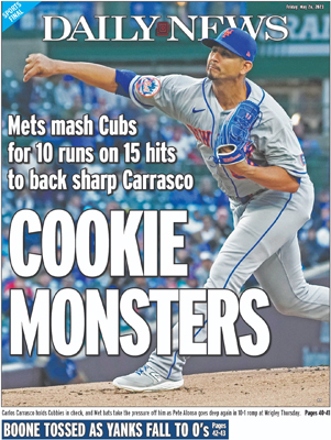
COOKIE MONSTERS
New York Daily News, May 26, 2023.
Winner of Round 1.10
Winner of Round 2.01
Image


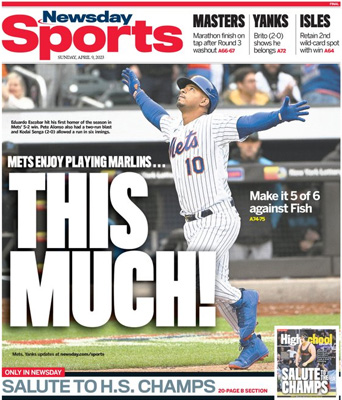
THIS MUCH!
Newsday, April 9, 2023.
Winner of Round 1.07
Image
User avatar
bmfc1
Posts: 4036
Joined: Fri Dec 28, 2018 1:49 pm

Re: 2023 Tabloid Cover Derby Round 3.03 COOKIE MONSTERS vs THIS MUCH!

Post by bmfc1 » Wed Jan 03, 2024 3:44 pm

Two good ones but the clever Newsday caption perfectly matches the picture.
User avatar
MFS62
Posts: 9501
Joined: Fri Dec 28, 2018 8:08 am

Re: 2023 Tabloid Cover Derby Round 3.03 COOKIE MONSTERS vs THIS MUCH!

Post by MFS62 » Wed Jan 03, 2024 4:49 pm

bmfc1 wrote: Wed Jan 03, 2024 3:44 pm Two good ones but the clever Newsday caption perfectly matches the picture.
Something you don't normally see photographed. While the Cookie Monsters cover has a clever headline, the picture is common. It could be of any righty pitcher in any game.
The This Much cover has more going for it.
Later
I blame Susan Collins
"Never underestimate the power of stupid people in a large group". George Carlin
I have never insulted anyone. I simply describe them, accurately.
User avatar
A Boy Named Seo
Posts: 2415
Joined: Fri Dec 28, 2018 11:49 am
Location: Nuevo Mehhico

Re: 2023 Tabloid Cover Derby Round 3.03 COOKIE MONSTERS vs THIS MUCH!

Post by A Boy Named Seo » Wed Jan 03, 2024 6:33 pm

COOKIE is a pretty great looking cover overall. They got an incredible action shot that fills the page. Headline doesn't dwarf or cover the subject, and the name of the paper even falls behind Carrasco's head giving it depth in layers. The white font even works to not overwhelm everything and there's not a bunch of extra shit about the Knicks or the Rangers or whoever crowding up the page. The headline itself is just fine, though. Can't have it all.
great googly moogly!
Post Reply